At Work With Tim Moore, Letter to Jane

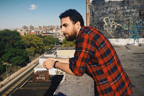
Photograph Oroma Elewa / Brooklyn NY
This week the fourth edition of iPad magazine Letter to Jane is released. The first three editions were edited, designed and coded by Tim Moore from Portland, Oregon. He’s now moved to Manhattan to work with iPad app start-up 29th Street Publishing, from where he looks ahead at his week.
Where are you today?
I just got into my office on 29th and 7th, eating breakfast and trying to catch up on the news before I get to work.

What can you see from the window?
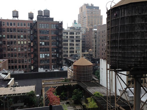
There's a water tower right across from our windows with a bunch of other water towers filling up the landscape behind it. It's the reason it's our logo, and it's the first thing people comment on when they walk into the office. I rather like our view because it feels like a closed off courtyard of rooftops. It helps tune out just how active and busy everything is on the streets below.
How many emails are waiting in your inbox?
At the moment just 14 saved ones that I'm procrastinating on replying. I use this app, Mailbox because it allows me to quickly empty my inbox in one swipe. I get so many PR emails, github tickets, and a lot of other miscellaneous time wasters that I quickly scan my inbox and if it’s not from a person I instantly archive it. Some days I just archive it all and wait for someone to ask if I got their email. I call it being efficient, others might call it something a bit more derogatory.

What’s your favourite magazine this morning?
I keep about 4 or 5 on my desk at all times. I don't really look through them much. I just have them there as reminders what I’m working on needs to fit comfortably in with what I feel is the best out there. I constantly have my iPad open with my work lying next to this stack and if it stands out for the wrong reasons I know I haven't got it yet.
On my desk right now is Tunica Magazine, Folch Studio might be my favorite right now. Everything that comes out of there has so much life to it; it’s always very refreshing to pick up some of their work.

The new issue of Gratuitous Type. Elana Schlenker really nailed this one. I love the flow of this issue and the cover is one of my favorite of the year.
Then I have that latest Vanity Fair because I’m addict for any Mia Farrow story, (although they could’ve just kept their family business private and gotten a blood test and be done with it. Also, the kid really looks like Sinatra to me).
I really like what you and Andrew did with My Favo(u)rite Magazine. Bob is one of my earliest supporters and continues to be someone who I greatly admire and am grateful for his encouragement. I was so happy to be able to contribute to the issue, and love how it turned out.

I also have the Bloomberg issue of New York that I keep telling myself I’m going to read, but I probably never will. I read one story online, liked it a lot so I picked up the issue only to recycle it in. Great cover though.

And your favourite magazine app?
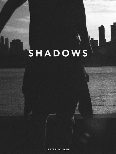
Well at the moment I would say mine, Letter to Jane: Shadows. I mean when you're in it and trying to just make sure the thing actually becomes a reality you're too busy to actually enjoy it. It's done now, I can look at it as a completed product and actually enjoy it for once. That's a new experience for me, enjoying my own work. I also redesigned The Awl's magazine Weekend Companion, that's going to be out very soon and I'm really happy with it. The content is great and the design is so slick. The original design is probably the most controversial thing I've done. This one is more refined, and completely unique to me.
It's hard for me to say I like a magazine app like Rolling Stone, New Yorker, or something like that, because they're conceived for print and then handed off to another team to convert for digital. They weren't conceived for this new medium and there is not an editorial or design strategy to publish to these devices. What's another one, Flipboard? Flipboard is a web browser, not a magazine. Letter to Jane is a true iPad magazine, and with this issue I think it's the best. Others will argue that I'm sure, but I'm at least in that conversation. The other true magazine apps are what we’ve been calling ‘sub-compact’ apps for the lack of a better, less insulting term, and I think 29th Street Publishing produces the best ones. Not surprisingly I could talk for days about this market, but I actually have to get some work done today.
How was the experience of raising funding for the new Letter to Jane app on Kickstarter?
It was terrifying, disappointing, and ultimately rewarding after it’s all said and done. Anyone with a small magazine can sympathize with having to deal with people constantly coming up to you and giving you ‘helpful’ advice on how to grow it, but without ever actually offering money to make that advice reality. Everyone has an idea, no one ever has money to back it up. So the Kickstarter was a way of saying, okay thank you for liking what I do, I want to take it to a new level, please invest if you would like to see this. I thought it would be a way to make something sustainable from my existing fan base. Really everything I thought going into this process was wrong.

I really underestimated how powerful a Kickstarter is in raising one’s profile. It was the best form of advertising I’d ever done. Sales of previous issues went through the roof, I was able to reach new press outlets, and it caught the eye of David Jacobs and Natalie Podrazik who hired me to be their creative director at 29th Street Publishing a few months later. This is all good, but creating an issue in the public eye with people demanding they get something they've already paid for really through me off my game. It was a completely different creative process than I was used to.
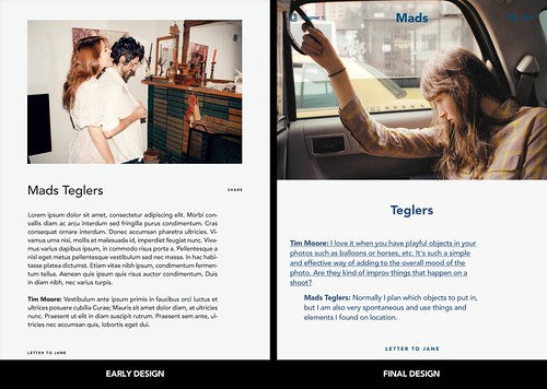
I had some pretty good ideas, and looking back at my early mockups, they were pretty close to the final product, but I ran into a lot of problems building it, topped with moving cross country to start a very demanding job. I write about this process in the introductory letter of the issue, so I won't get into too much detail. A lot of people ask me for my advice on Kickstarter, and I tell them to use it as a pre-order site. I used to look at it as an investment tool, but in reality no one is really investing, they're ordering a product, and no one is willing to invest the proper amount of money to get a business off the ground.

You put a lot of effort into the simple experience of content. What's the one part of the new app that satisfies you most?
Thank you, it’s just amazing how many different scenarios you have to consider when designing just how a person might swipe to the next article. After the last issue, I really felt like I loaded too many things into that issue. It was simple but also felt crowded too me. I really wanted the next thing I did to be very lean. Then the idea for the Kickstarter happened and giving away the source code really started the process of how I would design this issue. I was really making an issue for people behind the scenes and then for readers. The guiding principle in building the issue would that there would be these core features, and then you could reconfigure them to your needs. So I knew I was going to build a better photo gallery, and I knew every feature was going to be an interview instead of having interviews and photo features separate. So really the whole issue is one experience, the photo gallery and I show how to use it in different ways throughout.

How the text and the photos interact is really something I have to thank you and Matt (Willey) for when we worked on the Port apps. It was you that suggested to have one of the feature's images be tied to certain parts of the text, something I had no clue how to do, but it was such a good idea I found a way. From there I took that principle and applied to the gallery so that you could view the images many different ways. As a side note I'm very proud of those apps for Port. They're another example of an existing print magazine that applied a thoughtful editorial strategy to digital.
Tell us a bit about the 29th Street app publishing tool.
I consider myself very lucky to work at 29th Street because I believe we're making the right tools to solve digital magazines problems. The main problem with magazines on an iPad is that there’s a disconnect between the talent and the reader. There are these superstars in print that aren't touching their digital projects at all and if they do it’s with a very dismissive attitude. There have been so many stories in the past few years about how digital magazines are lacking because readers don't have this or that, and magazines rush to please them by adding half baked features. In reality readers aren't asking for more features they're asking for an actual magazine, not just content that was re-purposed and sold to them at the same price. They want an actual editorial and design strategy. They may not be asking for these things specifically, but it's one of those things you know it when you got it.
29th Street's biggest advantage is that it’s built around creating direct connections with the publisher and the reader. When someone comes to us the first thing we do is plan out an editorial strategy, then we get into design, and lastly we make sure they know how to make their own issues. That last point is important. They are actually making their own magazine with a specific strategy to cater to this market. This fosters the best connection between the writer and reader. They have their own admin where they make their issues and when they're ready, they publish it and it goes directly to the subscriber's devices.
We started out with making a certain kind of magazine, but you're going to start to see this change. We recently just launched a book club/store with Emily Books, a couple of graphic novels, and we have some rather big name magazines coming out soon that will hopefully shed this ridiculous sub-compact label.
What was the last thing your editor said to you?
‘Oh shoot I still owe Jeremy a bio for the conference’ (sorry to throw you under the bus David).
What are you most looking forward to this week?
It’s kind of a big week, Letter to Jane launch on Tuesday, submitting that Awl redesign I mentioned, and I get to get back to work on a project for a publication that was my dream job when I was a sophomore in college, so I'm pretty excited for that.
What are you least looking forward to this week?
With the good comes the bad. I believe so much in the product I’m putting out with Letter to Jane that I know I’ll have to deal with a certain amount of backlash, but like I said I’m happy so bring the trolls on. I know I’ll have to deal with one client that I’m sure hired me just so they could blame their own internal struggles on someone outside the office. And I just moved into a new apartment and I’d really like to get settled and return to some kind of normal life.
What will you be doing after this chat?
I should get to work, but I’ll probably check Twitter. I know people can’t stand me on Twitter because I go off a lot, but I’m at my most productive when I’m active on Twitter. I’m someone who has a million thoughts racing through my head all the time, and for some reason Twitter has proven to be the best way to empty my head and let me focus on what I need to. Again I would call it being efficient while others might have a different word to describe it.
Letter to Jane: Shadows will be available in the app store from tomorrow, October 8.
Tim’s colleague David Jacobs will be talking about the work of 29th Street Publishing at The Modern Magazine conference, London, October 16.


