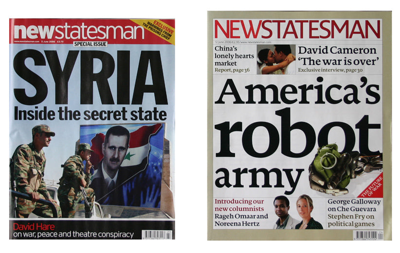
Before and after #1
The first thing to note about the recent redesign of left-wing news magazine The New Statesman is that it bucks the UK trend for smaller formats. This redesign increases the page size, albeit only slightly. But alongside extra pages and better paper, this increase makes a big difference to the overall appearance of the magazine.
The magazine has been reorganised editorially, featuring many of the same contributors but adding some new names to broaden the magazine's voice. This is a reinvention, not a revolution, and the redesign reflects that, treading a careful line between appealing to new readers while not scaring existing readers.
Simon Esterson and Stephen Coates of Esterson Associates worked closely with in-house art director David Gibbons on the project. The key design decision was, in Esterson's words, to 'get away from the 'angry' typography of big red and black all caps sans-serif headlines which have become a cliche in left-wing graphics'. The magazine now features cooler upper- and lower-case headlines (using the font Documenta), and a muted colour palette that anyone familiar with Esterson's time at The Guardian will recognise.
Overall, the design is calmer and more modern, and reflects the intelligent tone of the content better than the previous over-fussy design. Pictures are given more space, the flatplan is restructured to make the various sections clearer, and the navigation design vastly improved.

The new front cover, shown above right, is a central, almost symbolic, focus of the redesign. Its type-led approach is delibarately different to The New Statesman's weekly rivals (Time leads with photography, The Spectator uses illustration), and as Coates explains, 'signals an emphasis on strong stories and excellent writing'.
This redesign isn't a radical rethink of the magazine medium, but then that's not what it set out to be. Reading the first issue it clearly works; the magazine now has a strong set of tools at its disposal to express itself visually. Initial sales figures indicate that readers agree, with weekly sales up to 30,000 from 24,700 despite a price rise to cover the extra pages.
Finally, its interesting to note that this is the second left-leaning publication (The Guardian being the first) to redesign using modern serif fonts. Such typefaces strike a very different note to the modernist san-serif designs traditionally associated with left-wing politics, while avoiding a crossover with the classicist image of the right-wing. Is this the design style of the late New Labour era?


