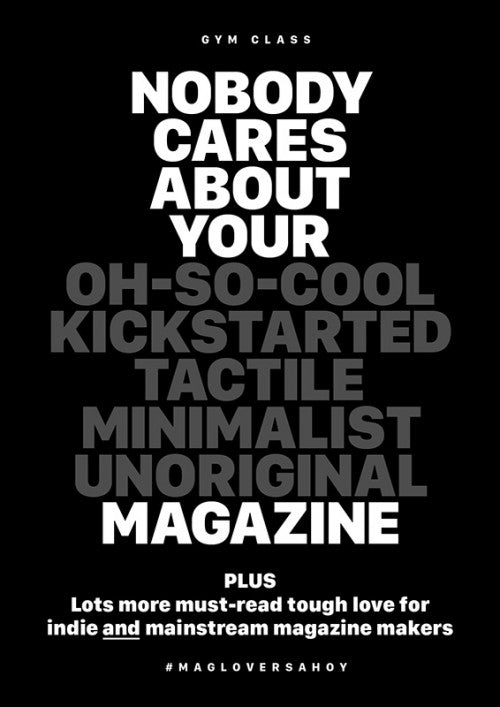
Behind the front cover, Gym Class #12

We’ve been fans of Steven Gregor’s new Gym Class cover since he revealed it at last month’s Printout. The bold and satirical statement is definitely on point, and it taps into something that we’ve been feeling for quite a while here at magCulture: namely our concern about the more derivative designs of many contemporary publications. We got in touch with the Gym Class creator to find out more, intrigued about whether the characteristically playful Steven is using the statement as a light-hearted provocation, or whether he is articulating a deeper concern about magazine making today.

‘The cover doesn’t relate to a single article within the issue,’ Steven first tells me via email. Although he’s typing I can sense a lot of energy and enthusiasm from his speedy and thoughtful responses. ‘The cover is a call to action… make magazines, and make them exceptional.’

Steven’s call for innovation and a unique sense of personality seems engrained in how magazine making has become simpler because of Kickstarter and design templates. Although it’s still tough to get something off the ground, it’s certainly easier these days to make a publication, and this can lead to editorial laziness both in terms of content and design. ‘Indie magazines used to be opinionated and bold. A point-of-view and authentic tone-of-voice was paramount… otherwise, why bother? In my opinion, nowadays, too many indie titles aspire to be stocked in WH Smith. Seriously? WTF!’

The new Gym Class cover is a deliberate response to this lack of authenticity: ‘It’s about Gym Class being bold and having an opinion… It’s declaring: Gym Class is a voice and you should listen to it if you make – or if you’re interested in – magazines.’

A unique voice is of course important aesthetically as well, and Steven emphasises this: ‘I look at so many magazines each week. Too many to count. But I never have any of them on my desk when I’m designing. Copying another magazine is like a pigeon eating discarded chicken bones…. ew… weird!’

To avoid this kind of magazine-making-cannibalism, Steven’s advice is simple. ‘If you’re looking to start a magazine… fantastic! You don’t even have to be rebellious! But, don’t pick up a copy of Kinfolk or Cereal looking for inspiration. Both these titles are very good at what they do… and the market’s not big enough for another hyper-minimal, generalist clone. You’ll receive a lot of attention on Twitter and Instagram, but this show of love will not necessarily translate to sales.’

The new Gym Class doesn’t just boast a strong cover; the content is music to every magazine lover’s ears. Q&As with US heavyweights Scott Dadich (Wired), Chris Dixon (Vanity Fair) and Gail Bichler (The New York Times Magazine) as well as Jaap Biemans (Coverjunkie) and eight magazine makers in the Bristol independent publishing scene are just a handful of examples of what’s contained in the pages. ‘It’s a cracking issue,’ Steven proudly proclaims, ‘Easily the best, content-wise, I’ve so-far published. So many ace – and respected – magazine makers give advice about how to make a great magazine, and how to make it sustainable.’

Yet the cover is what we all first see and initially get excited about. It’s also what we remember. Since Steven released the cover image, the new Gym Class has been the fastest selling issue to date. ‘It’s on pre-order and I haven’t, as yet, released any information as to what’s inside the issue. Goes to show… a new cover is a social media event. And the cover can make or break an issue.’
Interview by Madeleine Morley


