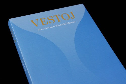
Magazine of the Week: Vestoj #5

Its thoughtful integration of word and image is why Vestoj is our choice magazine following the hectic fashion weeks this month: a publication that every fashionable magazine reader should be carrying in their bag this spring. Fashion is often wrongly accused of being purely decorative, unimportant and frivolous; something shallow that changes quicker than the seasons. Academic journals, on the other hand, are often stripped entirely of design and ornament for the very reason that fashion is considered ‘frivolous’: the editors seem to want the text to do the talking, and perhaps believe that decoration could be distracting or unnecessary.
Vestoj emphatically brings both worlds together – it is a journal of ‘Sartorial Matters’ –a celebration of the intelligence and importance of both magazine and clothing design. Published under the patronage of London College of Fashion, the academic essays contained in the magazine are attired in the most beautiful way, emphasising the significance of the topic of ‘Fashion’ by dressing up each page smartly and with plenty of imagination.

For the past three issues, designer Erik Hartin has created something innovative and different: a visual and tactile response to each issue’s particular theme. In their ‘Shame’ issue, readers had to cut through the fold of pages to read the secrets inside. In their ‘Fashion and Power’ issue, two publications were bound together so that you’d have to flip round the issue to read the other side – both parts of the magazine were battling for supremacy.
For the recent issue five, ‘On Slowness’, designed by Hartin with Moa Pårup, the magazine’s ‘sleeve/cover’ can also be a bodily ‘sleeve/cover’ (above). Peeling the jacket open reveals a knitting pattern for a sweater: like a jumper would protect the body, this pattern similarly protects the fragile and thin pages of the publication whilst looking stunning at the same time.

Each essay begins and ends with a single line reaching out into a blank page like a catwalk (above) – the effect slows down the reader’s pace as each essay stretches out languorously. In the editor’s letter, Anja Aronowsky Cronberg urges us to take the time to knit something slowly (perhaps like the sweater from the magazine’s jacket): a way to combat the stressful effects of the quick pace of contemporary life. Slowing down the progression of how we read and engage with each page seems to therefore chime with her call to ‘take your time’.
Another design highlight is the photocopied pages of short stories by the likes of Lydia Davis (above). This effect is another example of a playful way that the magazine creates a sense of texture and difference, especially in regards to its more text-based sections.

Hand-stitched portraits by Louise Riley accompany a collection of interviews with designers (above). The blue thread of the portraits mirrors the blue of the text: word and image are given equal importance through this colour cohesion.

Lastly, a piece about people and their favourite pair of jeans, the best garment for slouching and taking your time in, makes particularly good use of portrait photography. Justine Kurland’s denim close ups seem to perfectly reflect their wearer, emphasising how the clothes that you wear on the outside can intimately connect with your inner personality.
Vestoj emphatically demonstrates how intelligence can be beautiful, and how beauty can be intelligent. Point five of their manifesto could not be clearer: ‘Text and image shall be given equal importance. We must always integrate word and picture and guarantee that there is an on going dialogue between the two.’ Vestoj seamlessly achieves this harmony between text and image: its what makes it a magazine that is so easy to spend time with.
Review by Madeleine Morley


