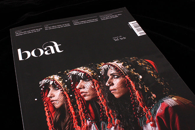
Boat #10, Tel Aviv
It’s been some time since we took a look inside Boat here; once a stalwart of the UK indie scene, since the team’s move to Los Angeles its presence is more easily overlooked. Yet the central concept remains strong; each issue the team set up office in a different city and work with local journalists to find stories that reveal unique local characteristics. It doesn’t so much compete with your guide book as flesh it out.
For issue ten the team went to Tel Aviv, and they do a typically good job of introducing this complicated city. We meet a local band who have managed to attract fans from both Jewish and Muslim audiences (A-WA, on the cover, above) and get an insight into local painter Guy Yanai’s creative process (below).
 The city is famous for its food, and that’s reflected in a city-wide walk through various restaurants and cafés (above) and in a longer piece about new eatery Claro, opened in an ex-printing office that at one point was Mosad HQ.
 The LA connection comes through in a piece about surfing, which starts off following a familiar path of surfing as release and peacemaker, the latter ideal quickly put to rest by surfer Hani Ovadia (below) explaining he doesn’t believe the sport can bring peace to the Middle East.
 Tel Aviv is to Israel what New York is to the US; more open-minded than much of the country its sits in, it has a large gay community and is a popular gay destination. A gay European writer is assigned to dig a little deeper and finds a world complicated by the Israeli-Palestine divide. Similarly, a piece about a software company set up to employ ultra-Orthodox jews confounds expectations (below).
 The magazine treads the delicate line between enjoying the culture and food of the city and addressing the obvious political issues of the country. It doesn’t meet the issues head on but lets them rise up where they naturally occur, a more realistic and engaging way to portray the realities of life in Tel Aviv.
Editorially the issue is as strong as ever, but despite another strong front cover the interior design feels a little little flat. It’s consistent and thoroughly smart, but I miss the ocassional shift in visual pace that earlier isssues had (see the handpainted headlines in our review of issue seven, Lima).


