

Buffalo Zine #3
Much of the discussion around indie mag publishing at present is centred around the issue of success, which in this context really means ‘business model’. This is an essential part of any publishing project – what’s the point of publishing one issue then folding? – but can sometimes overwelm the creative side and suck the joy out of making magazines. Thank god, then, for Buffalo Zine, a magazine hanging around at the back of the classroom, chewing gum and planning another night on the laughing gas.

Always arriving suddenly and unannounced, Buffalo Zine is a shapeshifter of a magazine. 2011’s launch issue was a newsprint tabloid carrying annotated photographs of a smaller magazine in its many pages (above); in 2013 the second issue was a more conventionally sized glossy that consisted of two magazines bound back-to-back by a rubber band (below). The aesthetic was timeless zine – collaged imagery, handwritten notes and archive subjects.

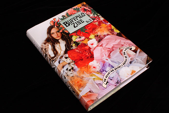
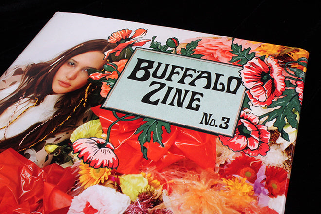
In his editor-in-chief’s introduction to the third issue, Adrian Gonzalez- Cohen describes how he moved on from issue two, talking of it as reflecting teenagehood via the ‘annoying charm of rebellion’. His words appear on the inside flap of the issue’s dustjacket, a shiny cover wrapped around the hardback publication (above). He eloquently explains how the new issue reflects our tween years – a period where we read books avidly, developing ideas of good and evil. The issue’s heavyweight 354-page book format is neatly justified, as is the slightly dreamy children’s book feel of the design.


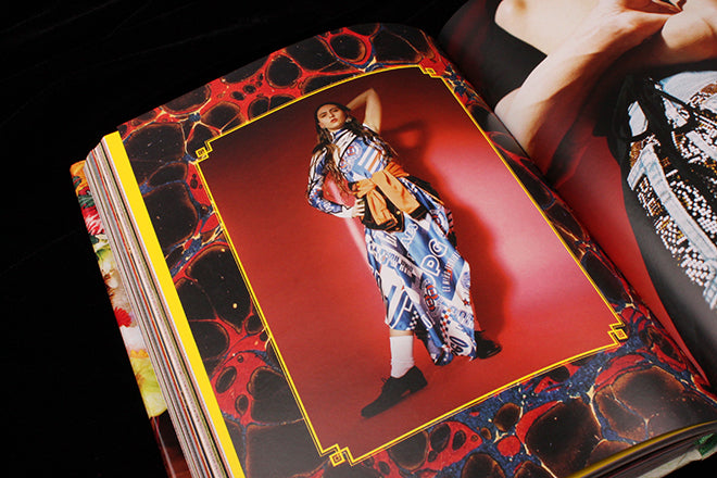
At last night’s Printout (more on which soon) the discussion turned to the clichés developing in some areas of indie magazine publishing; Buffalo Zine is the perfect riposte to any such clichés. Here’s a magazine that includes contributions from actors, musicians, artists, authors and fashion designers – significant names all, an A list of each discipline. Chloe Sevigny, Bjork, Peter Schlesinger, Irvine Welsh, Tim Walker… and it could easily be presented in super-cool fashion mag mode. Instead, the issue is a delightful confection of Victorian typefaces, elaborate drop caps, decorative borders and artful pastiches. There’s barely a centimetre of white space in the issue, it is so packed with design detail and content.


That content is strong too – this is not a magazine just about looks. Content and design work together well, treading a subtle line between full-on parody and confidence in its own conceit. The fun of making the issue is self-evident, a feeling that readily passes to the reader, but this is backed up with intelligent commissioning and selecting of archive content. This is a magazine that creates its own world for the reader to immerse themself in, always a pleasing thing, and after a deeper read it was also satisfying to find that rebellious teenager is still just there under the surface (below), a presence all the stronger for the otherwise pretty context.


The rationale for the format is convincing and the execution spot on. Highly recommended even if fashion is not your thing.
Art direction and design: Adrian Gonzalez- Cohen, David Uzquiza