Charles Asprey, Picpus
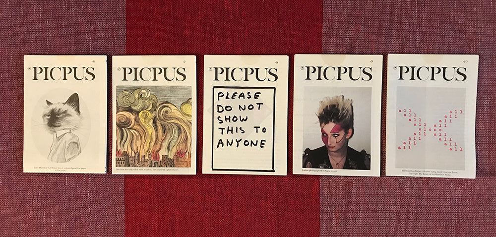
The most popular item on our free shelf at the magCulture Shop is Picpus, an A6 art quarterly that folds out to a single A2 sheet manifesto/poster.
Founder and co-editor Charles Asprey also produces monographs with emerging artists, most recently with Tenant of Culture and Amelia Barratt. He shares the background to his diminutive journal—he prefers that word to magazine—as he discusses his working week.
What are you up to this Monday morning?
Ah Monday morning! The doorbell rings and a thump of boxes being dropped in the hallway outside announces the arrival of 4000 copies of the new Picpus art journal, bang on schedule from Aldgate Press in Tower Hamlets.

This is our 29th issue. My co-editor Simon Grant and I have been producing this ‘not-quite-Quarterly’ since 2009 and each new issue brings great joy, soon followed by the slightly ominous realisation that they have to be distributed. Nonetheless, each time we go to print we call each other, congratulate ourselves and our design team at Studio ARD and suggest this must surely be ‘the best issue ever’!
Where are you?
Picpus HQ is my home off Rosebery Avenue in Clerkenwell, and Simon lives in Paris. We have about 70 stockists around the world and growing all the time. The latest addition is a gallery in Guatemala City.
About 20 or so stockists are in London; independent bookshops and galleries mainly. The remainder go overseas although with the cyber attack on Royal Mail last month that’s going to make life difficult for us as they are not accepting air mail parcels for the foreseeable.

Which magazine do you first remember?
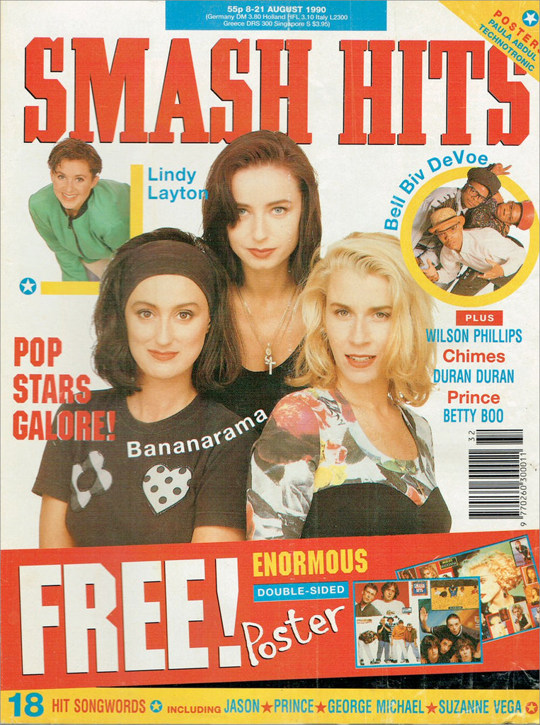
The first magazine I had to have as a kid was Smash Hits and then a little later Rolling Stone. They often stuck free gifts to the covers; like flexi discs that would be valuable collector’s items now if I’d had the wherewithal to stash them away.
I keep having to remind myself that the music world had, and has, far greater reach than the art world but our diminutive journal is out there in substantial numbers now (29 issues x 4000 copies each), it is collected and occasionally they even pop up for sale online. I was so proud when Picpus was included in the Tearing it Up! Exhibition at Somerset House back in 2018 and the curators installed some of our issues on the wall next to The Face.

What are the origins of Picpus?
The Scottish artist and Concrete Poet Ian Hamilton Finlay (1925-2006) gave us the inspiration for our journal. One of Finlay’s themes was the French Revolution and Picpus takes its name from a cemetery in Paris where Robespierre buried the victims of his Terror and where he himself ended up when the Counter-Revolutionaries got to him.

The etymology of Picpus is Pique Puce, flea-bite, and my artist friend Christian Flamm designed the flea logo for us (above). Christian also designed our masthead and drew a bespoke alphabet for us, so our brand identity is artist-designed and uniquely ours.
And whilst we love magazines we are keen to describe Picpus as a journal. Being on a single sheet of A2 paper with no actual cover, it’s in the tradition of manifestos and posters more than magazines. And given we knew we were going to have to distribute thousands of copies at our expense it helps that it folds down to A6 and can fit snuggly in an envelope or a pocket.

Why launch a free art journal in 2009?
Well I suppose we were tired of the content of art magazines (and still are mostly) as they all seemed to be devoted to the covering the same type of art, following the same curators and authors, they use an increasingly opaque form of language and are stuffed full of advertising.
With Picpus we aim to fill in the gaps in art history, tell stories in a clear style about the smaller (but still significant) events and practices over the centuries that we are less familiar with. Most of the contents are new to us so it’s a great form of discovery for us too and because each issue is non-time-specific, we end up with a great variety of content. There is never a theme to an issue, yet threads often emerge in the most unlikely ways once the contents start to be laid out for printing.
Have a look on our website, click open any issue and see the extraordinary variety of artistic creativity and start drawing your own connections. The lesser-known parts of the art world are thrilling to discover.
We intersperse these stories with some commissioned contemporary reviews and opinion pieces. One piece in particular that got a lot of positive feedback was a review of an exhibition by the painter Sean Scully. We felt we had to comment truthfully on how we felt about the work (and a shocking documentary on the artist who described himself as The Donald Trump of the art world!) and channel what many in the art world were collectively saying behind closed doors and actually put something in print.
It’s worth noting how little the art world (and maybe in other industries) rarely challenge themselves, the market or the status quo. Anyway it was a bold move and proved that people want well-written articles that dare to stand up and have a strong opinion. This article was printed in issue 22.
Two issues that we’re particularly proud of recently are issues 27 and 28.

One side of Picpus issue 27
The first is a special celebrating Ukrainian 20th Century art (above) with a text demanding that museums around the world label their collections accurately. For example, Kasimir Malevich and others have been claimed as Russian when in reality he and Prymachenko and Alla Horska (just two example) were fiercely proud of their unique Ukrainian heritage.
Malevich was even imprisoned and tortured by Stalin’s secret police and Horska died in mysterious circumstances in 1970 having exposed the sites of mass graves from the Stalin-era. These artists are heroes to their people and the least museums can do is to accurately record this especially when Russian tanks are once again crushing Ukrainian dreams of independence and targeting Ukrainian cultural objects.

One side of Picpus issue 28
Issue 28 (above) was the first time we’d invited a guest editor to be involved. We asked Rosy Head to compile a special issue of text only based on 15 months research into the history of Environmental thinking going back to the early 19th Century. This issue is larger—A1 folded to A5—to accommodate the extraordinary texts Rosy uncovered, The earliest goes back to 1807, proving that humanity has long been thinking about (if sadly not acting on) the implications of our species neglecting the planet and raping its resources indiscriminately

Do you have a sense who your readers are?
The exact numbers of our readership are largely unknown and we like to think people share the paper copy quite widely, but who knows? We can only estimate from the range of our stockists but having done a couple of book fairs I can safely say that the readership is made up of those that love design, fonts and layout as much as those who like reading about art and culture. And that’s very satisfying to us as editors.
What are you looking forward to this week?
Doing my delivery rounds in a little electric car stuffed with copies is a good opportunity to see some shows at our stockists. I’m particularly excited to see the exhibitions at Camden Arts Centre, Emalin Gallery, Maureen Paley and Raven Row. It’ll also be great to drop in on three extraordinary bookshops who host Picpus; Donlon Books on Broadway Market, Tenderbooks on Cecil Court and Claire de Rouen in their new space on Globe Road.
Long Live the printed page!
Editors Charles Asprey and Simon Grant
Design Ard—Chuard and Nørregaard


