

Compost #1
This week’s Magazine of the Week is the hefty and wonderfully crisp inaugural issue of Compost. The Buenos Aires-based publication is put together by editor Juan Moralejo, an independent publishing wizard and regular contributor to the likes of i-D and Apartamento.

Juan has always been fascinated by printed matter: a few years ago he published the 60-page mini-magazine Sede, later upgrading to 160-pages for Correspondenica, his magazine about Argentinean culture. Irritated by the constraints of such small and specific publications, he’s now launched the more general and abstract Compost – which at 400 pages is by far his biggest venture to date.
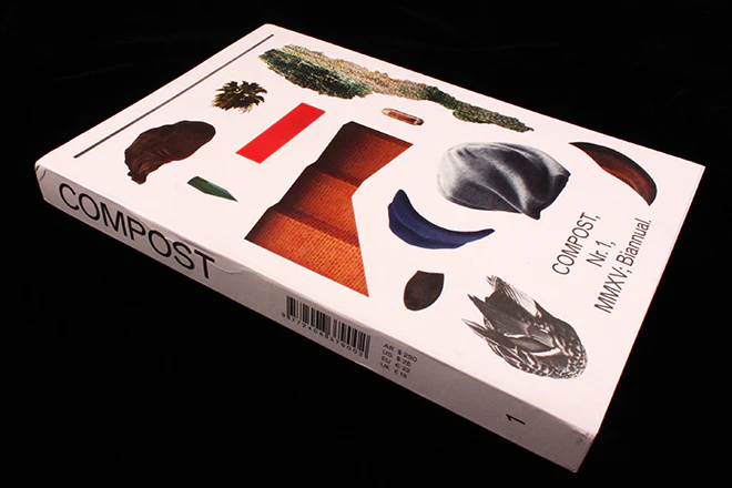
Together with the geometrically-inclined designer Benjamin Critton, Juan has opted for the increasingly popular open-bound format (above). There’s also something of the clear and confident Apartamento in the design: legible two-column text, simple layout, bold and playful page-numbers and clean photography makes for a pleasant read.


For Juan, past projects haven’t been challenging enough, and their strict, section-based format felt restrictive. That’s why Compost is loosely structured by ‘atmosphere’ – moods that can grow and evolve and which are supported by the design. There are eight ‘atmospheres’ in total – yet the magazine never directly articulates what these are. That’s for the reader to determine from the tone of the articles and the shape of the letters. Each ‘atmosphere’ is suggested by 8 different typographies used for headers – you’ll move from a chunky, solid and macho typography (above) to a thoughtful and literary serif (below).


As the magazine harmonises content, design and ‘mood’ so perfectly, it’s a surprise to hear that Juan and Benjamin never actually met face-to-face and that the entire publication was put together via emails between Buenos Aires and New York City. Together on Skype they chose to ‘channel clunky eighties magazines in a way that still felt modern’ (as Juan explained in an interview with Needs Supply). The eighties reference can be seen in boxy frames (above) and geometric patterns (below), and modern injections of soft blues, roman numerals and hints of minimalism keep the spreads fresh and forward-looking.

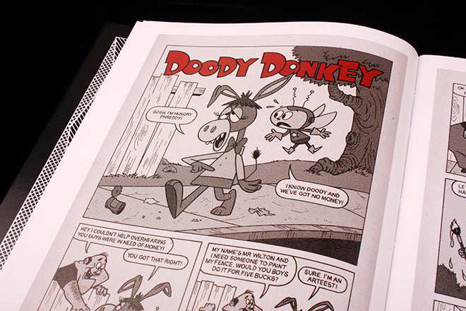
Comic strips are another fun throw-back (above), and powder blue makes more appearances for bitty features and infographics (below). Sections of vertical text make for further changes in atmosphere whilst also slowing your reading dramatically – a new pace that’s suited to the still photography being showcased (also below).


Compost is a mix-match of tones, styles and moods without being messy; it’s both clean and experimental, and it takes you through a range of feelings without detracting from the overall Compost look. Many starting-out magazines attempt to bring together a variety of styles and typographies but are let down by the lack of cohesion amongst the visual jumble, but this is what Juan and Benjamin have succeeded in getting just right. The magazine’s name seems applicable to its design – it takes from the past, using old references and a random pile of differing shapes and symbols, of discarded leftovers, and then something new and delightful grows from this compost.