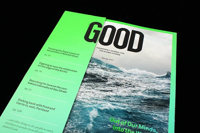
Good #33
Good is a restless enterprise, both in terms of its mission and its medium. For almost ten years, the magazine for ‘the global citizen’ has shifted between a print focus and a digital one, using different platforms (including films, a social network and live events) to bring together a community bent on ‘doing good’.
After a year without a print issue, Good have significantly rethought the magazine, tying their new vision together with a redesign. In words that chime with a lot of new, emerging independents, Casey Caplowe explains their print return in his founder’s letter: ‘Today, the web (in all its forms) does incredibly well at filling news and even inspiration… yet we realized there remains a space, and, perhaps more importantly, a feeling that the web cannot reach.’
As printed magazines have lost their status as the most direct news sources, their relevance as a meditative, immersive medium continues to influence design decisions, as is the case with Good. Casey writes that the new magazine intends to specifically create ‘a more calming pace and contemplative experience where we can take our readers on a journey without the distraction of one million other options a click or tap away.’
The new cover is less cluttered and more centred than its previous format: slightly bookish, serene and minimal, taking heed perhaps from stripped-back, bold indies like Lost combined with the brighter colour scheme of Perdiz. The old covers could be quite text heavy, and the project has decided to now reserve their online homepage for headlines and content summaries – keeping the printed publication’s front clean and to the point.


Double-paged photography and sideways titles slow down the pace and contribute to the immersive reading experience, and neon green underscoring harkens back to the cover, a small but visually arresting detail (above). The green appears throughout the issue, boldly highlighting quotes across strong images (also above).
 The content, as is Good’s unwavering mantra, continues to see the ‘good’ in all things: an interview with Portlandia’s Carrie Brownstein and Fred Armisen seeks the social critique behind the jokes (above), the design departing from the issue’s bookishness, using Textedit text boxes to display the interview.
The essay ‘In Praise of Rage’ makes a case for the psychological importance of getting angry. As Casey notes in his letter, ‘though the form is now refreshed, the intent here at Good remains true: to celebrate, chronicle, and push forward a growing community committed to living like they give a damn.’ The new magazines coincides with the launch of an app called CTZN to connect their global readership, another example of Good tailoring their message to a different format.
Design director: Nicole Jacek


