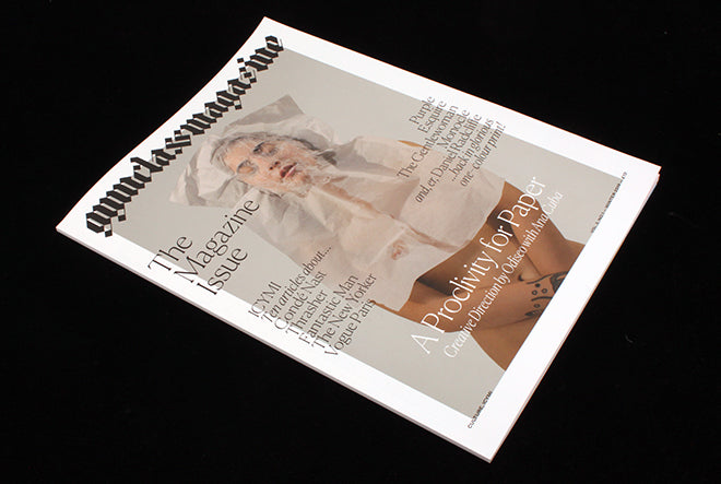
Gym Class Magazine, Vol2, #1
Oh, how we missed Gym Class Magazine! And we can assume its publisher/editor Steven Gregor missed it too, as after a two-year break he’s brought it back, with a new format and editorial concept.
With the original series of Gym Class, Gregor shared his love for magazines through commentary on their design and coverage of the people behind them. Issue by issue the magazine became more and more packed with ideas and detail as he celebrated the magazine format.
The new version of Gym Class retains his passion for the subject but is a simpler prospect both in terms of production and reader enjoyment. It has become a kind of almanac, collecting together a series of magazine interviews from various sources on a single subject. Each issue will adopt a different theme as the strand that ties the parts together.
Happily, the relaunch issue is The Magazine Issue, and features a string of interviews with some of our favourite magazine editors. Keen magCulturalists will probably be familair with most of the texts, but it’s useful to have them collected together. And there’s a lovely bonus column at the end that looks at fact-checking.
Gregor has pulled together the content from an impressive array of magazines – New York, The NYTimes Magazine, ZEITmagazin and more – then handed the art direction and design to the team behind erotic magazine Odiseo, at the Folch Studio in Barcelona.
As well as designing the smart, monochrome, pages, the team art directed the cover and accompanying story and a series of images that open each interview. All the images embrace paper as a visual theme.
I found the cover story pretty unappealing, though it isn’t helped by the print quality struggling with the fleshtones. Far more successful are the full-page interview openers, shot by Dizy Diaz under the art direction of Emmy Koski. ‘The articles are more about the people (and larger-than-life personalities) who make magazines rather than the magazine themselves,’ Gregor explains, ‘So it didn’t feel right to reproduce covers or layouts’. And portraits? ‘That felt too obvious. The visuals were an opportunity to do something unexpected’.
He’s dead right. The result is a lovely series of still lifes that a re visually intriguing and also lend the publication a shared visual identity, pulling together the different texts into a cohesive whole. Each shot stars an object wrapped in paper and subtely referencing its subject. S.I. Newhouse’s New York Times obituary is accompanied by a ghostly shadow (above), and Penny Martin is represented by the figure of a saint (below).
Gregor’s favourite image is the pipe that represents US Esquire editor-in-chief David Fielden (above); I particularly liked the tumbling skateboard wheels for Thrasher editor Jake Phelps (below).
‘The images have taken me out of my comfort zone’, says Gregor, ‘ and this is exactly the right place for Gym Class to be in as I think of what future issues might be (and who I might collaborate with to make them)’.
I’m intrigued by this new direction and where the next issue might take us. Good to have you back, Gym Class!


