

All change! Indie-inspired redesigns
Two long-standing magazines have recently redesigned, taking inspiration from the energy that the new wave of independent magazines has provoked.
What are the stories behind the new look of New Internationalist and History Today, and how successful have their redesigns been? We spoke to the editors and design consultants behind each redesign.

Previous iterations of History Today, from 1952, 1988 and 2017
The team at History Today, established in 1951, looked back at its rich history for inspiration and took inspiration from the very early designs of the 50s and 60s, as well as academic journals, in order to differentiate from other magazines on the newsstand. They worked with design agency Esterson Associates over a six month period on the compact redesign which first hit the shelves in May 2017.
Holly Catford, Art director, told me: ‘The brief was to make the whole thing very different from the other history magazines on the shelves that were less serious than HT. The aim was to look serious, yet contemporary – to reflect the content with the magazine’s design. I looked a lot at the history today archive, they were originally much smaller and journal-like. We changed the size, grids, fonts, paper, printer, everything! That doesn't happen very often in redesigns, it was really fun, but also quite hard to work from a totally blank canvas.

The graphic approach of the latest covers nod back to the early days of the magazine
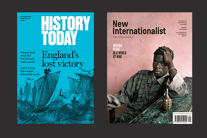
‘Our covers are very different from all the other history magazines and they really set the tone for the magazine. The way we use the typeface Druk is very important to the feel of the inside pages, I used some 486pt type in the April issue. We do straight forward layouts but with really strong openers. If something has really amazing images (like the 1979 Iranian Revolution feature in the April 2019 issue) the feature will get 16 pages with lots of double page spreads. We give the content lots of space.’
Kate Wiles, Senior editor, told me that they also looked at contemporary titles such as Lapham’s Quarterly and Delayed Gratification, which are smaller in scale and suggested a slower, more heavyweight read. She also explained that the redesign focused on the appearance and size rather than changing much on the editorial side of things, ‘We did introduce a few new features and are continuing to add more, reinvigorated by the possibilities of the redesign – I think it’s encouraged us to be bolder in the subjects we commission. We also ran a picture essay for 18 months, which took advantage of the new way images were showcased in the magazine.’

Previous iterations of New Internationalist, from 1987, 2000 and 2014
Over at New Internationalist, established in 1973, the redesign was not just about the look: there was an entire editorial rethink underlying it. ‘We threw everything up in the air’ Hazel Healy, Co-editor, told me, ‘We chucked out tired sections, spruced up old ones that we felt still worked and created a lot more space for visuals. Everything was crammed before; we needed to let the words breathe.’
‘We consulted our readership, then we whittled down ideas until all the editors agreed. The final result was a much better balance in terms of pace and content. We cover a lot of human-rights stories and while we always work to put solutions into our narratives, the overall effect could be sometimes be relentless, tiring, even depressing for the reader. That's different now. We have new, more light-hearted treatments, and we brought on board new young, women columnists from India and Kenya. We like to end with a lift-off into new, progressive future – that’s what our magazine has always been about.’

The new cover approach leads with a single story and majors on strong photography and contemporary illustration
Of the goal for the redesign, Kelsi Farrington, production coordinator, told me, ‘We asked TCO London help make New Internationalist more aesthetically current; to freshen up how our journalism is presented and to make the magazine more accessible and engaging – appealing to a new, younger audience without alienating our older, dedicated subscribers.’
They wanted people to be able to flick through an issue with ease and come away with the impression that New Internationalist is a key source for uniquely informative and international journalism in a bold, sleek package. Many independent titles provided inspiration for the redesign, and you can see the influence of magazines such as Huck, New Philosopher, Womankind, The Happy Reader, Delayed Gratification, New Humanist and Positive News in the new design.
Kelsi said that the independent magazine scene offers a mix of inspiration; from great text layouts to the use of illustrations, images and bold colours. They ended up nearly doubling the magazine's length – from 44 to 84 pages, enabling them to add in new sections – changed the frequency from monthly to bimonthly, and completely changed the format and paper stocks.
‘The format went from being self-covered and printed on quite flimsy paper to being perfectly bound with a thicker cover and printed on 90gsm paper. Essentially, the longevity of the new issues have been improved drastically as the old spec would crumple and tear quite easily. We've moved away from the throwaway feel that some of the weekly mags offer to a more substantial, keepsake magazine. There's also more harmony between our site (newint.org) and the printed magazine.’
Clive Wilson, from design agency TCO London who worked on the redesign, said of the process: ‘We were tasked with creating a contemporary re-design to showcase and better communicate the journalistic credibility of a magazine with a 40-year legacy. And we also had to engage a new, younger audience without alienating a fiercely loyal existing readership.
‘For the cover, the objective was to make the photography a major talking point – and a starting place for us were the bold, confident NI covers of the 70s. Surplus elements were edited down and a strong, elegant masthead introduced, but one which still speaks to the NI heritage. Our overhaul included a new set of symbols and icons, use of negative space to allow stories to breathe and the introduction of acclaimed contemporary illustrators such as Kate Copeland.’
And would they recommend the same route for other magazines wanting to reinvigorate themselves?
At History Today the answer is a resounding yes. ‘This redesign says that we’re a magazine with a long history and cutting-edge ideas. The most surprising response came from those who, even though the editorial line had not changed, thought it had because the articles were packaged differently! Our goal in the redesign wasn’t to reach new audiences, but to re-establish our place among our peers; the new design makes us stand apart and showcases the exciting and original history we publish.’
New Internationalist brought up a good point that investing in a redesign can be a difficult business case to make in the face of declining subscriptions, but it’s absolutely worth it if you work with the right design agency. The NI team were encouraged to invest in the redesign by the success of their 2017 Community Share Offer, as Hazel told me: ‘We raised £700K by selling reader-shares in the magazine. And quite apart from the money it was this major boost, from the phenomenal support from our supporters and their appreciation of our journalism that we do, that gave us the confidence to invest in our magazine, to carry on believing in print.’
‘Long-time subscribers love it (bar a few complaints about point size, which we are sensitive to) and i’'s definitely more attractive to a younger audience. The new look has really earned its place on the shelves of independent retailers. In terms of results, we relaunched in September, and we have already seen a 5%, increase in subscriptions, so it's a really solid start.’
newint.org
Editors: Vanessa Baird, Kelsi Farrington, Dinyar Godrej, Hazel Healy, Thomas Kilroy, Yohann Koshy, Chris Spannos, Jamie Kelsey-Fry, Husna Rizvi
Design: Andrew Kokotka, Ian Nixon, Juha Sorsa
historytoday.com
Editor: Paul Lay
Art director: Holly Catford
Buy History Today from the magCulture Shop
Buy New Internationalist from the magCulture Shop