


Inque #1
We’ve seen many indie launches this year but none have been so hotly anticipated as Inque, the new magazine from Dan Crowe and Matt Willey.
We’ve been following the magazine’s gestation since the pair ran a bold Kickstarter campaign last year—exceeding their £150,000 target.
We heard about early plans from art director Matt Willey in one of our Instagram Live series over the first lockdown summer; Editor Dan Crowe appeared on our Podcast earlier this year, and more recently revealed pages from the first issue at magCulture Live.
Our interest was piqued by two factors.
First, Crowe and Willey have a notable track record, working together on the creatively innovative literary magazine Zembla in the early noughties and then launching Port in 2011, guiding it through to its tenth anniversary earlier this year. Both also have their own, discreet projects: Dan at Granta books, and Matt as a partner at the New York office of design studio Pentagram.
The second factor was their strategy for the new mag, built from their joint experiences of Zembla and Port.
Zembla had been supported by a wealthy individual who pulled funding after eight issues. It remains close to many editorial designers’ hearts for its bold visual reinvention of the lit mag (although not everybody approved; design critic Rick Poynor observed on the Eye blog, ‘How much graphic cheer-leading, though, do readers actually need?’).
Having been through its ups and downs, Port has developed a level of creative-commercial collaboration that has seen the title succeed through neccesary compromise. Not an unusual situation, of course, magazines are commercial entities. And while Port has changed in many ways since launching ten year ago, it remains a visually arresting and well-put together magazine.
Nonetheless, for at least five years Crowe and Willey have discussed launching another magazine with a very different strategy. Inque would be a big, serious project with no economic restrictions imposed by outside factors. Any parameters would be self-imposed—for instance an inbuilt obsolescence; the new mag would last for ten, annual, issues and then cease.
They wanted to commission the best writers and image makers yet publish without advertising. Nobody would stand in the way of their creative ideals.
Kickstarter was the answer, and they exceeded their campaign target when it ran in August 2020, since when issue one has been in production. This week, copies appeared in a few select shops and subscribers began to see what they had signed up to.
So how does that first issue measure up to what was promised?

The first thing to note is the physical scale of Inque. Although slightly smaller than originally specced, the page size (242 x 340mm) is large but practical—you won’t need a table to read it, but it is big. And deep too; 234 pages of thick matt coated stock brings the third measurement in at 19mm.
That spine width provides a canvas for what appears to be the first part of a design planned to buid up across the 10 issues. The cover paper is heavier than most magazines, an impression emphasised by both front and back covers being gatefold and thus double thickness.

Another physical aspect to highlight is the double-sided six page foldout section featuring a pair of Giles Revell’s extraordinary photographs of beetles (above), more of which later.

The cover design sets the overall tone for the issue. This is not a magazine designed to sell to allcomers, but a magazine made to be delivered into the hands of subscribers.
Reassuringly quiet, it feels timeless. The cover image, a collage by Katrien de Blauwer, is monochrome and aged, and the magazine name and details appear in small white type at bottom left. Speaking briefly with Matt Willey last week, he explained, ‘There are rules for how magazine covers work, rules that are connected to neccesities that don’t really exist anymore. Inque won’t be stacked behind other magazines on the shelf. It can function in a different way.’
The cover also flies in the face of more general current wisdom; not just the tiny type—every designer’s dream—but in its decidely un-Instagram friendly nature. I speak from experience: reduce this cover to thumbnail to promote an event, and it all but disappears.
Yet in real life, it works. It looks thoroughly confident, comfortable in itself, and timeless. It doesn’t look brand new, it looks like it’s always been there.

The quiet confidence of the front cover is nicely subverted on the back, where an alphabetical list of contributors runs in large, bold, condensed type. And what names! Ben Lerner, Kae Tempest, Hanif Kureishi… this was very much part of the original promise of Inque. Inside, those names light up every page.

Proudly described in the editor’s letter as ‘A magazine without genre’, Inque is divided into four sections, three of which have no explanation. The third is subtitled ‘Fiction’ and despite running towards the back of the issue, is clearly the heart of the magazine. The other three sections are up for grabs; ‘If you sometimes feel lost, or in unexpected places, that’s a good thing.’
Despite their largely arbitary nature, the four sections are clearly defined by a series of bold flat tint colour opening spreads with vast black page numbers, a device familiar from other Matt Willey designs.

Each of the individual sections has its own pace: Part One—and thus the mag itself—opens with the heftier features in the issue (an unusual flatplanning decision apaprently driven by contributing editor Adam Moss, late of New York magazine); Part Two has briefer pieces (above), a break in the traditional structure of opening with briefs; after the Fiction section (pages and pages of writing with the occasional illustration), Part Four is visually orientated. But even these brief rules are broken.
A wonderful piece about the New York Times archive is richly illustrated yet appears at the front of the issue, as do Giles Revell’s amazing fold-out images—photographs, not drawings—of the beetles.

Generally then, the magazine is a free-for-all; the content mixes text and imagery on a single 12-column grid throughout, only the Fiction section shifting from a four column layout to its own three column design for a denser, bookish feel. The spread above is a typical fiction spread: unashamedly wordy. ‘I want this to be about you reading this extraordinary content’ Matt explained.
A concise set of three typefaces—all from Klim Type Foundry—is used across the issue.

Personal highlights include the afore-mentioned beetles, a series of paintings of Lucha Libre masks by legendary NY illustrator Seymour Chwast (above), writer Ben Lerner’s half-prose, half poetry text ‘The Orange’, and young photographer Shawn Pridgen’s first set of images of New York. Starting in issue one with Brooklyn (below), Pridgen will work round the City borough by borough, issue by issue.
But that’s just a small part of what’s on offer; this is a magazine that feels like it’ll last a year. There is a lot here, over 50 pieces.
 Photographs of Brooklyn by Shawn Pridgen were shot throughout 2020 and 2021
Pridgen’s photographs are just one of a number of series that will run across the entire ten issues of Inque; a lovely idea that makes the most of the concept. There’s also a ‘novel’ by Jonathan Lethem that will appear chapter by chapter across the issues.
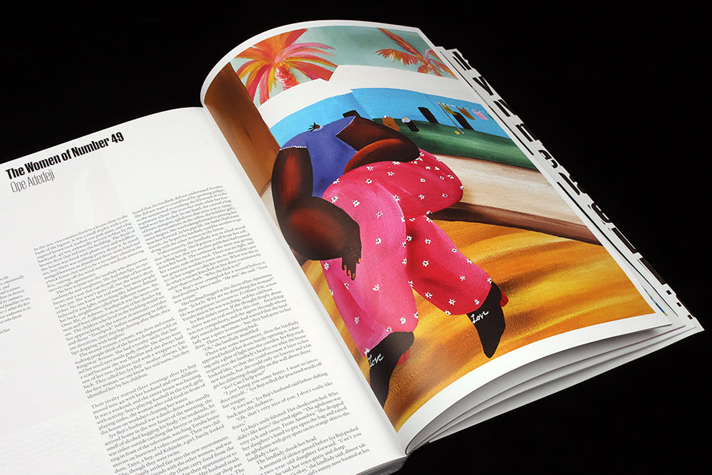 Bahati Simoens illustrates a story by Ope Adedeji, selected by Chimamanda Ngozi Adichie
As is to be expected from the team behind it, the attention to detail is tight throughout: the writing and image-making are both exceptional. Barely a foot goes wrong: there’s a clear delineation between text and image—not once do headlines or words cross the pictures. the typography is efficient and monochrome, with well-used but not gratuitious white space. The fiction is beautifully illustrated (Bahati Simoens, Manshen Lo, Leanne Shapton and many more), with work often reproduced at full page scale.
 Leanne Shapton illustrates a story by Joyce Carol Oates
You can sense Crowe and Willey revelling in the freedom and space they’ve created for themselves; space on the page but also space in terms of time. ‘One of the lovely things about doing a magazine so slowly is that we can give people time’, Matt told me. Inque is perhaps the ultimate example of the slow journalism of the indie world, the concept followed all the way through to its annual schedule.
Inque can also be read as a reaction to the pairs’ previous magazines. They clearly relish its relative opaqueness alongside the commerciality of Port—that phrase ‘A magazine without genre’ again—and for Matt it’s also a response to what even he sees now as the overdesign of Zembla.
‘I want Inque to be about you reading this extraordinary content, because I think if I did something that wasn’t that I would have kind of failed in some way. I think I was guilty of a bit of that when we did Zembla. We made fantastic literature, but it was hard to read at certain points.’
Does he really think that? ‘Zembla’s tagline was ‘Fun with words’ and we were doing the same with the design. And we probably took that too far. But I thought it was really interesting, because you weren’t supposed to do that with a literary magazine.’
Perhaps Inque, then, is a grown-up Zembla, designed by an older, wiser Matt Willey for whom it is what you are supposed to do with a literary magazine? I wonder, too, if it’s been a relief to turn away from the intensely American decorative tradition of his last major editorial project, The New York Times Magazine.
These are questions too close to Willey for a definitive answer, yet. He is a hands-on designer, producing the pages himself, and still too close to the project to articulate a detailed response. A typical comment is, ‘I just play around with things until things start to feel good’, which belies the passionate engagement he has with his work while also being a feeling familiar, I’m sure, to other editorial designers. An emotional investment is required for great magazine design, an investment that can make it hard to rationally discuss a project until later—Willey’s thoughts on Zembla have far more clarity than those on Inque for now.
So here are my thoughts on Inque: does it deliver on the bold promises of its fundraising campaign? Yes it does—there’s nothing like it out there. It’s the biggest, bravest magazine launch of 2021, indie or mainstream, and establishes a new benchmark for others. By crowdsourcing its start-up financing and charging £55 for an issue it can avoid overt commercial pressures and remind readers that great content costs money.
Yet for all its strategic and creative brilliance, I can’t help feeling slightly disappointed; to paraphrase and contradict Rick Poynor, I found myself wanting more graphic cheerleading. Inque has fabulous content in every respect, and I wanted the design to step up and match the words and images, not step back out of respect.