John O’Reilly, editor
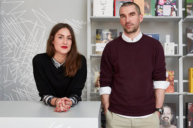
Today we’re chatting magazines with the former music journalist and current editor of the Association of Illustrators magazine Varoom!, John O’ Reilly. This week the publication is releasing its 35th issue, which boasts a new format and design, and a fantastic bright yellow 3D rendering by Jack Sachs as its cover.

We caught up with John to find out what publications have caught his eye from an illustration perspective, and have been at the top of his stack during the re-making of Varoom!.

An old issue: The New Yorker
I have a lot wonderful publications from the 90s when I was a young-ish journalist, Matthew Higgs’ Imprint 93, early issues of Colors, The Idler and The Baffler, but as Harold Wilson famously said, a week is a long time in politics – so I’ve chosen The New Yorker. At the moment what really helps me get a grip on what’s happening in the political world, on my emotions about what’s happening, are the covers commissioned by Art Editor Francoise Mouly.
These covers by two of their regulars Barry Blitt and Bob Staake (both previously featured in Varoom!). New Yorker covers are theatre pieces as much as 2D images, their purpose is atmospheric. Just as politicians create atmospheres with words, The New Yorker subscriber’s coverline-free covers are atmospheres that envelope, making an emotional climate for the reader to inhabit and for the articles to move around in. Blitt’s baggy-gaggery loosens me up – the world is crazier and meaner than you think, and the newspaper is reading my mind! The illustrator has created a voice for me through which I can breathe.
Staake on the other hand is a craftsman who collapses an emotion, an idea and a narrative into a simple bold colour and shape. And just to show how real President Trump’s project is, the image breaks what they would call the fourth wall in the world of theatre as it hides the masthead. Sometimes the job of the great illustrator who in inventing a social world in an image gives me the tools to free me from my confusion and anxiety, they help me make a decision about how I feel. And that helps me start do to do something about it. Thanks Bob, thanks Barry!

A new issue: Holo, #2
Holo is one of those big chunky new hybrids, part magazine part oversized book at 220-something pages with the strapline ‘Emerging trajectories in art, science and technology.’ It can be a little bit chewy, like food that is good for you, big bold stand-firsts, chunky black text, serious reads. There’s part of me which needs a dollop of ketchup. But Holo is so carefully considered in its editorial structure, choice of writers such as Geoff Manuagh, and not without a sense of humour – the page introducing issue two cover artist Karsten Schmidt is called ‘Crystal Math’. And while there is lots of great environmental photography that locates the thinkers, I imagine Holo’s image-makers as creating devices, images, that are adjusting my eyes to see a future.
This issue includes Casey Reas (who we featured in Varoom 12 – Illustrating the Future) and moody, restrained black and white collages throughout the magazine from Eva Hillreiner, that really hold up well among the diverse visual ‘emerging trajectories’.

And another thing: Harvard Design Review, #42
Published before the Brexit vote, before President Donald Trump, the last Summer/Spring issue of was called “Run for Cover!” As ever an extraordinary array of how design operates through buildings, spaces, practices and relationships.
The textured cover image, the block of black colour breaks up and flees across the page. Editor Jennifer Sigler writes in an editorial titled ‘Dreadful Design’, that ‘Our instinctive urge to hide under tables might save us when faced with a shooter, a bomb an earthquake, but more abstract threats ask our minds, not just our adrenaline, to intervene. Can we think our way out of fear? Design our way through dread?’ Design as redesigning the relationship between thinking, feeling and making, design not as problem-solving but as problem-making. It was philosopher Gilles Deleuze who said that there are too many answers and not enough questions. The demagogues have all the answers to all the wrong questions – ‘Immigrants!’ ‘Muslims!’ ‘Borders!’ We need to design better questions.


