

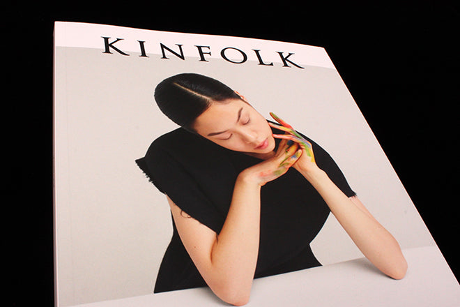
Kinfolk #18
Did you know there was a new issue of Kinfolk out? Unless you subscribe or are one of the many people who buy every issue you can be excused not knowing. The magazine tends to fade into view rather than land with a splash. Perhaps because it originates in the US, or maybe because it’s just how they swing, we’re not treated to parties and press releases. A review copy arrived at the studio in late December, and last week our shop copies were delivered. Quietly. It almost felt wrong to show copies on our new arrivals shelf – should we just have a couple under the counter for people that ask for it?

This lack of attention is a shame, because it’s a better magazine than it generally gets credit for. It tends to be pigeonholed as the leading voice of a set of magazines that loosely focus on a lifestyle centred on drip coffee, leather satchels and Scandiniavian city breaks. And largely that is true; it does encompass that easily mocked worldview. But the deeper message of enjoying a slower, gentler and more community and family-orientated life is a positive one and suits print well.

But what really sets Kinfolk apart is its art direction and design. There are plenty of magazines covering a similar beat, but reading the latest issue (coincidentally themed The Design Issue) I realised there was one key thing that sets Kinfolk apart from other magazines that rely on swathes of white space, limited colour palettes and small headline sizes.

With too many such minimalist magazines you get a sense from the pages that a headline has been dropped onto a blank InDesign page, an efficient but slightly dull typeface selected, and the characters letterspaced until the page looks ‘right’. It’s an easy style to assimilate, but a harder look to achieve properly.

With Kinfolk you can sense the underlying structure to the pages. Other magazines might start empty and add a few design elements to taste, but the pages of Kinfolk feel like they have started busier and slowly been reduced and refined.
A simple pairing of two families of type – a classic combination of a quirky serif and a humanist sans – three colours (black, red and a mushroom grey) and restrained scale throughout give the pages a controlled, authorative feel. All of which sounds unspectacular, but as discussed above, that’s very much this magazine’s thing. It doesn’t seek to shout or scream, it just does its thing in a highly considered and restrained manner.

This general impression is enhanced by the design detail. Kinfolk does not allow widows, rivers in the text or ugly hyphenation. Real effort has gone into making sure everything is as clear and easy to read as possible. And on that note, there is good reading to be had in the issue: Ilse Crawford and Hugo MacDonald discuss how the design of our homes effects our lives, and an interesting series of designers from different disciplines discuss the reltaionship between their work and the wider world. There’s a sense of design being taken beyond the design industry bubble and being examined seriously with non-designers in mind.
If you’re going to highlight the benefits of a slow, responsible, quality-over-quantity approach to life then your magazine needs to match those values. Kinfolk does just that, and therefore deserves more recognition for its design.
Editor: Nathan Williams
Design director: Charlotte Heal

Buy this issue of Kinfolk from our online shop.