Lewis Blackwell, editor-in-chief, BE
This morning we’re at work with Lewis Blackwell, editor-in-chief and creative director of the Built Environment Trust’s new journal, BE. From real buildings to prototyped ideas for built space, the architecture title sets out to both inspire and inform.
Besides leading the creation of BE:, Lewis is the director of strategy and development for The Built Environment Trust, chair of the Wildlife Photographer of the Year Award, and the author of many books. He’s the former worldwide creative head of Getty Images and most notably for magCulture readers, the former publisher/editor-in-chief of Creative Review. Today we catch up with him to hear more about his latest publishing venture.
How was your weekend?
The centerpiece was a musical party. My step-daughter’s very talented Pete had a big birthday. As he is a musician, among other things, he took over a hall and his many muso friends performed with him, the perfect celebration. Other than that I rode my bike a lot, training for an event, then swam to counteract the excesses of the cycling, also went to the cinema twice with my wife, Jan.
Tell us about your journey to work.
I cycle for 14 minutes, downhill from Hampstead to The Building Centre, off Tottenham Court Road. I then get a black americano and often a chat with Manu at The Gentleman Baristas, our café. It’s reassuring that they have a great following among cycling paramedics, who both know their coffee and what to do if something goes seriously wrong with any of us.
Describe the state of your desk.
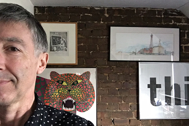
I have two, one at home and one at The Building Centre. They’re both a mess. This is a detail from my home studio, the cluttered corner of a beautiful desk (a one-off design by the late Simon Morgan, bought by my wife long ago when she was one of his lecturers). It is strewn with the detritus of recent life – car tax reminder, receipts from last weekend in Stockholm, out of date krona, a map of Paris (where my daughter studies, which gives me excuses to visit… see her picture of me looking towards Montmartre with my back to the Cy Twombly exhibition at the Pompidou). There is also tucked in here a contract from the Natural History Museum, where I chair the Wildlife Photographer of the Year Award, and a booklet from a hotel where we stayed in Jaipur. I don’t know why that is there but I like the almost hand-made quality.
I also have an office at The Building Centre, the base of The Built Environment Trust for who I create BE:, their first journal. I work in our new CoWork space there, too, a lovely environment where I am away from the mess. And I often hide out at the London Library, especially when engaged on a book, or when I want to think and read with motivating company, living and dead, and a tidier desk. I love the lettering on the walls in the stacks.
Which magazine do you first remember?
The Beano, if comics count as magazines. And the Radio Times, lying around the home, which coincidentally one of my best friends now helps edit.
What magazine matters to you the most this morning?
The London Review of Books. I am just starting into the latest. My wife pays for the subscription and I nick most issues. Serious but always entertaining thanks to a roster of great writers. Design in service of communication delivers a quiet, understated beauty.
It’s been a number of years since you were editor in chief and publisher of Creative Review. How have you found returning to mag making?
It’s very enjoyable. The gap was long enough to forget the less engaging parts. I have dallied with magazines since Creative Review though, launching a couple when I was creative head of Getty Images, where we devised Edit and Taxi, both of which won awards. The executive editor of BE:, John O’Reilly, and the art director, Paul Pensom, did great work on both of those, so it is a pleasure to be colleagues again. At least for me. Paul is art director of Creative Review too – everything is connected.
How does BE reflect the work of the Built Environment Trust?
The Trust exists to foster ways of living better through building better… which is a wonderfully wide open and important brief. We need to urgently change how we build and maintain the environment in order to survive. The journal is a meditative response to this brief, and a tool for thought around the work we do or aspire to do.
What will can find in issue one?
There’s an unspoken but deep allegiance to ideas around sustainability that weaves through the whole issue. We have an original piece by William McDonough, the American architect who is a key thinker behind applying circular economy principles to building. We also have a manifesto article called ‘Reimagining Ambridge’, which rethinks how we work and build in the countryside. And we have lovely and provocative original drawings by various designers and artists that explore food as the primary building block, which sits alongside the central feature, called An Incomplete Primer on Super Material. And much more – 148 pages, four paper stocks, no ads!
Pick a spread from the issue and tell us what it says about the magazine.
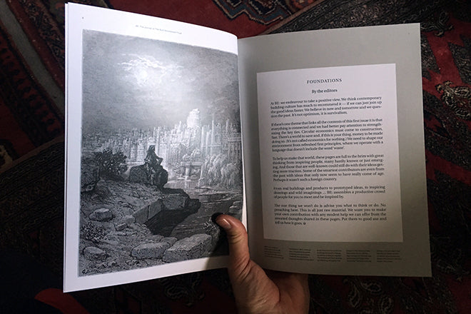
I think the editors’ letter at the start says much about our contemplative approach. This is not a shouty experience. The picture, dug out by Paul, is from Doré’s illustrations of a kind of London, which weave documentary, manifesto and fantasy. Kind of our approach.
What are you finding most frustrating about your work this week?
I am usually, daily, underwhelmed with my performance… I don’t get done quite what I set out to do. This week has the added nuisance of Easter holidays, which means lots of people are slow to answer my emails, etc. Of course, if I was on holiday I would feel differently.
What’s going to be the highlight of this week for you?
Perhaps going to an exhibition with my daughter, who is back for a few days. Highlights are hard to predict though: last week, I clocked up the deep pleasure of seeing Fassbinder’s Fear Eats The Soul, a great movie from the 1970s that is so relevant today. It only happened because we failed to get into the theatre. Highlights often come from surprises.
What will you be doing after this chat?
Not tidying my desk. Getting an americano. Then wondering what we need to work out around an art installation we want to create to explore the 24-hour city, the culture of night time. I am a wee bit concerned there could be a health risk in the material we plan to use. It’s certainly more risky than putting print on paper. Oh, I need to check out our list of newsstands and how they are doing.
buildingcentre.co.uk/bejournal


