

Lindsay Ballant, The Baffler
This week we're at work with Lindsay Ballant, freelance graphic designer and art director of political quarterly The Baffler. Founded in 1988, the satirical, left-leaning title went on to inspire a host of new leftist publications in the states including Jacobin, n+1 and Dissent. This year, Eddie Opera’s team at Pentagram has been behind its new redesign, which sees a move away from ornamental visuals steeped in the history of titles like Punch towards a minimal look much more on par with the newer magazines that The Baffler first informed.
As well as art directing the quarterly, Lindsay writes (she’s currently penning a piece on the design and visual messaging of the 2016 elections), she has on online store of cause-driven buttons and pencils, and she teaches graphic design at Maryland Institute College of Art (MICA). We catch up with Lindsay as she starts work on The Baffler’s next issue.
How was your weekend?
It was pretty solid. I made a few meals at home, read some longer articles, went to a march here in D.C. in support of the ACA (Obamacare), and did some work.
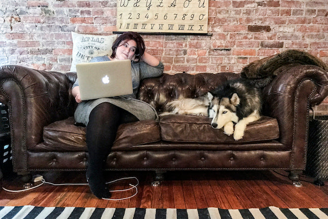
Tell us about your journey to work.
After spending nearly 12 years working almost exclusively in house and/or at full-time positions, I now work from home for the majority of the time and I love it so, so much. So my ‘journey’ usually begins with lying in bed reading news articles I cull from Twitter or bookmarked the night before, then walking my dog Luna for about 40-60 minutes, then making quick breakfast and a pot of tea and having it with my boyfriend at the kitchen table while reading more news or doing some simple email responding, then going to the study or home office (we use the master bedroom of our two bedroom apartment for now) to work.
It’s everything I dreamed of while I was in an office for years eating some yogurt parfait and sipping on coffee from a disposable cup (that likely dripped while en route) while staring at my inbox. Homeiness and comfort are my new pillars.

Describe the state of your desk.
Here’s a fancy cleaned-for-press pictures!

I keep a few tokens of encouragement/inspiration around: at the base of my screen I have a patch from Best Made Co, the company my first boss started, a Baltimore Orioles patch of my father’s from the late 70’s/early 80’s (my father and I bonded a lot over baseball and this was our team), some Bernie “Birdie” Sanders stickers inspired by this moment, my initials in acrylic 3-D printed form as a gift from Adam Wahler of A2A graphics, and my ‘I Have Seen the Future’ pin, which is a replica of the one that was given out at the 1939 World’s Fair in Queens, which my grandmother went to.

Which magazine do you first remember?
The magazine I really first connected with was Seventeen magazine. It was projection on my part, and Seventeen was the vehicle. And the more I‘ve thought about Seventeen’s personal impact on me in regards to its function, especially after I found myself working in editorial for so long, the more I’ve thought about how I view magazines as an extension of one’s personality or lifestyle.
Think about the way magazines and publications are often prominently displayed in interiors, placed on coffee tables, instagrammed with lattes, used as style accessories (even the non-lifestyle titles). It’s a means of classification, self-identification and signaling, like any other brand. I have the self-awareness to know that I do this myself.
Do we identify ourselves as a New Yorker reader or a Monocle reader or a Kinfolk reader? They are, of course, supposed to be read, but how many of us keep them around without actually reading them. Which is all to say, I wanted to aspire to live in the world Seventeen presented to me.

The previous cover design, with serif logo
Tell me about how you worked with the Eddie Opera team at Pentagram to visually communicate The Baffler’s new editorial vision?
To be honest there wasn’t much overlap - I attended one meeting with their group and The Baffler staff in regards to a brainstorm of the website redesign, but the branding and print redesign was already completed by then. I received a brand guide of aesthetic formalities and some templates and was on my way.
I was asking for a more philosophical framework with which to start from, and much of my guidance came from discussions with Baffler staff themselves about the redesign process, what their intentions were, what they wanted to change from the old, and by looking at old issues of The Baffler (which dates back to 1988) that I can only describe as a zine-like antidote to The New Yorker. So I was able to piece together an idea from there. I will say that after looking at those old issues the intentions of the redesign, especially in regards to the anti-ornamental, the simplicity, and use of different type styles to signify each kind of story (salvo, opinion, fiction, poem, etc), became more clear to me.

The current cover with redesigned logo
Pentagram’s redesign sought to make sure that The Baffler looks like a magazine that both a left or right leaning individual could pick up. Why?
I found what Pentagram discovered with its field research really fascinating - that sans-serifs are viewed as more left-leaning and serifs are viewed as more right-leaning. Tradition vs. modernity perhaps?
In any case, my view of it is I don’t put as much emphasis on whether the cover or form entices someone from either side of the political spectrum. I think the modernity of the new identity and the unique quality of the masthead running off the corner as they’ve designed, the lack of any headlines on the cover, and the legacy of interpretive cover art is, by nature, more left-leaning, in that it isn’t literal and is very non-conformist.
Furthermore, The Baffler’s founder, Thomas Frank, is widely known as a left-leaning historian, journalist, and cultural critic. It’s true that he’s critiqued both the right and left political spectrum, but he’s always critiqued the left from an even further left vantage point, and by extension, The Baffler has, from my observations, embodied those same qualities. If anything, we’re trying to differentiate ourselves from other leftist publications with more irreverence and wit in our approach to diffuse some of the gravity/outrage many of the stories will leave you feeling. We throw some proverbial spitballs at the mainsteam, sure. But to me The Baffler lets its Leftist freak flag fly proudly, and doubling down on that persona further solidifies its place within the very overcrowded media landscape.

The political climate in the USA right now is having a huge effect on the kind of editorial illustrations being commissioned by magazines. What illustration have you recently commissioned at The Baffler that you have found especially politically effective?
One of my favourite illustrations from the redesign issue which we put out last December was a portrait of Hillary Clinton (above) by London-based illustrator Sarah King to accompany a piece by Yasmin Nair about Clinton’s brand of feminism, which she argues is an elite one obsessed with a more ‘Lean In’, empire-building approach instead of the kind of grassroots activism embodied in the 60’s.
It views the struggle through class divisions and points out the ways in which rights have advanced for some but not others. The inspired-looking portrait is made up of quotes Mrs. Clinton used when articulating her own vacillating positions on some social rights, such as “When I was ready to say what I said I said it” and “You’re constantly reevaluating where you stand” (on supporting gay marriage), “It was a defensive action” and “I’m not in anyway excusing them; I’m explaining them” (on her support of the Defence of Marriage Act). To me this embodies Clinton’s role perfectly - at first glance, a stately aspirational portrait is actually made up of a bunch of tedious rationalisations.
What are you finding most frustrating about your work this week?
Well it’s the same issue I have nearly every week - the fact that I have to do so many small and medium-sized things for completely unrelated projects!
What’s going to be the highlight of this week for you?
Definitely the podcast artwork for The Baffler's new podcast - the name they’ve come up with is ‘Whale Vomit’!
What will you be doing after this chat?
It’s probably time to give Luna a walk.