

MacGuffin #10
Dutch design and crafts magazine MacGuffin has been thrilling us with ‘backstage information about the life of things’ for ten issues now, yet it still feels as fresh as ever.
This is in part because, as we wrote on its launch in 2015, ‘the magazine isn’t interested in things that are iconic, but rather in the mysterious, unexpected things that set a story in motion’. Each issue takes the simplest everyday thing and uses it as a starting point for fabulous stories.

‘When we had to choose the theme for our anniversary issue we thought of the rather festive object, The Bottle,’ explains co-founder Ernst Van der Hoeven, who together with Kirsten Algera and graphic designer Sandra Kassenaar form the core team of the magazine.
‘The biggest challenge for a themed magazine like MacGuffin is always to find the right media partners. When deciding on the themes of upcoming issues we—although in second instance—also take the advertorial possibilities of media sponsorship in consideration.
‘Like when working on issue four, The Sink, we thought: posh brands of designers kitchens would be easy to convince to advertise in a smartly crafted magazine totally dedicated on sinks… but it never worked as we really hoped for. Somehow we always seem to miss the momentum, or maybe not talking to the right people at the right time?
‘Anyhow, since we are secretly big fans of Aesop, when we chose The Bottle as the theme for our anniversary issue we hoped we could reserve some pages for their advertising in MacGuffin.
‘But how best to lure them to hop on the MacGuffin boat? We thought it might help to to write an article about the iconic Aesop bottle and sent the article to them. And so we did, but they never responded on the text we commissioned.
‘Never mind. We very much love the Aesop confession of Liv Siddall. So true to our heart!’

Over to Liv…
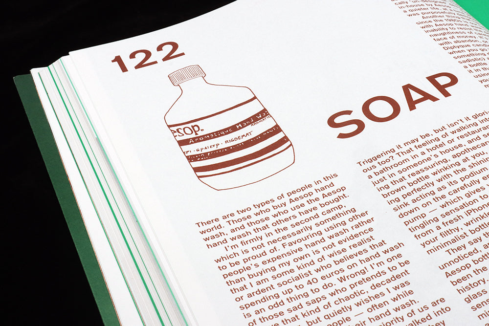
There are two types of people in this world. Those who buy Aesop hand wash, and those who use the Aesop hand wash that others have bought.
I’m firmly in the second camp, which is not necessarily something to be proud of. Favouring using other people’s expensive hand wash rather than buying my own is not evidence that I am some kind of wise realist or ardent socialist who believes that spending up to 40 euros on hand wash is an odd thing to do. Wrong! I’m one of those sad saps who pretends to be above that kind of chaotic, decadent behaviour, but quietly wishes I was one of those people – often while helping myself to their hand wash.
And I imagine the majority of us are the same. Many of us have walked into a friend’s bathroom to discover they have somehow become a millionaire overnight and have purchased a bottle of ‘Resurrection Aromatique Hand Wash’ to A: keep their hands clean and B: make their guests start questioning their earnings (and their own). Many of us have stood in said friend’s bathroom and helped ourselves generously (if you secretly hate them) or modestly (if you respect them) to their Aesop hand wash, while casting your mind back to the hateful, dust-flecked bar of Dove in your own toilet at home.
Triggering it may be, but isn’t it glorious too? That feeling of walking into a bathroom in a hotel or restaurant, or just in someone’s house, and seeing that reassuring, apothecary-style brown bottle winking at you, contrasting perfectly with the shining, spotless sink acting as its podium. As you press down on the carefully engineered pump – which gives you a similar tingling sensation to removing the lid from a fresh iPhone box – and bring your filthy, wrinkled hands towards the minimalist bottle you think: ‘Wow!’
They say the best design goes unnoticed, and this is half true of the Aesop bottle. If anything, it’s probably been the most ‘noticed’ soap bottle in history. Its particularly dark-mahogany glass apothecary bottle, whose no-nonsense aesthetics embody the crafty minimalism of the 2000s, has been aped all over the world by imitators, yet no one can match its curious appeal.
Interestingly, the utilitarian design of the bottle and the serene, minimalist label have not changed much since the brand launched in 1987. Now, to see toiletries packaged with a distinct we’re-ripping-off-Aesop vibe is pretty commonplace, but it was a different story in 1987. This was a time where the middle classes insisted on serving food on square, red plates or covering and furnishing an entire living room in different types of chintz. A brand bringing out extraordinarily expensive toiletries that looked like medicine bottles discovered in a derelict monastery or flasks found in a war-time dugout was actually quite radical. Their dramatically ‘un-designed’ design – created in-house by Aesop – suggested living a quieter life, at a time when everything was purposefully designed to be loud.
Read the entire text by Liv Sidall in MacGuffin #10, The Bottle