MacGuffin #5
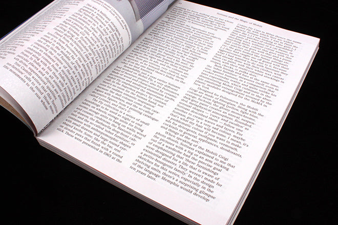
This week’s Page 23 consists of a page of text. Like our recent review of Anxy, it’s a reminder that magazines must read well in addition to looking great.
MacGuffin is a long-standing favourite here at magCulture, and their fifth issue is as strong as ever. Using The Cabinet as its featured ‘thing’, the issue is as visually inventive and tangential as ever. It’s always a beautiful magazine.
Mathijs Labadie photographs a series of stunning examples of marquetry, presented on high-gloss paper, and Johanes Schawrtz offers a series of shots from inside an anonymous self storage space. We travel the world via seven modernist cabinets courtesy of Adam Stech, and take a tour of cube obsessive William Graatsma’s Maastricht house.
Those are just a few of the visual treats, scattered through the issue. But MacGuffin is a magazine to be read too, as its double win (best art direction and best editor) at last year’s Stack Awards showed. The research that goes into each issue shines through every article, it’s one of very few magazines where everything is worth a read.
It is also easy to read – Page 23 falls halfway through a piece about Ettore Sottsass’s pre-Memphis era series of ‘Superbox’ cabinets, and the page is a typically honest MacGuffin page of content: there are two columns of text, a running head and a page number. All in black, with nothing to interrupt or make a noisy appeal/distraction to the reader.
It is a confident page, relying on the magazine’s slightly quirky Churchward Newstype font to express identity. It seems a simple thing to achieve, but is anything but.


