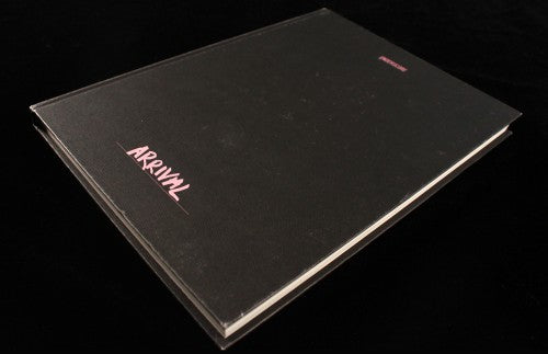
Magazine of the Week: Underscore #5

We’ve covered Underscore before, but after a two-year break it’s great to see it back in print; and, coming all the way from Singapore, it satisfies a desire to see more magazines from beyond Europe/US. Following on from 2013’s ‘Flight’ issue, this time the theme is ‘Arrival’, reflecting the new beginning for the magazine.

Not that the issue is such a great shift from the earlier ones. The one obvious change is the new cloth-bound hardback cover, making what was always a bookish publication more so. I generally like such twists, but I miss the colour of the previous issues (see no3).
Otherwise, though, it’s business as usual, the 160 pages divided into four chapters that continue numerically from the last issue (so we have chapters 21–24 here). Each one is almost a mini-magazine in its own right, opening with a double-page image (above) and carrying various stories including regular ‘Conversations’ and ‘Neighbourhoods’ interspersed with more general pieces.

Though coming from the far east, the outlook is global – Berlin, above – and essentially concerns the interests of the editorial team. We meet Japanese designers (below), hear about Greenpoint, Brooklyn and visit a Fair Isle knitwear manufacturer.

The design is clear, simple and monochrome, with photography seamlessly moving from broad landscapes to retail interiors, via artworks and objects.

Background tints are used subtly for emphasis – an interview with The Gentlewoman editor Penny Martin sits on a pale blue-green typical of that magazine’s colour palette (and the accompanying portrait of Penny has a white border like her magazine’s covers).

Underscore is a magazine that can sound very similar to other titles when outlined in a review like this; but when seen as a whole it has a unique approach to its content and presentation, a highly satisfying completeness and simplicity that belies the amount of work that has gone into the pages.
There are plenty of independent lifestyle magazine out there covering the same locations, brands and cultural concerns, wrapping them up in a default monochrome modernism, but Underscore is different. The scrawled text on the image opening Thomas Mader’s piece about ready-mades asks the question ‘Too pretty?’, to which the answer for many of this type of magazine is a simple ‘Yes’. Not so Underscore; it is more than just pretty.

One final thing; as ever, the issue comes with an accompanying soundtrack, with individual tracks assigned to each story (above). Nice!


