

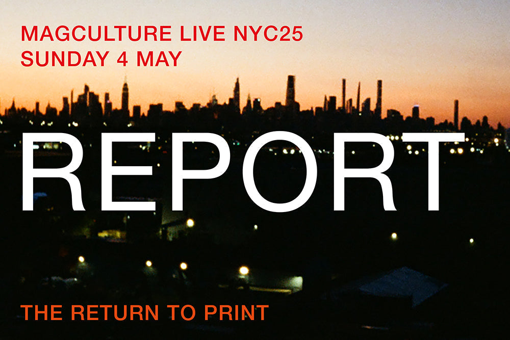
magCulture Live NYC25 wrap-up
The sixth New York edition of magCulture live took place in Brooklyn on Sunday 4 May, featuring speakers from 10 magazines presenting their creative work in the context of the theme ‘The Return to Print.’
This was our fourth trip to New York since Covid, and while we follow a familiar schedule each year, it continues to get busier and busier. On the Monday we set up our pop-up magazine shop with Vitsoe in the West Village, and the pop-up opens on Tuesday for the rest of the week, showcasing around 60 favourites from our London Shop. We also programme free lunchtimes talks and co-host a party at the Vitsoe space, before closing up on Saturday. And the following day sees magCulture Live itself take place.
Along the way we catch up with friends, make new friends, and generally take the temperature of the city. And right now print is hot, with a growing number of brilliant editorial projects cutting through the digital haze. Like in London, design students remain entranced by magazine-making, so it was a pleasure to offer a bunch of free Live tickets to visual communications students from Parsons. The pop-up and all our events were busier than ever—thank you to everybody that joined in!
Videos of our free lunchtime talks at Vitsoe are available here:
Matt Willey (Inque)
Recorded Thursday 1 May
Aliza Abarbanel (Cake Zine)
& Erik Hayden (Lyrics as Poetry)
Recorded Friday 2 May

magCulture Live NYC25
Our ‘Return to Print’ theme arose from the observation that multiple areas of publishing are rediscovering the analogue form. Even as the big, mainstream publishers have receded further from their print origins, more and more small start-ups have launched into print. We’ve been talking about this for years, but others are noticing now: there’s been a clear rise in digital platforms, brands and other organisations pivoting to print—hence ‘The Return to Print,’ a phrase that assumes that print never went away. Print isn’t returning, it’s the users—publishers and readers— who are returning to it.


Editor-in-chief Lindsay Peoples delivered an energetic and passionate overview of the platform, and explained how The Cut appeared in print first as back-to-back editions with copies of New York magazine. This whetted the teams appetite—40 pages wasn’t enough space—and so the first 80-page standalone issue appeared last year. If we didn’t quite get to hear precise reasons why the shift to print happened, it was clear Lindsay was right behind the addition, bringing here print experience to good use. Judging by the celebrities who signed up for it and the advertising it attracted there was a clear demand to extend the brand into print.

One of the challenges The Cut in print faced was getting in front of readers, so with the first issue they opened a pop-up café in downtown Manhattan, offering copies alongside branded coffees and free New York subscriptions. That first issue led with Chloe Sevigny, and as we noted at the time, combined its parent magazine’s design nouse with a sense of luxury brand calm. Issue two built on that success, with a more contemporary lineup of celebs. Lindsay confirmed issue three for this autumn.

It’s probably not often that The Cut sits next to New York Review of Architecture, but we love these combinations. Publisher Nicolas Kemper introduced himself and editor Samuel Medina, setting the tone for their presentation with a little theatre (above). ‘Before we start, all of your tote bags have our current issue in it, and it’s best to talk about it if you can actually see the thing in the flesh. So take out the issue, because we’re goofy, and I’m going to take a picture of everyone reading it. Hold the issue in front of you. Yeah, let’s do it. Okay, yes. Hold it up. Hold it up…’

They told the story of their magazine, mixing the earnest with goof, just as they do in print: starting with its 2019 launch from a Chinatown basement, to their belief in print—describing NYRA as a print-only publication, explaining, ‘we say, welcome to the future. Nevertheless, we have some antique sentiments and a weak nostalgia for a bygone medium, so we just launched an Instagram account…’

The magazine went through several earlier iterations before arriving at its glorious yellow tabloid form in 2022. The two showed some inspirations (above) and talked through the process of defining what they do. Their magazine is a case study in restraint: take three or four simple parameters and work to them. They discussed printer relationships and had a nice line in self-depreciation—it’s always good to see mistakes featured in a deck, and their story about an issue that got printed the wrong size was a useful reminder of the physical nature or print production.

The printed issue (above left) came out short; somehow the height, and not the width, was reduced by about 10%, squeezing all the content in the process. The following issue they marked the additional 10% with a red line, and promoted the issue as having 10% more area.
One of the reason for producing your own magazine is for it be a magazine on your own terms, and NYRA is just that. Yes the team make light of the process, as above, but that belies the deeper intent behind the magazine, which also came across in the talk.
They emphasised community, meaning readers and other supporters of course—they’ve had the financial support of architectural organisations—but also treating contributors properly. They quickly established an agreement with the Freelenacer’s Union, so their contributors are paid properly, and have also set the company up as a worker’s co-operative.

We also heard about the origins of their rat mascot, NYRAT, that appears throughout the magazine. It’s been through a few versions, but originated as a drawing accompanying a piece about US protest symbol Scabby the Rat—large inflatable rats used to call out businesses with poor worker relations.

The rat drawings first surfaced in an earlier version of the mag. With the redesign they have become a central part of the magazine’s visual identity, along with line drawings in general (there is never photography.) Now a tabloid, two-colour publication using two typefaces—those tight parameters—it’s loved/reviled in equal parts for the use of backslanted italics, not only for its logo but throughout all text. The yellow and black pages are immediately recognisable, and the overall package is the ideal context for the serious, longform writing they publish.
If the NYRA team were horrified by their issue that was shrunk by the printer, the next speaker’s magazine would terrify them. Every issue of Viscose Journal changes size and shape, the better to reflect its changing themes.

Its founder, Danish art historian Jeppe Ugelvig, grew up fascinated by magazines, ‘I think I always understood print as something that was really precious,’ he told our audience, ‘I had a developed sense of its collectability, that magazines was something that you kept and that you put them on your walls or in your shelves. You showed them to people. You had first issues. You had rare issues.’

Setting out to be a fashion editor, Jeppe found himself surrounded by the prevailing death of print narrative, and forced to create content for the new generation of digital platforms spun out of fashion mags. He left fashion for the art world, but gradually felt the pull of print again, the experiemental magazine Made in the USA (above) attracting him back to the form. ‘Could one do a sort of a subversive take on fashion magazines?’ he asked himself, ‘Especially because in my sojourn into art history, I had been exposed to the world of artists’ magazines, which has a parallel, but very, very different history to commercial fashion publishing.’ He was thinking about publications like Aspen Journal, the sixties US title that consisted of objects and documents presented in a box.

The result was Viscose Journal, launched in 2021. ‘We called ourselves a journal for fashion criticism, flipping that image-text logic on its head and trying to prioritize text rather than images.’ The first issue was themed ‘Style’ and came packaged as a mock crocodile skin handbag (above).

In developing Viscose, Jeppe cleverly turned a problem—a failure of imagination in fashion publishing—into a new direction for the printed fashion magazine, linking a love of print with his new experience of art publishing. The seven issues to date of Viscose have each used different physical formats, getting bolder issue by issue as momentum and belief built—the last two, Text and Scent, have been particularly strong, experimenting with different papers and formats.

Jeppe was a really engaging and intelligent speaker, going into real depth about the origins of his magazine and ending with a reflection about the response to his publication, ‘The people that really responded to our call were fashion students and young researchers, who, in the age of the algorithm, are so starved of precious things.’ No longer! Watch out for issue eight of Viscose Journal, due later this year, with the exciting theme of Sound.

We stayed with fashion for the next speaker. Steff Yotka is the Global editorial director at i-D magazine, one of the team behind the longstanding magazine’s recent return to print. It first appeared in 1980 as more of a zine than the glossy magazine it later became. Steff paid attention to the magazine’s roots, namechecking founder Terry Jones (above, in classic i-D wink mode) and noting, ‘One of the things that resonated with us as we thought about how to bring such an iconic magazine into 2025 was the dashed-offness of the original i-Ds.’

In latter years, i-D became slicker and more luxury brand-filled, but as Steff explained, the aim now is to take it back to its bright, unpretentious roots. ‘The team and I looked at the graphic design language of the early copies: there’s not a centimeter of wasted space in the magazines, there are jokes printed in the gutter, little diagrams, you're supposed to cut things out, the type is going in all different directions.’ i-D was to be more i-D again. ‘We were really compelled by this slightly chaotic approach to designing a magazine, because, in a way, it feels very internet.’

The cover strategy for the relaunch issue also looked back to the magazine’s origins. Steff noted how many people started their career on the mag, both behind the camera—Edward Enninful, Nick Knight—and in front of it. Stars like Sade and Madonna’s first covers were i-D covers. For the relaunch issue they appealed for an unknown cover star to lead the magazine, settling on Enza Khoury, an 18-year old trans high school student and aspiring actress from Ohio (there were also two limited edition covers featuring Naomi Campbell and FKA Twigs). Enza subsequently went on tour with the mag, promoting the issue at Paris Fashion Week.

Steff ended with a look at the website, pointing out a new series of micro-sites they were experimenting with, ‘It was really important to find ways to let the visuals of the print magazine inform how our website works, not necessarily the other way around,’ she explained.

Along the way we saw spreads from the new magazine too, of course, showcasing the contemporary take on Terry Jones’s design chaos. What did Terry make of the new issue? ‘We mailed the magazine to his house in the countryside, and he sent an email that was like, very Terry. He was like, huh, actually, a good magazine!’

After a brief break, we reconvened for the second half of the event, starting with the now traditional indie quick-fire session. Five indie mags—speakers above— presented their projects back to back, starting with Annabel Brady-Brown, editor of The Metrograph, a new film magazine.
Describing the general state of film publishing, she noted the closure of many longstanding titles—‘You can imagine some of the conversations that me and my team were having with people when we started explaining that we were indeed starting a new print film publication, and some of the sort of surprised, incredulous looks that we received!’ Yet the first issue of The Metrograph sold out, with the second on its way now.

In this respect it matches the success of its publisher, the eponymous downtown reparatory cinema. Anabel explained how the cinema holds regular Q&A events with film makers, directors and actors, how they always try to project analogue prints rather than digital versions, and have a restaurant on site. They also distribute printed programmes. ‘People love coming but then they love taking a little bit home with them. It’s only a couple of extra steps to launching a print magazine, it doesn't feel quite so crazy!’

She described the reseaerch that went into the magazine, particularly in terms of design (they worked with Matt Willey). ‘When we were throwing around ideas, trying to work out what on earth we were doing, we looked for design references to a lot of old film magazines, especially from the sixties and seventies, and from all around the world.’
Explaining the structure of The Metrograph, she shared a lovely story about the detail the magazine gets involved in—the detail that helps you understand the richness that goes into making a film. ‘We like to get in the room with the craftsmen, to learn a bit about the process and how films are actually made. We have one coming up in our next issue with Ben Burtt, who’s the sound designer for things like ‘Star Wars’, which sounds a little dry on surface. But he basically invented how the light sabre hums.’
The magazine seeks to capture the communal pleasure of cinema and help redefine what film and film-going means in contemporary culture—the common thread from their version of cinema to the print mag is the analogue.

Next up was another magazine representing an arts venue, in this case Brooklyn’s Pioneer Works. Andrew LeClair and Daniel Kent design Broadcast, a magazine they introduced as ‘starting initially as a website that was very inspired by print, and has now turned into a printed magazine that is taking cues from the website.’

A similar cross pollination between print and digital was noted by other speakers over the day, but Broadcast takes it further. The two designers explained how the website typography was inspired by print (specifically old type specimans like that above—‘There was something about seeing all the typefaces together at the same time that resonated with us’) to the extent that when the cursor crossed the text it would blur slightly, mimicing ink spreading in the printing process. When they launched the print magazine, they further adapted the print-referencing designs for real print; they added an outline stroke to all the type to make it look a little overprinted and blurry, exaggerating the print effect.

The finished magazine design is a complex mix of references to historical publishing technologies like Letraset and state of the art printing techniques. To make this work, they applied clear parameters, like NYRA, to tie the many disparate elements together, ‘We limited the colour palette to three colours, and mixed them using opaque white ink rather than transparent in offset printing, so the colors kind of stand out against the tone background.’ This also helped add coherence to images from multiple sources.

‘Hi everyone. My name is Daniela, and I run an independent art magazine called Superstars Only,’ announced next speaker Daniele Rodriguez. She’s produced five issues of her mag, a project that began as a personal, diaristic project, a vehicle to publish her boyfriend Adrian's writing for school.

Her talk was just as personal, a clear and direct exposition of a publishing project that has gradually evolved issue by issue. Punctuated with big bold capitalized headlines in saturated acid colours, the presentation was almost more i-D than Steff’s (it was intriguing to note the two talking later in the day.)

‘The second issue was called Puppy Love, because we were excited to be doing do it again, and it was very DIY. We printed each copy ourselves at the Design Lab at my school.’
By issue three, Daniele had left school and was working at an art gallery. ‘It was my first time experiencing the art world from the inside, and I felt really strange about the whole thing. I didn't really like what I was experiencing, I wanted to put something out there that satirised that experience.’

The resulting issue helped define Superstars Only, with spreads like this (above) mocking the art world.
By issue four, Escape, Daniele had left the art gallery, and facing challenges around what to do next. ‘I was playing Hogwarts Legacy on the PlayStation, and started to watch ‘Game of Thrones’ for the first time, and got really into these fantastical worlds. I found myself getting lost in them and addicted to them.’ She discovered virtual world Second Life and set her aim on its users, ‘I was really determined to talk to as many people as I possibly could in this world and ask them each five questions.’ She was chasing stories rather than waiting for them to come to her.
‘I love magazines. My favorite thing about them is the front cover. I would get really excited when the latest issue of my favorite magazine would come out. I would go out to the store and buy it, and I wouldn't want to put it in my bag. I would want to wear it with me, take it out for a walk.’

This led to the fabulous fifth issue of Superstars Only, the Bagazine issue; Daniele added straps to her magazine so it could be worn (above).

That move was backed up inside, the opening spreads featured bag ads from fashion mags, photographed in mundane settings (above), mocking the common opening runs of ads in magazines, plus a series of interviews with people on the subway discussing the content of their bags (below).

Daniele’s magazine and her talk was a strong reminder that making your own magazine should be fun. You don’t have to heed the traditions.
Fun was also at the heart of the next presentation, as we heard from Maria Dimitrova, editor of AFM magazine (A Fucking Magazine, or A Feeld Magazine.) Like Anabel before, Maria had already been publishing her own magazine Mal, a journal about sexuality built on essays, fiction and poetry. Supported by Feeld, the dating app for ‘open-minded individuals,’ Mal lasted five issues, but became a starting point for Feeld to launch their own magazine, AFM.
‘Very early on, we drew a line between what Feeld as a brand naturally stood for, and how AFM would step out of that umbrella,’ Maria explained, highlighting one of the issues when you’re creating editorial for a brand. As well as commissioning work from established writers, they also used the Feeld app to ask users to contribute poems. Other magazine-brand connections came up by chance; it turned out that cover star Juliana Huxtable was already a member of Feeld, but this was only discovered during the interview with the DJ/artist.

In her wide-ranging talk, Maria introduced the many contributors who wrote for the first issue of AFM, emphasising her desire to commission words from surprising people, including in issue one, a coming-of-age biographical piece from filmmaker James Ivory, a story that stands out from others about celibacy, bisexuality and making your own latex.
She also introduced the magazine logo and colour palette, explaining their attempts to convey Feeld’s digital identity in print via transparency and layering and the bold use of color; AFM was one of the most graphically complex magazines we saw all day, designed to bring together many types of writing and image.

If the magazine was designed to help Feeld reach beyond their digital presence to the real world, this was taken further for the launch of issue one, when they set up a pop-up newsstand in homage to New York’s street kiosks and gave out condoms, scratchcards, postcards and tote bags alongside copies of the magazine.
It’ll be interesting to see what happens next with AFM, as Merel van den Berg (previously art director at The Gentlewoman) has just joined the team. Magazines can’t stand still!

The final speaker in the indie quickfire session opened with the perfectly fair point that as his magazine was produced through Condé Nast, it really wasn’t indie. Yet it definitely aligns itself with the indie world in design and strategy.
Jeremy D Larson opened with an interesting take on the power of print; we’ve heard so often about people growing up with only print magazines as their lifeline, but Jeremy described growing up in a very small town in Wisconsin, loving music, and being denied any print. He knew their names—Spin, Rolling Stone, Melody Maker, Smash Hits—but magazines were unavailable to him. ‘All I had was the internet, a dial up connection, and somebody who told me about pitchfork.com,’ he explained, ‘and that was to me, like what a magazine was.’

Today, Jeremy is Deputy Director at Pitchfork, and has edited their reviews section for over eight years. He spoke eloquently about contenporary music and print, ‘Print, to me, is like vinyl. It will never be kind of the main economic driver that it once was, but it will be increasingly the more powerful conduit to connect to art and to connect to music.’
He recounted Pitchfork’s history of print, citing the 2014-16 series of quarterly zines (ironically they came to an end as Condé Nast bought the then independent Pitchfork business). Earlier this year they devised a new print strategy, buidling on their digital ‘Cover Story’ strand; ‘We needed to do it in a very sort of scrappy way, because it’s very hard to to ask for money at a large corporation sometimes. So we made a very scrappy, small, very small zine of our first Cover Story this year, Swedish rapper Bladee.’

Each zine features only one story, a longform interview accompanied by a commissioned photo shoot, and deliberately rough and raw—the image above is the front cover of the first zine. It’s anonymous (there’s a Pitchfork logo on the back cover) and appeals directly to fans of the featured individual. The first run of 300 sold out quicky, they reprinted, and held a launch party in NY—a key part of any new magazine today, it seems. Jeremy clearly got a lot out of the project, enjoying breaking out of the standard music marketing experience.

‘Today, big artists give you so much more access than ever really. But we were looking for artists who really are not very tell-all, who don’t give their whole life story on social media. And Bladee is one who is very private, and he gave us access.’ Megan Garvey wrote the interview, Jason Nocito tooks the pictures and Chris Panniker designed the ziine. ‘My main forte is just writing and editing, but making this zine has been a really wonderful experience.’ They’ve since published a second zine, featuring Turnstile.
Is the Pitchfork zine indie? Does it matter? Of the five magazine presented in this quickfire session, perhaps Superstars Only is the one truly independent publication, but to me it’s great seeing an arts venue and a dating app harness print, and learning from the new generation of indies. It’s also wonderful to have a Condé Nast team subverting their own print history with a consciously low-key, non-glossy zine.

We ended the day with Richard Turley reprising the talk he delivered at magCulture LIve LDN last year. As I wrote then, Richard thrives on chaos, and this talk leverages that. As a video of his magazine work to date plays, he delivers a stream of consciousness overview combining facts, reflections and anecdotes. At once brilliant and frustrating—at times he can’t complete a direction he’s set off on—it’s electrifying watching somebody with such a collection of brilliant editorial work respond to it in real time rather than deliver a carefully mediated set of notes.

From university projects, via The Guardian, to New York and Bloomberg Businessweek, he established his early career, before glossing over his departure from publishing (he spent a few years at MTV and Weiden and Kennedy).

Thankfully Richard returned to print, to bring us multiple editorial projects. We need people like him, willing to try things (a magazine designed purely in Word? A new zine in broadsheet newspaper format? a parody fashion magazine 400+ pages thick?)

Confident enough now to publish his own projects alongside larger commerical jobs—on the one hand the afore-mentioned broadsheet zine Civilization, on the other a redesign of Rolling Stone—he is a unique combination of creative magazine-maker and brilliant observer of the industry. Good Trouble, Heavy Traffic, Mushpit, Interview, Offal, Nuts… brilliant designs all, but each one also says something about magazines and the magazine industry.

And yet Richard still quotes The Guardian creative director Mark Porter, who tutored him ‘If you can see the design, you’ve failed.’ He continues to follow that advice, and while his work is thick with design, it’s always at the service of the story and/or idea, and he doesn’t stick to a style.

He creates parameters—much of the actual design detail is quite classical—and encourages his collaborators to push against them. He plays down the complexities of this, but the thinking underlying every move he makes is visible as soon as you look.

With that, magCulture Live NYC25 ended; another day of shared magazine-love and inspiration to remins us all why we do this! A little last-minute magazine shopping at the magCulture pop-up, a few beers out in the Spring sunshine overlooking the Manhattan skyline, then home.

Huge thanks to our speakers for their time and work making the day such a rich experience, to all our partners (see below) and to the audience. We hope we’ll see you all for magCulture Live NYC26.

A video of magCulture Live NYC25 is available on Vimeo on Demand here.