

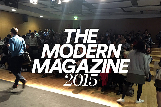
ModMag15: pm
2.00pm
We're back! Welcome to the pm instalment of live notes from The Modern Magazine conference -- we've just gone to lunch and now we're back for the last half of the day. We start off with three talks that are slightly more focused on art direction and design.
Bertie and Char, Mushpit
'From zine to glossy to…'

Mushpit very much started out as a zine and now looks like more of a glossy, and they talk about the transition for their presentation. They began the project when they were 21 with student loans, printing the zine in Dalston. At issue 5, the magazine got slightly bigger because they worked with a brand, but the brand wouldn't let them put a woman on the cover with a hairy armpit, and they decided they really didn't like the process of working in this way.

'All the magazines that were targeting us were bull-shit, we don't want to be sold Urban Outfitter sandals. We were really inspired by teen magazines in this way,' they say. They show how they've 'ripped off' magazines like Vogue and Heat, but obviously with a satirical twist (above). 'We also use InDesign as if it was cut-and-paste, so we took the energy of the riot grrl zines but translated it to InDesign. With the photos, we're trying to work out how you can make fashion something less about advertisement, and more politically aware and relevant.'

'Are we London's first anarchic fashion mag?' They ask ironically, 'Maybe...', showing the process of how they went from zine to glossy (above). They went bigger and glossier because they felt the format would be more exciting for photographers, and shops were being funny about taking a small magazine (saying 'it looks like a supplement'). Mostly though, they wanted more space: 'Also, as soon as you put Mushpit online, it just becomes content. The thing that makes it funny is that we've spent all of this time and money (that we don't have). That's a whole part of the joke. That IS the joke.'
2.15pm: Matt Phare, Shortlist
'Creativity in free magazines'

'In 2007, we were just four middle aged men with a dream. The men's market was in decline, but we thought there weren't very many good ones,' begins Matt, adding: 'We wanted strong content, and we wanted to make covers like posters.' For his talk, Matt ran through some of the 'posters' he's worked on.

After creating Shortlist, they made Stylist, a version for the women's market, where the focus was business and creativity. After the Nigella Lawson edition of Stylist, suddenly the ability to do more collaborative issues opened up - such as one with Kylie Minogue and another with Lena Dunham. Matt also discusses the illustrated covers - from a Quentin Blake cover to one drawn by Tracey Emin, and another of Lisa Simpson. Allowing illustrators to change or play with the masthead was a big decision, but they enjoyed the immersive-ness of it. A cover made of stained-glass, and another made out of neon lights are two more examples of their innovative use of covers ('this now hangs in our office,' says Matt of the cover below).

Another thing Matt talks about is when they decided to make an issue in 24-hours. They initially didn't have enough money for it, but then they heard that Ford Fiesta were doing a project about driving for 24-hours. They spoke to Ford, who ended up sponsoring the issue. The cover of the issue ended up being one of the staff members asleep on the office next to the statement: 'We made this magazine in 24 hours and now we're tided tierd tired...'
'We work on 10 covers in one go,' says Matt, 'so if something falls out, there's always something else to bump in. That allows us to be really creative too: we get enough time. The fact that we're free means we enter a lot of awards because that gives you credibility, so we want strong covers for that. We've won many awards for our covers.'
2.50pm: Charlotte Heal, Kinfolk
'Behind the scenes of a redesign'

Charlotte starts by talking about her own design practise, which fed into her re-design of Kinfolk. She talks about the importance of trust in relationships between photographers, editors and designers working together, which has been crucial to her practise. Subtlety also strings a lot of her projects together and plays an important role in the way she approaches design.
She first cut her teeth at Love magazine, which Charlotte realised quickly was a lot different to book publishing. Having worked at Love and the re-designed Lula, she had the confidence to go into Kinfolk, but the approach for Lula was very different. With Lula, she was told that the vibe was meant to stay the same - whimsical and cute, but Charlotte was streamlining it down.

With Kinfolk, the brief was very different. Before Charlotte, it was calm and 'meek', everything was centralised, and image and text ran next to each other. The idea of 'shaking it up' was daunting because everyone loves Kinfolk, and to rip it up and change it would make a big statement. 'Because I already had an evolved aesthetic, it was just about pushing that, rather than ripping the whole thing up,' says Charlotte.
Kinfolk wanted to look more mature, to extend the voice and content. 'A lot of it did remain the same in term of the paper stock, we liked the cover flap, and a shiny foil wouldn't have felt right. Again, it's that level of trust - thinking "these things are working and these things aren't", and about moving forward without leaving people behind.' The level of trust had to happen quickly, because Charlotte only had three months.
It was decided that the front of the book section should nod to the old aesthetic, but pushed forward, and this helped prevent people from finding it too scary. The colour palette stayed similar, but arrowed captions and smaller images changed the look substantially. 'It's a magazine, it's different from a book, you need to change the pace and it's more playful. Small things hand't been addressed as much before the re-design - subtleties is what I concentrated on.' Overlapping the masthead with the photograph on the cover is one example of the subtleties Charlotte concentrated on: she used these small nods and changes to elevate the design and to create a sense of energy and life.
Another break, and another announcement from Jeremy... London-based mag-a-holics take note.
Next month, Jeremy is going to be opening a magCulture shop in London: 'We've been doing pop-up shops. But now we're going to have big shelves and a till, there is going to be heaps and heaps of magazines. It's going to be the magazine shop I've always wanted to have.'
The location: St John Street in Clerkenwell.

3.00pm: Tea
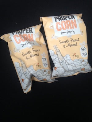
As well as tea, there's also some popcorn courtesy of Proper Corn and biscuits around, and I catch up with some of the audience and speakers to hear their thoughts so far:

Bertie and Char, Mushpit
What's your favourite magazine of all time?
Cheap Date.
What's your favourite magazine today?
Mushpit and Jeremy's book Independence!
What have you enjoyed today so far?
The Gourmand. The Gourmand is amazing and Stylist... So good, had no idea that much work went into it, to do 25 Kylie covers for a weekly magazine is crazy... Good for women too! We also love Jeremy and we love that he's wearing a vodka lime and socialism badge!!!

Harriet, Financial Times
What have you found particularly interesting today?
Rapha's talk. You never hear about a magazine's branding story in that way, people always want to hide the marketing and selling stuff. It's also so beautifully designed. I loved Mushpit too - when I saw it on the Park stand I was so confused, but after hearing them speak I want to get a copy. I'm going to get them for Xmas presents, it's brilliant.
What's your favourite magazine today?
Hello Mr.

Stine, Stack Magazines
What talk did you particularly enjoy?
Mushpit were hilarious. Monocle was brilliant, I knew it was a well functioning business but it made me look at the brand in a different way. It was also interesting to hear about all the parts that went into re-designing Kinfolk.
What's your favourite magazine today?
Flaneur.
And your favourite magazine of all time?
Apartmento, best magazine of all time.

Ross Weston, Gallery Magazine
What have you enjoyed so far and what are you looking forward to?
Looking forward to Scott's talk, enjoyed Charlotte's but they've all been good!
Favourite magazine today?
I've spent £80 on magazines here so I can't say... I do like Kinfolk.
Favourite magazine of all time?
Very tough... Wallpaper definitely made a big difference.
Jese, magCulture
What have you enjoyed so far?
The Rapha talk. It was interesting to hear how design is active in making something commercially viable, and how they've retained such a strong aesthetic at the same time.
What's your favourite magazine today?
Flaneur or the The White Review.
What was your first favourite magazine?
Idea - it's been around for 70 years and is super design geeky.

Angela, advertising art director
What talks have you especially enjoyed today?
Kinfolk, it was so detailed, and I can really relate. Monocle was also very good, he's a good presenter and storyteller.
What's your favourite magazine?
Spoon. Not the one around now... I remember it from when I was studying fashion. There's only imagery, no words. It pushed a boundary and questioned what a magazine is. I like it when magazines disrupt.
I also spoke with David from The Gourmand, but ran out of battery so no picture. Here's what David had to say:
What have you enjoyed so far?
Hearing the different speakers and the very different point of views. There's a balance between magazines that are commercially very viable and also then the opposite. Today we've seen that there is no right or wrong.
What's your favourite magazine today?
The international edition of Zeit magazine.
Thank you to Kelsey Freeman for helping with the Q&As and photographs today!
3.45pm: Scott Dadich, Wired US
'The past, present and future of Wired'
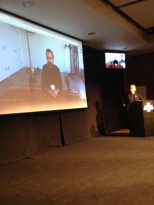
Scott couldn't make it from the US so we're having a google-hang-out with him instead. Jeremy is asking some questions for a Q&A, and we've got Scott projected on the screen.
Scott says that one of his earliest memories of Wired was browsing the magazine section as a student, and seeing a copy in the second year that it existed. The cover story was about the founders of the game Mist - it was neon and yellow, the pages exploded with colour: 'I fell in love with Wired even back then.' At home, there were lots of magazines about, Texas Monthly, the occasional Playboy, Sports Illustrated, People. 'We always had them around the house, it just felt natural to us.'
The first big job Scott had was at Texas Monthly as Associate Art Director, he'd worked at an ad agency before that. Quickly he became the Art Director, and he learnt about journalism during his time working there: 'I learned to edit, to design, to write. That was formative for me.'
He joined Wired in 2006, a period when it was winning a lot of awards in the States and also the UK. He was approached to re-imagine the magazine, and Scott wanted to make it more broad, to make it less arcane. 'We went for everything from music to design to security, and we wove those elements together into a new packaging.' At the time, wired.com was owned by a different company, so Scott only had the magazine to think about. 'It was a moment when we could have a lot of ambition, we had a lot of scope for re-imagining.'
Scott discusses his touch-screen version of Wired. 'We started re-imagining some of the visual language in a tablet experience. We met some friends at Adobe and made the software that became the digital publishing suite. It was a moment of experimentation. We were a little naive I think, we made a lot of assumptions about how people want to consume information.'
Jeremy asks Scott about the fact that he's moved from design to editorial, and how it's been moving between those two boundaries. 'Working at Texas Monthly, there wasn't that boundary, it was a lot more porous, so it's been like that for a while for me. Wired holds a fairly unique position in terms of how it's structured - there's a lot of trust between the different departments. We work in teams - there will be the editor, the writer, the photographer, the digital aspect, the audio one. They get operated on as a team. It's felt natural for me that the boundary between Editor and Art Director was largely a similar role. What's different is the business side, the operations and thinking about paying the rent and everything that goes along with running an organisation made of 180 people.'

Billy Sorrentino steps into the google hang-out: 'We run everything past each other. All the design, across every medium we do.' In reference to how they've changed the online aspect of Wired to reflect the magazine, Billy says: 'We knew that we had to bring the aesthetics to the web, but we didn't think of it in terms of typography. We thought, how do we simplify?'
Do they think it's an anomaly to being making a print magazine given Wired's topic? 'I think print can do things that digital can't do. There's a profound appetite in terms of our readers and audience - people have strong opinions, they care. They might not agree with our decisions, but they have a voice. When you're publishing something that's very long, you don't want to read that on the screen. People are interested in how the world is changing, they want well-told stories, and as long as they're interested in that, people will read print magazines.'
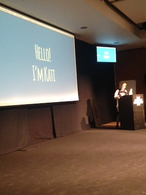
4.30pm: Kati Krause, writer and editor
'What websites must learn from magazines'
The questions that keep Kati up at night: 'What does it mean to be a magazine on the web? What can digital media learn from magazines?' This talk is a follow-up talk to one Kati gave in Munich, she'd just come back from working with Matter - a platform on Medium. They'd hired her to help them work out how to make short magazine-y content for the site.
'When I talk about what digital magazines mean now, I talk about three things: it means mobile (pointing to her phone). The second characteristic is that they're mutli-platform. It's inevitable. Finally, the third is that it's unbundled. These three things go against what a magazine is, it's counter-intuitive. A magazine needs space, you can touch it, it's about this idea of being one bundle, one thing.'
Kati shows some new platforms experimenting with content curating: there's Blendle, there's Snapchat's new news platform, and then there's Pocket. Kati's own manifesto of what digital media can from magazine starts with 'Design'. How can you make something beautiful and readable for such a small screen (the phone)? As a designer you're very limited in what you can do. For Kati, simplicity is the best, or as Kati describes it: 'Focus. A quiet space, a time for immersion. That's what you can apply to mobile if you want to. It means something different than in print, but it doesn't mean you can't use the principle.'
The second point in her theory is 'Voice'. Voice could also mean brand. 'Voice allows you to retain an identity, and therefore reader trust.' Kati highlights Vice, Slate and New York magazine as particularly good at this aspect.
Thirdly, 'community' - as Louis from Alpine Review stressed in his presentation. 'In digital media, community has unfortunately been reduced to comment sections. For blogs, this can work, but for bigger media it can often damage the sense of community.' Kati points out how Bloomberg, The Verge and other big magazines have started to abolish comment sections - 'That's an interesting trend. People feel like it's failed.' For community, Kati site Rookie as one of the best examples of a magazine that creates a sense of community.
Her last point is 'Slowness'. 'That job at Matter that I talked about, I failed. We created a whole bunch of new formats. They were very magazine-y. They were easier to produce than features, but they weren't fast. Slowness in digital media is relative. Publishing something two days after an event is probably too late. That's too slow.' Kati goes on to discuss how the obsession with speed is becoming stressful for people, there's a constant fear-of-missing-out that's unhealthy. 'In digital media, we should emulate magazines, and just slow down a bit. That gives you time for reflection, for responsibility, and to create something with enduring quality.'
5.00pm: Ibrahim Nehme, The Outpost
'Can a magazine change the world?'

The first issue of The Output 'attempted to capture the hopes and dreams of people working in the Middle East at the time. We wanted to use "narratives of possibility" to counter the narratives of impossibility that we're all accustomed to in the media', says Ibrahim.
The latest issue is 'The Possibilities of Our Body' issue. 'We don't talk about our bodies. In a place where our body is very prone to injury, intoxication, lots of bad things, because of the volatile nature of the region, we need to talk about the body, because change starts there. We developed an issue based on the twelve areas of the body, and we chose one object for each system. We worked with a doctor to find out how each system works, and we philosophised this. The digestive system became about renewal for example.'
The issues are themed, but borders have always been an important theme running through all issues of The Outpost - 'There are so many restrictions prohibiting people and ideas. We wanted to imagine a new reality. For one story, we looked up the old railways that used to exist in the Arab world and we laid them out on a map. The story is highly inventive, but for a place where there's so much friction, trauma and issues, imagination becomes your primary tool for imaging a better future and also getting there.'
'Stories can impact the world we live in,' continues Ibrahim, 'We wanted to use stories to elevate the place we inhabit. We wanted to tell better stories about who we are and the place we come from. We plan on venturing into new platforms too, to tell new stories in other formats.'
Ibrahim finishes on an exciting, inspiring and important note, that must resound for all the magazine-makers and magazine-readers in the audience: 'In a world where all the economic and political systems are breaking down, we need new ways of interacting with each other, we need new point of views. These views can be presented in film, in magazines, in art, but it's paramount that we put a dent in the system in a time when the system is beating us. Jeremy ambitiously titled this talk "can a magazine change the world?" and my answer is the equally ambitious, yes. Stories can help us understand our place in the world. They inform our identities, they raise awareness. They shift our perspectives and inspire.'