

Mould Map #4
This timely ‘Eurozone spezial’ of Mould Map brings together a collection of politically bent comics and graphics, visual stories exploring historical moments of resistance as well as fictitious design Utopias. It’s produced by Landfill Editions, a comic, zine and science-fiction publisher based in Nottingham, and its aesthetic isn’t immediately easy to warm to.
When I first flicked through the magazine, I set it to the side, unsure about the influx of colour and mis-match typography, and overwhelmed by the amalgamation of visual material that it offered. I thought it was a bit of an impenetrable, psychedelic mess. Often first impressions about magazines are right, but it’s always worth returning to something deemed OTT, weird or unreadable, because sometimes these judgements are wrong, and the resistance you feel is a deliberate part of the design. This is the case with Mould Map.

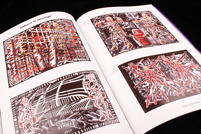
 On a second glance, I started to get very excited about the content, especially the archival stories, many of which are great examples of design archaeology. There’s a piece on the 60s inflatable art collection of Action Space (above), another on Frigidaire magazine and radical left comics from 70s Italy (also above), and a selection of recent works by Gilbert and George (below) that slowly begins to creep the content towards the present. A piece about Maggs Counterculture, the alternative collections part of rare books dealer Maggs Bros, sees an archive of Oz magazine covers and another of colliery commemorative plates surreally sitting side by side (also below). The stark layout and black background of the spreads is provocative and dark – completely opposite to the current editorial design status quo.
 The magazine not only ignores design trends, but its selection of illustration is also off the beaten track. Unlike the beautifully balanced, organic and boldly colourful work that have become current favourites – championed by the likes of Anorak and Nobrow – Mould Map’s illustration is more scratchy and less deliberate (below). Some of it reminds me of early Wrap, before they honed their style.


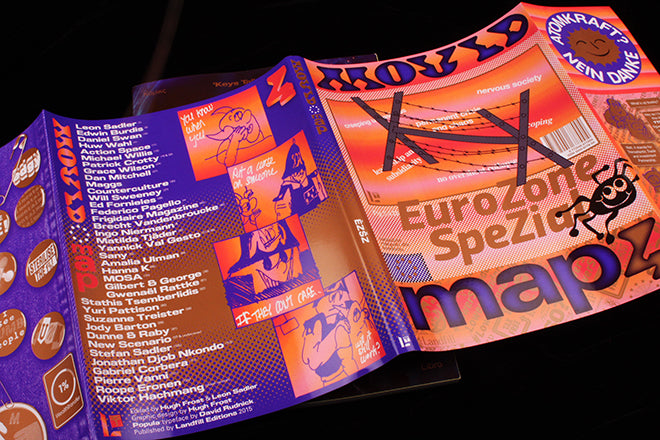
 My concern about the mess of different styles was soon soothed when I noticed the metallic bronze, shimmering ink that speckles spreads throughout. The ink ties the various visual styles together – it’s the string threading the chaotic universe that is Mould Map (see above). A fold-out cover sleeve also hints to the fact that the magazine has very deliberate structure (below).

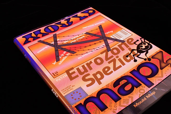
 The outside cover sleeve deserves close consideration – you can read so much into it. I enjoy the way that it hark back to the 60s, with its denim jacket print, protest badges and German anti-nuclear sticker (above). This is then updated by the technoid typeface, computer generated backdrops and drawn references to Adventure Time. The bureaucratic logo pattern also nods to the theme. It’s rare to see such a design-heavy publication tackling contemporary politics, especially as directly and boldly as Mould Map. The theme of protest bleeds from the cover into the issue – with contemporary illustrators making their version of the anti-nuclear sticker in the shape of comic strips and posters.

 Mould Map is an example of a magazine doing things differently in terms of its visuals, and this is a breath of fresh air considering how many publications are beginning to look the same. Spend time with Mould Map, and you’ll find it’s both modern and old: the archival spreads are laid out rigidly and geometrically like a shadowy museum, but the new comic commissions have contemporary resonance and meaning.
Editors: Hugh Frost and Leon Sadler
Design: Hugh Frost