Nick Millington, Esquire
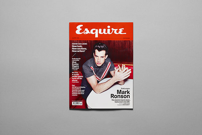
The British edition of Esquire has recently had a smart new redesign. We catch up with new creative director Nick Millington as the second issue sporting his new look arrives on the newsstands.
Where are you today?
I’ll sound like a bell, but I’m in New York getting ready to shoot our September cover this afternoon. Can’t say who with or who by but it’s going to be a good one. I’d normally be behind my desk in our Soho office which is a bit like a doctors waiting room… but a nice one.

What can you see from the window?
The Big Apple. You can see the bottom of Hearst towers (our plush American counterpart) in the middle of the picture (above). Normally though if I climbed out of our window I’d plummet to my death on Carnaby Street (below).

Are you a morning or evening person?
If I had a choice I’d make mornings shorter and evenings longer. How often do fun things happen in a morning?

What was the first magazine you remember enjoying?
Max Power. Nothing to do with the way it looked. It wasn’t my eureka moment for wanting to become a graphic designer or anything. I just liked crap cars, juvenile humour and Jakki Degg at the time. I also bought any magazine with a playable demo.


What’s your favourite magazine this morning?
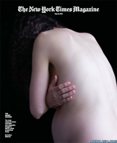
I picked up Wired and the New York Times Magazine. They never fail to impress me in one way or another.
Are you Esquire man – do you dress and live the life?
Not at all. I’m working on it though. I’m not interested in modified hatchbacks anymore so that’s a start. Maybe once I’ve finished paying off my wedding I’ll start investing in the lifestyle. An understanding of it is enough for now.
 It must be exciting to be at the Esquire controls after being the number two; what was the first thing you changed on the magazine?
I’ve been number three, number four and intern here as well so hopefully I’ve been influencing things for a while. David McKendrick (Esquire’s previous creative director of seven years) was nice enough not to treat me like a number two so we flushed out things that needed updating as we went. I was conscious not to try and run before I could walk and so I’ve been bedding in, getting to grips with new parts of the job like the cover shooting process. Six months later and four years after the last redesign we decided to change everything. I suppose the first change was the cover masthead.
 You’re two issues into the redesign; what were your influences and what did you hope to acheive?
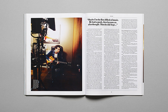
I tried to avoid looking too heavily at competition. Esquire has a long history to look back on for inspiration and many of the changes seemed a natural progression. The main influence was the way the content has moved on since 2011. It’s more challenging, more elegant and more high-end. It’s a classic magazine with a modern attitude and hopefully this design celebrates that.
With the fonts we’ve covered it literally. Plantin is our bold and classic condensed serif that carries authority and sets the tone of the new grown up Esquire and Euclid is our modern sans serif that keeps our fashion and timely features looking slick and fresh. We’ve also introduced a more generous grid to make for a more relaxed read. Less clutter brings the focus back to the content. If its useful, enjoyed and has a few surprises then I’m happy.
 And how do you feel it’s settling down?
It’s always going to take a few issues to get fully up to speed but it’s coping well so far. I expected more tweeks than we’ve actually had. We redesigned it in a month alongside another issue but the team did a great job of getting it tight. From the outside the reactions been positive too so I suppose only time will tell.
What are you most looking forward to this week?
My birthday on Thursday – I’ve got the day off.
What are you least looking forward to this week?
My birthday on Thursday – we’ve got decorators in.
What will you be doing after this chat?
I’m off to do a quick recce around the shoot location, run through the shots and the styling, and wait for the talent to arrive… I usually need a beer afterwards.


