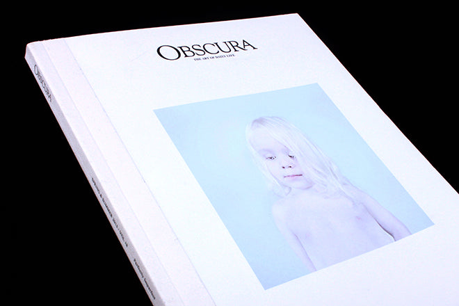
Obscura #18
In the Spring of 2014, Obscura redesigned, opting for pale and muted tones instead of the chunky typography and saturated colours that they’d used for their previous issues. The resulting design will not appeal to everyone – it is a very specific aesthetic. A cream cotton strip seals the perfect bound spine, and the thick, textured paper stock throughout somehow feels light as a feather – the combination is surreal; the magazine is rigid but its lightness catches you off guard. The Hong-Kong based publication sets out to celebrate ‘the art of everyday life’, and for issue 18, they’re investigating the idea of perfection and imperfection.
 Throughout, the spreads are mostly pared-down, pale and ghostly – Obscura enjoy transparency and the faint outline created by watercolours. What stands out for me is the small inserts of glossy, floppy mini-magazines that contain their own features or interviews, for example an interview with pianist Hauschka (above) which is smuggled between two of the thick, card-like pages. The piece – like all of Obscura’s content – is written in Chinese and has been translated to English. The interview is accompanied with simple photography of the musician’s studio.

 Surreal animal illustrations also use glossy inserts to encourage reader interaction: peel back the paper and you’ll find different definitions of the word ‘perfect’. On the other side of the page, quotes from the likes of Poe – surrounded by plenty of white space – continue to probe the idea of imperfection.
 At the back, a set of ‘Selections’ – chosen objects that Obscura find interesting or worth writing about – are entirely illustrated. The drawings combine the kind of hand you might find in Oh Comely with the pared down design of minimalist magazines like This is Paper.
 A feature on a Risograph printing press adds a bit of bold colour to the magazine (above).
Obscura is a sweet publication, containing some fun paper-y tricks and surprises. Once you’ve looked through, it feels like you’ve been in a daydream, or it’s as if you’ve passed through a thick, ephemeral cloud.
Editor-in-chief: TK
Creative director: Irene Leung


