October 2015
The monthly round-up of the best of our in-box includes magazines about running, trainers, finance, football strips and urban development. And six launches.
Supplement #1
The launch issue of contemporary culture magazine Supplement boasts a lot of strong photography and art, including the work of Deborah Turbeville, David Bailey and Katharine Bernhardt. Spreads are clean, the writing is mostly long-form, and there’s something charming about its sleek, elegant simplicity. Supplement is designed by London-based Plus Agency – it’s another example of a mag-shaped calling card.

Got a Girl Crush #4
Got a Girl Crush started in 2009 as a blog by Internet friends from opposite sides of the US (Brooklyn and San Francisco); it was a way for them to document the things that they came across online day to day. Now, Got a Girl Crush is based entirely in Brooklyn, it's edited by Meg Wachter and Amanda Stosz, and it has a tangible form. Issue 4 is bright and chatty as ever, and reading through is like overhearing to two best friends trade recommendations and anecdotes over milkshakes in a diner. Particularly interesting is a feature on a taxidermist and another on a Peace Corps volunteer.
gotagirlcrush.com

Lobby #3
The architecture journal from Bartlett University always have strong cover illustration, and ‘Defiance’ themed issue three is no exception. Lobby’s combination of colourful design and investigative articles on architecture and urban planning make it one of the most intriguing University publications around, and I’m impressed by its deliberate and carefully conceived signature look, which seems to be honing issue to issue.

Crepe City #1
A brave blank white cover, produced using a dimpled, matt paper stock and with the logo gloss-varnished, echoes the crisp visual appeal of a new pair of trainers. The magazine links its creators’ shared interests in sneakers, collecting and culture – and they’ve produced 170 pages to reflect this. Obsessive in knowledge and love for their subject, it}s a strong first issue that highlights the detail of something most take for granted.
crepe-city.co.uk

Meter #2
Magazines about running seem a natural fit alongside other indie sports titles – think cycling – but there isn’t quite the same visual appeal. Meter does a good job of digging up stories, and if you’re into running you’ll find plenty to enjoy, but the sport (and mag) lacks the visual cool and cultural history that opens other sports up to non-followers.

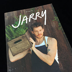
Jarry #1
There’s a lot of magazines about food, and also a lot that document gay culture, but there’s only one magazine that does both and that’s Jarry. There’s some strong illustration inside, the spreads are clean and simple, and articles range from an interview with a dancer about his diet to a feature on Angelica Huston’s personal chef.
jarrymag.com

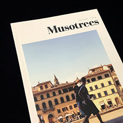
Musotrees #1
Malaysia-based Musotrees boasts a cover that nods to the simplicity and muted pallet of Cereal, and it similarly explores travel through the theme of ‘journey and destination’. It was set up by a group of friends, four avid wanderers and Instagrammers, who decided to bring together their collection of photographs and travel tales in a printed format.
musotrees.com

Poppy #3
Striving to apply the same visual creativity to business and finance that the same team did for drink with Hot Rum Cow might seem super-ambitious, but issue by issue Poppy is getting there. There are plenty of finanical services customer magazines out there that dream of looking and reading as well as it does.
readpoppy.com

Indoek #1
The first of a new series of publications from LA-based creative studio ITAL/C, Indoek will focus on a different surf beach/town each issue. Launching close to home with Venice Beach, it’s a satisfyingly large-format, unbound magazine that gives an exhuberent visual overiew of the beach in illustration and photography.
indoek.com

The Holborn #3
The magazine of ‘A Well-made Life’ returns with more pages and the same overrall structure. Dividing the stories into the rooms of an imaginary house is a charming idea, and there’s some good writing within the issue, but it somehow gets lost in the slightly repetitive layout.
theholbornmag.com

Football Strip Concepts #4
A real curiousity; a magazine about imaginary football strips. The first half features strips inspired by publisher/illustrator Angelo Trofa’s recent trip to South America, the rest includes future strips and other kits inspired by his favourite fashion brands. Weird but enjoyable.

Zoo #47
The thick Fall issue of Zoo is glossy, moody, dark and inundated with twisted high-fashion. For me, it almost looks like what would happen if Vogue got chopped up by the monster in Alien; the spreads are clean yet the photography and modelling are delightfully off kilter. Interviews with publisher AA Brownston and the Swedish band Little Dragon chop up the pace and diverge from the fashion focus.

Matter #4
Matter Magazine advocates slow journalism and it takes a fresh, thoughtful approach to contemporary politics. Each issue explores the political landscape of a different location, and for number four Matter have honed into their home country, the UK. The tone is smart and on point, and the writing includes approachable, focused essays from academics and journalists alike.

Urban Pamphleteer #5
Urban Pamphleteer is a series of publications produced by the UCL Urban Laboratory, and they explore key questions about contemporary urban development from a diverse range of perspectives. The design is always focused and engagingly experimental, and issue five explores the future of cities.
ucl.ac.uk/urbanlab/research/urban-pamphleteer

Dodo #3
There’s two exciting things about Dodo. The first is that their tagline is bizarre: ‘Your own private treehouse’, the second exciting thing is that issue three can be converted into a rain hat (just in case the roof of the treehouse wasn’t working so well…) The illustration is loud and fantastical, just as you’d hope for an ‘adventure and science’ magazine.
dodomagazine.com

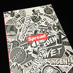
Spread #1
There are always plenty of zines and mags around that collect their makers’ friends and there interests together and publish them as a snapshot of a moment, with little obvious linking themes or strands. Spread is one such publication; it’s a useful testbed for people’s ideas – I enjoyed Simon Lendrein’s comic strip – but as, is so often the case with kind of mag, is pretty hit and miss.


