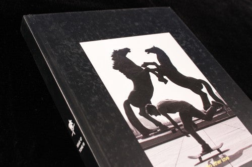
Out now: Desillusion #4

Desillusion is the magnum opus of skateboarding and surf culture. The hefty 260 pages are dedicated to a generation raised on beaches and in skate parks, and it’s a magazine that tackles its subject with serious, almost biblical, zeal. For the last three issues, the quarterly publication has gone hardback, dubbing its new resurrected self as the ‘Tome’ series. The name implies that Desillusion is self-fashioning itself as a kind of scholarly book, and throughout its thick pages, sun and surf are glamorised and mythologised with edgy content and stark design.

An interview with the legendary professional skateboarder David Gonzalez celebrates the immortality of skateboarding. An emphatic quote in bold letters – “Skateboarding died three times since I was born” – is indicative of the near-magic and hallucinatory tone that permeates throughout the rest of the magazine.

Sharp flash and Nana Goldin-style snapshots abound. Mike Spears’ photographs of palm trees floating in glistening LA pools, jean clad kids hanging out in car-parks on baking concrete, and girls blowing bubble gum on the beach are particularly memorable, printed on glossy pages so that they resonate, as opposed to the rest of the magazine which is decidedly matte.

In terms of design, wave-like lines separate text and underscore titles. The wave formations seem rich in symbolism, like the iconography of a religion.

The text itself is quite small on each page, allowing for a lot of white space. This expanse seems to make sense for a publication about skateboarding and surfing, two activities that rely on immersive and immense areas like sea and concrete. Underlining becomes the way that the publication differentiates sections of text; there is nothing particularly typographically fussy, and like skateboarding and surfer style, the aesthetic is simple and laid back whilst still communicating a sense of a subculture and a tribe. It’s a hefty, powerful book, and a magazine foaming with insight.
Review by Madeleine Morley


