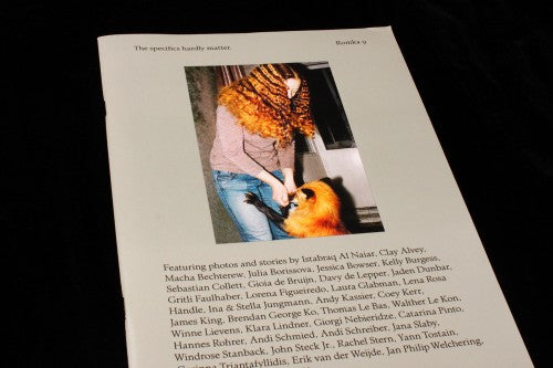
Out now: Romka #9
Romka is a photography magazine with a lovely, simple concept: contributors send in their favourite photographs along with a piece of text that accompanies it, and the two are printed alongside each other on a page. The publication has been around for a while now – it’s nine issues old – and while it’s taken a variety of formats in the past, this latest design is its best. It’s a shame that there are only going to be ten issues though: Romka is an example of a magazine that has taken time to find its feet aesthetically, but which has now definitely found its format. Editor Joscha Bruckert tells us that there will be only ten issues because ‘I enjoy the pressure of working within boundaries, unlimited possibilities are a huge turn off’.

The soft grey on the cover, the single photograph and the list of contributors perfectly describe the simplicity and charm of the concept. There is something quite poignant about reading through the pages; they’re like snippets of diary entries or small, personal poems. Unlike the past issues, where photographs have been laid out in a scattered way, issue nine’s format has image on one page and text on the other, like a simple storybook (above). ‘The magazine’s design is constantly changing as we are less interested in building a brand and more interested in finding the best possible form for the content’, Joscha explains.

Some of the pictures showcased are found objects (above). They’re like the gems you find when rifling through a shoebox of photographs at an antiques fair – pictures that once had real significance to someone, and which you wish you knew the stories behind. In Romka, you get to read those accompanying stories.

Other photographs are more personal: pictures of best friends, loved ones, a mother (above) – and the artist’s honest feeling about that particular person is printed beside it. The entries can be quite intimate, directing the way that we read an image through the anecdotes in the text. ‘When I started the magazine back in 2008, there was a flood of independent publishers who all basically did the same: showcase the work of emerging art photographers,’ Joscha explains as part of his reason for starting the project, ‘I was much more interested in how we all use photography to preserve memories, a practice not limited to those with an artistic background.’

Other pictures are more enigmatic and dream-like (above), memories that don’t give themselves away with the words, allowing for differing interpretations. Like the best projects of this sort, Romka allows contributors to approach the concept in whatever way they like, resulting in a curious amalgamation of stories and delightful fragments.
Art direction: Lysanne Bellemare and Benedikt Bock
Review by Madeleine Morley


