

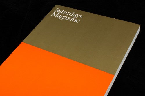
Out now: Saturdays Magazine #4

I’ve never surfed in my life, but I imagine surfing is about impeccable balance, about putting equal weight on water and air and keeping on the edge like a tightrope walker. The cover of surf magazine Saturdays captures this sensation: it’s crisply divided between shimmering gold and matte orange. All their covers have taken this format in the past, splicing the front into pairs like black and silver, white and yellow, red and blue. I like to think of the covers as different times of the day as seen when floating on a calm sea, and this golden view of issue four would be the horizon at sunset.
The issues are few and far between, the first came out in 2012, but when they come they are hefty publications, reminiscent of surf/skate magazine Desillusion that is similarly thick and encompassing. The magazine is put together by men's lifestyle brand Saturdays, which has stores stocking menswear and accessories in New York’s West Village and SoHO, as well as locations in Tokyo, Osaka and Nagoya. Like COS’s customer magazine, the editors know their brand well, extending their sense of style and subsequently lifestyle beyond the cloth, and understanding the crucial link between the two.


As well as staple content that illuminates the lifestyle associated with the brand, like spreads showcasing apparel (above) and beautifully shot surfing images (also above), Saturday’s interview section brings together a variety of surprises that you don’t have to be a surf nut to enjoy. Q&A’s with Francis Ford Coppola (below), Duane Michals and Acne founder Jonny Johnson (also below) are not necessarily what you’d expect to find in a surfing magazine. The portraits of interviewees are stylish, set against the discreetly confident chapter numbers that are used to tie together the interview section.


At the heart of the magazine’s design lies an aesthetic of balance, of creating harmony through opposition, as first indicated by the cover. The double pages of a spread are used as two contrasting planes that can play off each other in order to create a sense of equilibrium: an interview with chef Frank Prisinzano contrasts a bright orange background and a large pull-quote with a simple layout of a black and white portrait shot and small interview text (above). The left is bold, the right delicate – together the aesthetic is striking.


This same balancing act is used for pairing of photographs: two images taken from the same angle of New York in the day and night convey entirely different atmospheres (above) but are placed side by side nonetheless. Moody and abstract black and white photographs of buildings close-up are laid out with a similar emphasis on difference: a large and encompassing photograph on the left stands out all the more next to the small and spacious layout on the right (also above). Although these are generic magazine design techniques, the extent to which you can find examples of aesthetic balancing is compelling. The visuals of surfing are often bold and set around the idea contrast, taking inspiration from the yellow of sand against the deep blue of the sea. This sensibility, of being on the edge, of combining movement and stillness, is constantly evoked in Saturdays, in subtle ways as well as obvious ones.

Whilst surfing is about balance, it’s also about rolling, cascading shapes, and keeping control of tumbling movement. To reflect this, the idea of falling, of crashing into the sea, sometimes the design ‘spills out’ or stumbles against the simple harmony of the layout. For an interview with Eastern Surf Magazine, a picture of a wave crashes over the divide between the two pages (above), splashing over a boundary not usually crossed elsewhere in the magazine.

Similarly, typography is pushed over edges and seems to swell on the title pages of photography spreads (above). Embedded in the magazine’s design is the sensation of skilful surfing and of pushing things to the limit – the feeling of powerful balance but also the moments when that power begins to tip and everything falls apart – and you get the impression that art director Luke Flyn has definitely caught a wave or two in his time. When a client magazine so consistently and cleverly conveys the sensation of the lifestyle associated with its brand, you know the design comes from a passionate place.
Editor-in-Chief: Colin Tunstall
saturdaysnyc.com/magazine
Some details corrected 8 May
Reviewed by Madeleine Morley