

Peeps #2
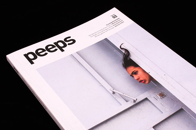
The second issue of Canadian anthropology magazine Peeps has changed its format to address the problems that its founders noticed with the first. Peeps is a title for thinkers, but it is also a social magazine that aims to be open to all, and therefore it aims for accessibility. Issue one’s design didn’t visually invoke this ideology of openness however: “When reviewing it, I was a bit concerned that our design was suggesting a magazine that was either too academic or elite,” says publisher Greg Salmela.

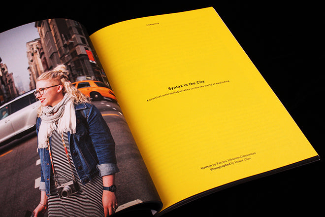

The redesign reflects the accessible tone of the title’s features and interviews. More colour and photography creates a gentler, but also more vibrant and flavoursome, pace. Title pages for example are energetic and immersive because page colours match their adjacent images (above) – sky blue, the yellow of blonde hair and the red of a poster seamlessly draw the anthropological context of a story into the layout. “I think we have created a more exciting and enjoyable reader experience,” says Greg. The issue’s smaller format is the result of economics (the usual suspects of shipping, printing and paper costs), but the personable quality of the size is also conducive to the design’s new raison d'être.

Stand-out articles in this new issue include an in-depth article on whether gentrification is having an effect on sex workers in Paris’s Rue Saint Denis (above), an exploration of the social spaces of post-apartheid Johannesburg (below), and a personal story about discovering local Maori life along the Whanganui river in New Zealand (below).


In terms of its depth, breadth and journalistic achievement, Peeps has something of Offscreen or Makeshift to it. It’s a serious, impressive title with a clearly defined mission and outlook. The redesign has succeeded in crystalising its vision.