Perrin Drumm, editor, Eye on Design
We start the week with writer/editor Perrin Drumm, founder of AIGA’s Eye on Design website. Since 2014 the site has established itself as a reliably opinioniated voice about graphic design, graphic designers, and the issues that concern them. It often covers magazines and editorial design, so it should be no surprise Perrin and her team are now launching Eye on Design magazine. We caught up with her as the first issue is about to be published.
Tell us about your typical Monday journey to work.
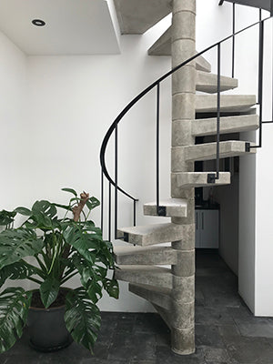
Right now, I’m in Mexico City, and to get to work I descend a concrete spiral staircase and walk a few steps over to a little private patio in the beautiful apartment I rented for the week. It is so dreamy here, I could really get used to this as my new normal. Yesterday I Googled, “Can Americans buy property in Mexico?” (Answer: yes, within limits). Still, at some point I suppose I’ll have to return to New York, where my commute is far less glamorous.
I live in Greenpoint, Brooklyn, and getting to my office in the city includes trains so crowded there often isn’t room to open a book or magazine—you’re lucky if you can squeeze close enough to grab onto a pole so you’re not doing the subway surf. It’s a strictly earbuds-in journey; I rotate between audio books (I can bang out one a week), music (I love hearing what Spotify’s Discover Weekly algorithms think I’ll like), and podcasts (I rotate through about a dozen different ones each week).
Describe the state of your desk and what you can see in your office.
I’m staying in Mexicos’s Condesa neighborhood, near Archivo Diseño y Arquitectura, La Casa Luis Barragán, and tons of great little cafes and restaurants. Directly outside my window is a pre-school, and right now I can hear the teacher giving them an English lesson. It’s really sweet to hear, but I’m not going to take a picture of them because that would be creepy, so here are some other snap shots of the area.
Which magazine do you first remember?
If we’re going way way back, the Highlights magazines from my dentist’s office, the ones where all the word search games have been scrawled over by other kids’ crayons. But as far as formative mags go, it’d have to be Archie Comics and The Paris Review, which I used to buy second hand in used bookstores.
I studied fiction in school, and was always disappointed by how ugly the most respected literary magazines were. I always thought The Paris Review was the best looking and the most interesting one on the newsstand. Now lit mags have really upped their design game, but The Paris Review is still my go-to.
Archie Comics and The Paris Review may seem like odd bedfellows, but it’s actually a pretty good indication of how wide my tastes range. I subscribe to the latter, and yes, I shamelessly binged the first season of Riverdale. Don’t judge. Okay fine, judge.

Which magazine matters to you the most right now?
It’s thrilling to see so many quality titles out there right now, but the one that stands out as the most unique and exciting is The Smudge, produced by Tan & Loose Press. It’s a six-page piece of Risograph newsprint that’s always fun, insightful, and surprising. Imagine a late ’60s counterculture rag was frozen in time and reanimated today, ready to tackle our most pressing topics, from politics and global climate change to interpretive dance and bread. I never know what I’m going to get in each issue, but I know it’s going to be weird and good.
What is Eye on Design’s relationship to AIGA?
Eye on Design is published by AIGA, which is the oldest and largest not-for-profit professional design association in the United States. It’s one of dozens of projects and programmes run by AIGA, but Eye on Design stands apart as the organisation’s primary publishing platform, with a focus on design journalism and stories about emerging and experimental design from all around the world, not just the US.
In addition to our international readership, we have 24,000 AIGA members who are top of mind when we commission stories, but where other AIGA programmes often have to be quite formal in nature, Eye on Design has a more casual and hopefully fun (yet still well informed and considered) voice and style.
Why launch a print magazine when you already have a successful website?
I’m a writer, ephemera collector and daughter of a letterpress printer; I can’t pass a used bookshop without buying something old and musty. Which is all to say I love things printed on paper, and like most editors, I had an early and ardent love affair with magazines. Opening them up was like accepting a special invitation to a strange new land, a VIP tour to an entirely different world. I still feel that excitement when I open a magazine today. Where am I going to go? Where are they going to take me?
But professionally, I came up through the editorial ranks of online publishing—often at titles that ran both print and digital—so I recognize the value of both, and understand how stories function best in both formats. Despite all the benefits of digital publishing, it doesn’t provide the same kind of immersive reading experience that a magazine can.
There are some titles telling deep-reaching stories online, and it’s exciting to see that happening, but it takes quite a bit of development resources and it’s a big ask of the reader, too. Personally, those stories are fun to experience as one-offs, but I don’t want to regularly read long stories on my phone or computer. I spend too much time in front of screens as it is.
After we brought on more globally-minded editors and writers at Eye on Design, we started to publish longer, more reported, and deeper-reaching stories on broader topics. We found ourselves wanting to invest more time reporting on certain issues (sexuality, mental health, education, etc.), and while we still publish under those verticals on the site, we recognise that print offers the opportunity to really dig into one specific area from a variety of points of view and in a range of formats in a way the digital medium, or at least our site, just isn’t suited for. We think the magazine bridges the print-digital divide in a very considered and thoughtful way.
How does the new magazine relate to the website – is there shared content?
We’ll occasionally run a story commissioned for the magazine on the site, but only as a jumping off point to have a wider, ongoing conversation about the topic with our readers and audience on social. We’d never dupe content just to fill a void in the editorial calendar; we fortunately don’t need to operate that way. We’re lucky in that, as a not-for-profit, we don’t have a story quota to fill or advertisers to appease. We set our own standards—which are high—but they’re dictated by the editors.
The first topic we’re turning to print to dig deeper into is “Invisible,” the theme of issue lone (above). We’re looking at it from a range of perspectives, from the problem of underrepresentation within the design industry and the unsung heroes behind well-known designers, to code as the invisible language of design, with some visual fun and games in the mix.
And since we espouse forward-thinking design, we practice what we preach by inviting a guest designer—someone who’s working in a really exciting and different way—to have free reign over the editorial layout, the paper specs, the colour choices, etc. Each issue will be designed by a special guest; this time we’re excited that Maziyar Pahlevan took the bait and returned with a very provocative, very cool, and very unexpected design for issue one.
What are you worrying about at work this week?
Two things: Press check and our new online shop, which is now open for pre-orders on our first issue. Our senior editor, Meg Miller, is at our printer making sure things go as planned, but of course little hitches do arise. That’s part of the fun of this process though, right? And our managing editor, Liz Stinson, and I are bumbling our way through the backend set-up of online sales and fulfilment, which is even less sexy than we’d been warned it would be. We’ve had lots of help though, and I think we’re quite lucky in that our community and our partners have really gone all-in with us.
It’s a funny feeling, to spend months preparing this thing and planning for it, and then one day the switch is flicked, the presses run, the orders come in, and you almost can’t believe it’s all working, that nothing’s breaking, and it’s real.
What’s going to be the highlight of the week for you?
Exporting the first batch of subscriber addresses to our fulfilment centre. Then it’s really real.
What will you be doing after this chat?
Rewarding myself with a mezcal and mole tamales.


