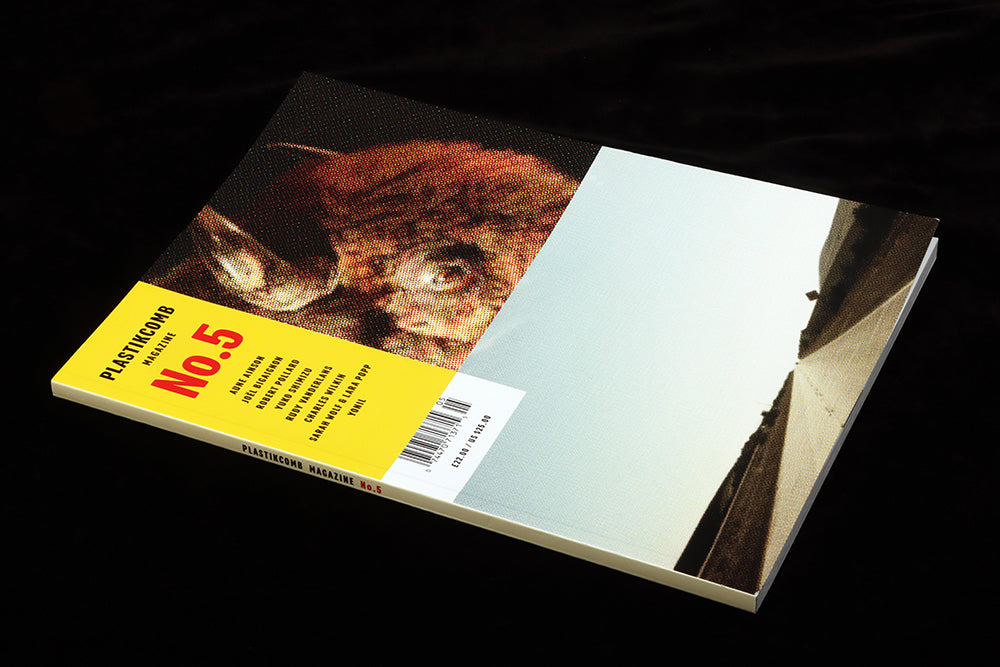
Plastikcomb #5
US design/collage magazine Plastikcomb is back for a fifth time, staking a corner of design publishing for its kaleidoscopic form of visual nostalgia.
Harking back to the eighties experiments of David Carson’s RayGun magazine and the work of Jeffery Keedy, Ed Fella and co from the Cranbrook Academy of Art, Plastikcomb combines a love of early US advertising imagery with everyday imagery, bold typography and visual evidence of the printing process. Their tagline ‘Digital is dead’ is evident throughout.
Perhaps Carson is the most appropriate reference—like him, Plastikcomb founders Aaron Beebe and Thomas Schostok are untrained designers working in the editorial space. Their page designs exude a raw energy that is all the more powerful as the words they present are about design, type, and collage; meanwhile the front and back covers, designed this time by US designer/ photographer Rudy VanderLans (another eighties figure), use the same visual references but are calmer and more considered.
The result is a chaotic but thrilling ride, ignoring traditions of grids and systems in favour of the spontaeous. Here are five examples from the issue.

One
An interview with Israeli artist Yonil opens with a typically bold opening spread. The monochrome type elements—headline, page number, credits—look as if they’re a single rejected page found on the floor by the photocopier. They bear tape marks, textures and paint drips. A sample of Yonil’s work sits on the page, balancing the large type on the left.

Two
This spread is almost unidentifiable as an opener to a major feature. Telling the story of Charles Wilkin’s book ‘Index A’, a key reference point for the aesthetic being celebrated by Plastikcomb, the central image is the book’s cover. It’s surrounded by collaged elements of design that might well be from the pages of the book, but they’re layered and cropped so tightly I can’t tell for sure. The following pages clarify the context, but the opener comes after a pair of unconnected pages that are typical of the magazine: a doodle and a fake advert, both featuring Plastikcomb’s mascot, Dusty.

Three
Longer features are regularly broken up by fake ads and other one-off pieces of design. The left page here is one of a series of images of TV dinners scattered through the pages (it’s unclear whether this is an archive or contemporary image), while on the right is an illustration reminding us of the name of the magazine. Such pages break all traditional editorial sense, but is a vital part of the make up of Plastikcomb, one-off ideas keeping the energy up as you flick through the issue.

Four
Editorial convention isn’t always completely ignored! This powerful spread opens an interview with Estonian photographer Aune Ainson. A double page reproduction of one of her images—a close-up of an overloaded power socket— has her name reversed out in white, the type worked to echo the plugs and sockets in the image.

Five
Cover designer Rudy Vanderlans is interviewed about his photography, and the page design is the calmest of the entire issue. His photographs float in the centre of clean pages, the black interview text abutting the images leaving much of the pages blank. Note the coarse halftone dots at top right—this is PRINT!
These five spreads from the issue show how the strength of Plastikcomb lies in the tension between a desire to break convention while also make a satisfying expereince for the reader. The running order of pages in unconventional, yet makes sense in the magazine. Pace is considered, the stories balanced and varied to keep the reader’s attention.
Perhaps the most intrigiung thing about the whole issue is how, like that image of the TV dinner, the magazine is timeless. Is it from today? From the eighties? Or the fifties?
Read our interview with Plastikcomb co-founder Aaron Beebe.


