Postr #16
One of the less great things about magazines that are very, very beautiful is the fact that it’s a lot harder to cut them apart and paste favourite pages onto the wall or into scrap books (something that occupied most of time as a teenager rummaging through i-D and Dazed). They’re just too beautiful to ruin. That’s why Wrap is great, because it allows you, even welcomes you, to dismantle its contents – this idea is actually part of the design and purpose of the magazine. Postr has a similar appeal: you can put it on your wall without disrupting its aesthetic harmony. You’re even encouraged to do so.
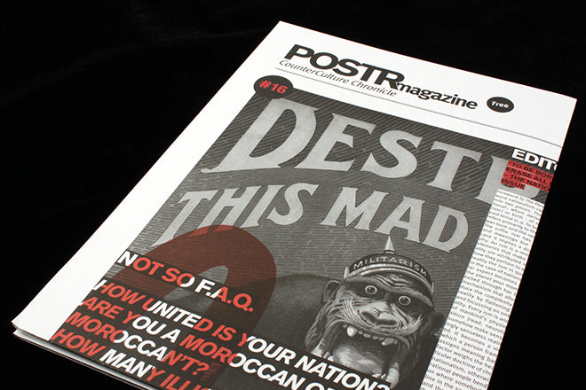
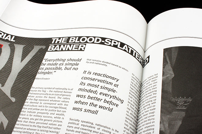
The sixteenth issue of the single paged, A1, double-sided Belgian magazine is ‘The National Issue’. The editorial and three essays question the idea of nationalism, which apparently Einstein said ‘was the measles of mankind’. Font size and images are used to differentiate between the four sections of text, and the see-through, big red lettering gives the entire image a poster-like appearance.
 Hold the magazine up close to your face and it reads like a newspaper (above); put it further away on your wall and the text becomes like a pattern that bolsters the overall typographic composition (below).


Spin Postr around, and you get a poster for a photography exhibition in Brussels, paid ad space that funds the project.
To complement its cut and paste aesthetic, Postr has a raw, ideological edge to it. I like that it can be put up on streets or on a bedroom wall, but that it can also be distributed in shops and cafes when folded. Its form can change depending on the context, which means a wider ranging net of readers - always a good thing. Postr is a publication that takes liberal internationalism as a theme, so it seems fitting that it can break its own boundaries and reach all sorts of spaces. When ideology finds its design counterpart, it makes for a neat union.


