

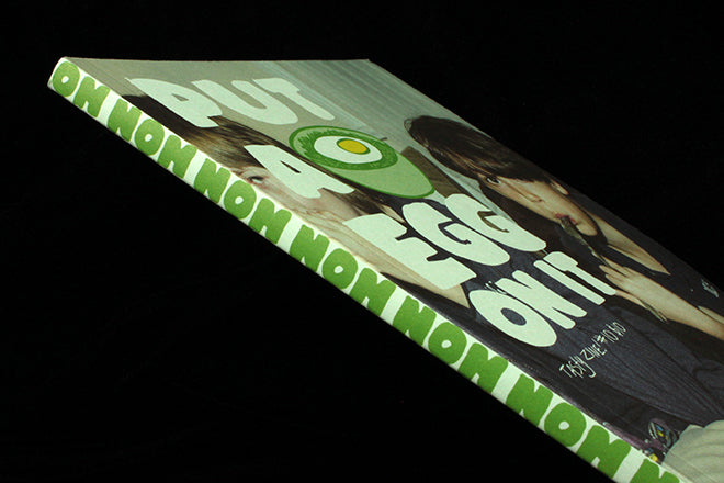
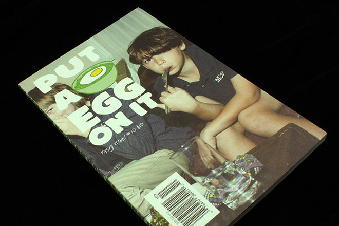
Put An Egg On It #10
Issue ten of Put An Egg On It is their best issue to date. The New York ‘tasty zine’ has steadily come into it’s own over the past five years, each issue refining a laid-back vision and celebrating food messiness and communal cooking in an enjoyably down-to-earth way. As ever, issue ten is a delicious jumble of slapdash recipes, personal essays and food for thought, and it’s all tied together with a relaxed cut and paste aesthetic that matches the tone. The magazine is put together by two Brooklyn-based artists, Ralph Emerson McGinnis and Sarah Forbes Keogh, who work together on a variety of projects under the name R&S.
 I’ve always been a fan of the ’zine, it was the first place to inform me that putting an egg on top of a recipe will probably make it better – so it will always be close to my heart. Here are some of my highlights from the new issue:
 There’s a feature on Andy Warhol’s kitchen portraits of dinner-party friends (above).
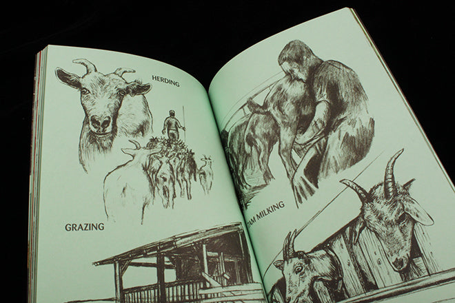 Lars K. Huse illustrates a guide to goats cheese from the Norwegian island of Håøya (above).
 Dustin Harris photographs the ‘First Date Cakes’ he asked girlfriends to bake him over several years (Chloe, above).
 Occasional magCulture contributor and magazine enthusiast Kati Krause talks love, longing and food (above).
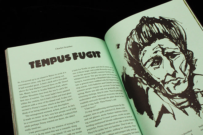 Memory and food are beautifully intertwined by Charles Graeber, who remembers what it was like to cook at a crumbling hotel on a Maine island (above, all essays illustrated by Derek van Gieson).
 This week we also featured Pylot on the site; a fashion magazine that rejects air-brushing and promotes realistic portrayals of people. We love Put An Egg On It because it does the same thing but with gastronomy: it’s a magazine that reflects the day-to-day way we interact with food, complete with unclean plates, weirdly shaped vegetables, messy workspaces and un-photogenic stews. In many ways, the magazine is the opposite of an episode of Master Chef, and it doesn’t shy away from capturing the dirty dishes that overflow in a post-dinner party sink. Like a steamy kitchen, each page also has a slight lime green tint because the magazine is printed on green paper – a touch that has become a particularly effective visual identity.