Real Review #4
This week’s page 23 is from the latest issue of magCulture favourite Real Review. Parodoxically, this page 23 shows how arbitary page numbering can be, while also illustrating the vital part numbers play.
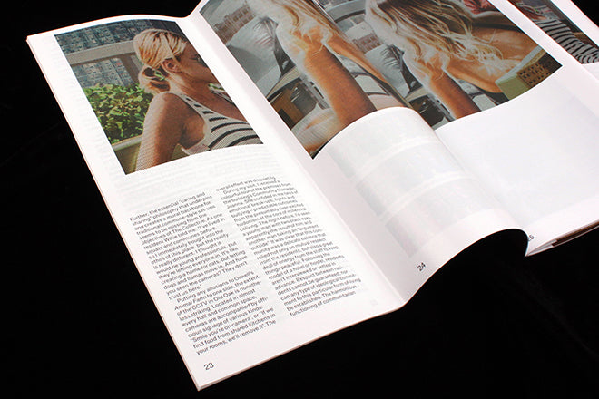
Much has been written about Real Review’s unique format – square pages folded vertically to create a tall, narrow page shape. When unfolded and then opened out, the pages still conform to a traditional double-page spread, but the fold divides each of the two pages in half and the layout treats the resulting four tall sections as individual pages.
If we take a traditional approach to counting the pages, Real Review consists of 64 large, square pages and page 23 would be situated just over a third of the way through the issue. Instead, every one of the tall sections is individually numbered, as shown in the image above, a simple technique that allows articles to start and finish in the middle of spreads. A further numerical complication is that, unusually, the front cover is not counted as page one; instead the first right-hand page after the cover is assigned as the start. These two factors together mean that this is a rare example of a left-hand page 23.
The picture above also shows how these factors have led designers OK-RM to make a feature of the page numbers; they are the only regular piece of page furniture and are unusually large in relation to (most of) the body text. They alone define the four-page per spread concept.
The content of the page finds us in the middle of a typically sharp Real Review analysis of a detail of contemporary life. Hannah Foulds visits The Collective, a new shared co-living space – the inevitable extension of co-working spaces – and finds it wanting as she compares its rent with other London accomodation and contrasts stories of bullying and violence with the idealism of Le Corbusier’s 1952 Unité scheme in Marseilles.
The page itself is half text, half image, the space above two columns of words taken up by one of a series of photographs by US photographer Daniel Shea depicting an idealised yuppie-ish lifestyle, a young woman enjoying balcony life in the sun, mimicking marketing material used to sell city apartments.
It’s a typical Real Review page, with intelligent text illustrated by a cleverly sourced and relevant piece of art rather than a promo shot.


