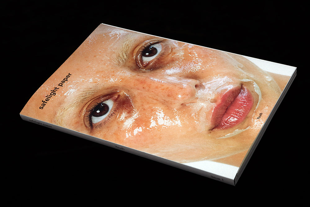
Safelight Paper #1
Photography and magazines have gone hand-in-hand since the introduction of the photographic halftone around the beginning of the twentieth century.
The ability to reproduce photographs in print drove the rise of the magazine through the twentieth and into the twenty first century. Photography in magazines was central to the post-second world war consumer boom, spreading lifestyle, news and advertising. Today it’s hard to imagine a magazine without some form of photography in it. We take it for granted.
There are also many magazines devoted to photography as a subject; titles like the British Journal of Photography and Aperture address the practice of photography and critique the work of photographers past and present.
Others showcase photography as an art form. Current examples include True—giving creative space for leading commercial names to freely express themselves—and M-A (A Space Between) and its more experimental series of images without context or words.
This month’s Magazine of the Month majors on its own photographic niche, reflecting the contemporary interest in rediscovering otherwise outmoded technology; all the images in the debut issue of Safelight Paper are analogue rather than digital, shot using film.
Published by analogue photography shop and lab Safelight Berlin, the magazine reminds us how varied the non-digital can be; its 168 pages showcases a series of stories from 11 photographers, including the magazine’s editor-in-chief and creative director Nicolas Blanchadel.
Over the years, the shop has built a loyal community of analogue camera lovers, with exhibitions and events highlighting the medium. Adding a magazine to the mix had a clear role; ‘The magazine itself came from a frustration on my side,’ Nicolas explained to me, ‘a need to have more artistic talks than technical with our customers.’

Safelight Paper is the first launch issue we’ve selected as Magazine of the Month. It arrives with two bold cover variations, each satisfyingly similar in colour and tone. Arnaud Ele’s close-up portrait suggests the issue’s theme, ‘Youth’, and Clara Borrelli’s sun-screen smile on the back of an older man suggests youth as a state of mind. A nice touch is that both images are easily recognisable as related to stories in the issue, but neither are repeated inside.

Like the simple cover design, there is little editorial or typographic intervention inside. Open the issue, and the cover folds flat leaving the main magazine as a tape-bound section of its own. As Nicolas explained, ‘I always had a deep love for photography books and wanted my magazine to be a beautiful object with a nice touch feeling, a smell, etc. Something that feels right on a shelf.’
On the left of the spread (above) are contact sheets from one of the shoots, establishing the analogue format; on the right, a black white page presents the theme ‘Youth’ and its dictionary definition. The next page has a brief editor’s letter, then we’re into the images. I share a few here; the notes are my impressions, since most are presented without caption or comment.

Ana Evig shares a series of images from her days growing up in Kyiv, this double page example being typical of old analog imagery printed as 7x5" prints for the family photo album.

The artist’s name is generally the only element on the pages beyond the images themselves. Clara Borrelli’s cover shoot opens with this double pager (above), setting the tone for the rest of her story that reminds us that youthful love can continue into old age.

Alan Knox gets busy in the darkroom, manipulating the negatives and exposures to create powerful black and white images such as this repeated face with a moon-like disc moving across it. Who needs PhotoShop?

Several of Jordanna Kalmen’s contributions also use darkroom manipulation, but there is also physical intervention. Here, black and white prints are cut open to reveal blood red growths from ‘inside’ the body.

The one pure reportage story in the issue does have some explanation to it. Natalia Kepesz visits a Polish military summer camp and shoots the young boys ‘playing war’.
A surprising story, it adds another dimension to the photography in the issue, and backs up Nicolas’s claim that he ‘wanted to bring together all types of photography inside the same magazine, inspiring our customers to create meaningful projects.’
Safelight Paper does just that; although specialising in analogue photography it presents a wide view of the medium, something that might put off the photography purist looking for a deeper dive into one genre, but makes it an ideal source of inspiration for the casually interested.
Editor-in-chief/Creative director Nicolas Blanchadell


