

Joe Richards, M-A ( A Space Between)
Large-format photography magazine M-A (A Space Between) is a gorgeous, tactile publication presenting uninterrupted, full-bleed visual stories from emergent and established photographers.
Founder Joe Richards is a designer, editor and teacher. He cut his teeth in Paris and London at Céline, and has worked with artist Katerina Jebb and trend forecaster Lidewij Edelkoort. We meet him as issue two of M-A (A Space Between) launches.
What are you up to this morning?
My routine begins at my desk, I'll drink coffee while still in my pajamas, watch the sunrise while eating an Elvis Presley-style peanut butter and banana sandwich (non-fried!), followed by lengths in a nearby swimming pool. Then I feel just about awake enough to start the day...

Describe your desk and your work space.
I live most of the time in Bath, in a Georgian house which is the oldest building in this area, it was built in 1770 and originally was a country house, surrounded by meadows, over time the surrounding streets were built, the railway line to London is at the bottom of the garden... outside my window grows my friend, a magnificent horse chestnut tree whose trunk is so wide that many outstretched arms could embrace it at once.

My desk is in a bare wooden room, whose windows look out on that tree, in the summer the light is dappled green with the movement of leaves. The table in this room is oak with an oiled cloth cover in dark cream - a favorite colour. I am a designer, editor, and teacher so this table is piled with books, folders, and materials for the different projects that I am currently working on.

Which magazine do you first remember?
Franca Sozzani's Vogue Italia was a lodestar in my late childhood, I would save up and buy it each month from the newsagent when I started secondary school. I remember the sense of anticipation of seeing the covers, the shoots inside, analysing all the photography, the layouts, the typography.
I loved the shoots which would go on and on like silent film stills... how dangerous and beautiful some of those images were: Peter Lindbergh, Helmut Newton, Sarah Moon, Paolo Roversi and the clothes: monochromatic Helmut Lang, the regal austerity of Chanel and the piratical abandon of Galliano. My thirst for it was unquenchable.
Which magazine matters to you the most this morning?
It's more books, I don't really look at many magazines now as I don't feel satisfied in the same way—that's partly why I started M-A (A Space Between)... I will certainly find solace in the beauty of photography and art books though... I will often make a sort of visual prayer for the day ahead by cross-referencing open books and leaving them on my desk while I drink coffee, looking on into those pages.

Describe M-A (A space between) in three words.
Granular
Visceral
Emotive
Tell us more about the magazine's name.
MA is an ancient term—even a philosophical state in Japan—a term that I have thought about and observed for a long time. I heard a beautiful definition from a Japanese student I knew who described it as ‘sensing the presence of someone in another room’. I thought it would be fascinating to create an ongoing visual essay meditating on this. The ‘Space Between’ is my interpretation of this, when I edit the images I cross-reference them together so it refers to this as well as the viewers' interpretation of them.
How did you arrive at the final physical format for the mag?
When I had my fashion label, which is now on pause, I would present the clothes with a large format sketchbook as a way of introducing press and buyers to my creative process. These books would often receive a lot of attention—I would watch these quite serious people become very calm and emotive as they turned the pages and I realised that there was a real place in creating a publication of this nature which others could engage with. I used a similar format for M-A (A Space Between) the large scale has an enveloping quality which I like a lot.
Did you try multiple ideas before settling on A3 spiral bound?
It was a very direct choice, I love the sense of a spiral, such a beautiful piece of design that has a very pure function. I love the mix of materials without any need for glue.
The advantage also in terms of viewing the pages and images is strong as the page can be totally flat. The magazine is also a book of prints and so you can change the page and interact with the object within your home interior so it functions both as a document and also an artwork. I love the books of Ed Rucha which I see in auction rooms that also use spiral bound.

How do you source the material for each issue?
Part of my instict for the art direction of M-A (A Space Between) was to explore its iconography early. Its purpose was always to make the magazine of my dreams, but also to make something that I needed—that I could not find. Something visceral, arresting, and emotionally charged. I knew that If I wanted to engage with the sort of pictures I love I needed a space that was beautiful in quite a pure way—I didn't want any extras, any distractions in the experience of viewing the work. In fact it really is an exercise in how to distill elements to their most essential.

No titles, no borders—how can the item stand out on the newsstand for being recognised as having its own style? How can it engage with the viewer on a deeper level? I knew I didn't want it to look like all the other art photography magazines with that ubiquitous emotionless gloss. I moved towards simple papers like sugar paper which when printed absorbs ink a little like a screen print - The acetate cover is a direct link to a 1960s textbook sort of feeling, which I also love. So sourcing is done via a range of suppliers, who reflect those values.
Haha—I just realised you mean material as in contents! I was thinking as a designer. The process of finding the images for the issue is very connected to the meditative state that I feel with putting the item together, its holistic. At present M-A (A Space Between) is published once per year, everything about this concept is slow, so I wanted the rhythm to be like a very calm heartbeat.
I have a very simple method for choosing images—it can be by anyone and of anything but it must make me feel. The objective is to connect on a soul level, once you think in this way the images actually levitate toward you. In fact, M-A (A Space Between) has a very pronounced soul, all I am doing is listening to it. Everyone I asked said yes to being involved, and I thank Claudia Andujar for this really as she set the rhythm and gave me the confidence to follow my instinct with this issue.

In your editor's letter you briefly discuss what makes a great image. Can you enlarge on that?
It’s a highly objective idea and one I write about with a smile as I appreciate how abstract it is as a concept. But in terms of the connection to M-A (A Space Between) I feel an overriding loyalty to the freedom of expression which is documented by every contributor, and that is the great thing.
To follow an instinct to frame a moment, often made out of release by the individual—for searching for answers—internal questions of the subconscious. The images of Claudia Andujar, for example are so pivotal, not only in the magazine, but in the life, because they do something extraordinary—they remind us of our humanity and they break my heart because they are full of truth. And nothing is more arresting than that.

Share one story that sums up the magazine.
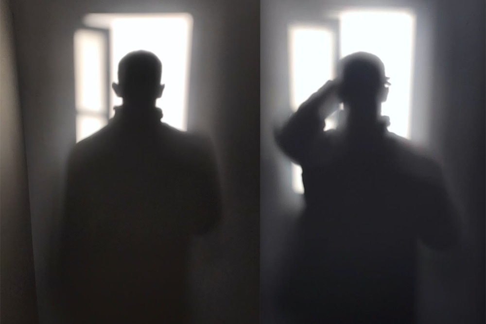
There are so many stories, important stories within this issue, but If I were to choose just one, I think it would have to be about Daniel Obasi (above). Someone who I first heard about via my friend Harris Elliott's Le Tings platform.
I bought a print of Daniel’s work during lockdown and I knew I wanted him to be involved in this issue of the magazine because his voice was so distinctive and searching. We would talk via Zoom about so many things and nearly never about the pictures for M-A. He said that he wanted to make new work for this issue, which I was delighted to hear as I thought archival work would be an answer.
When the images arrived I was amazed at their directness, and from listening to Harris Elliott and Joyce Addai-Davis discuss the possible deeper cultural significance of the work, and the sense of release that the images potentially signify. I feel proud that this publication is centered around truth, and more and more I see a future for this publication to hold that purpose.
What one piece of advice would you offer somebody wanting to launch their own publication?
Have a point of view based on your passion, know yourself, and use your publication as a force for change, use your platform for others.
For example, M-A (A Space Between) is rooted in a purpose to present emergent and established photography excellence together. I have been in too many tutorials where I would see beautiful work have the lifespan of turning a sketchbook page. Often, I imagine, this work would not be seen again once the student had left the school, and I wanted to do something about that.
I also wanted to reinstate that level of joy and hope I had experienced when I was a kid in seeing magazines which made me dream and respond on a visceral level. I think there is a damaging snobbery about photography and photography publications, when in essence it's not about what type of camera you have it's about the image—it’s about the energy that image emits.
What are you most looking forward to this coming week?
Working.
Design Hejing Fang
maaspacebetween.com