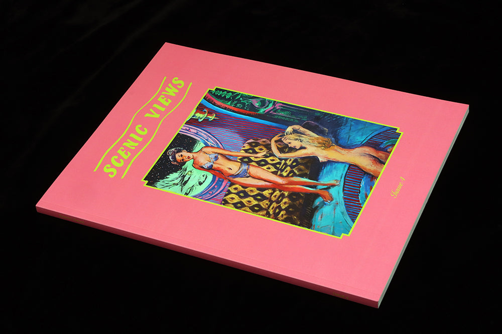
Scenic Views #4
The interiors magazine seems to be going through a bit of a moment (with new launches Manera and Ton), and right now our favourite example of the genre is Scenic Views, the London magazine offering a unique sense of what’s scenic.
We’ve followed the magazine since its 2019 launch, but with this fourth issue it’s really hit its stride, the clever curation of overlooked interiors and curious collections, and its subtle design, making it our April Magazine of the Month.
Co-founder Louise Benson dropped off copies for the shop recently, and I took the opportunity to have a quick chat with her about the issue. ‘The magazine has evolved from being just about overlooked interiors; now I would describe is also as looking at forgotten design histories,’ she told me.

The overlooked interiors remain—this issue includes a series of images from inside a care home and another of themed found images, this time of party venues (above)—but there’s a new confidence in the way Louise and fellow publisher Lorena Lohr are stretching their remit. ‘It’s taken a little time to feel out what the edges of the project are, and set our own boundaries,’ Louise told me, ‘We always feature an artist’s work, and in the first issue we were able to feature Beryl Cook’s paintings, our dream artist. Her work is so well exposed that it’s overlooked.’

Cook’s work set the tone at the launch of the magazine; now Louise and Lorena can push further. Take one of the two featured collections in the issue; ‘We’d wanted to do the sugar packets feature for a long time but we hadn’t figured out exactly the right way to do it’. The resulting story combines examples found on the web and photographs of several people’s collections, all laid out in a simple grid arrangement that reflects both their tiny scale and a childish delight in seeing multiple images of similar things. ‘They can be remarkably creative, miniature forms of creative escapism that were only produced for a short period and are perhaps the only remaining souvenir of an interior that’s long disappeared.’
They work with designers Michael Nash Associates, providing plenty of source material and references from museums, libraries and beyond. Louise: ‘I found a discarded set of The Architectural Review from the seventies. The way they gridded images together on a page is uncommon today, but makes more of the space and allows the reader to make visual connections between images.’
They used this layout style for the party venues in this issue (top)—it strips away a layer of self-importance that more carefully presented images might assume.
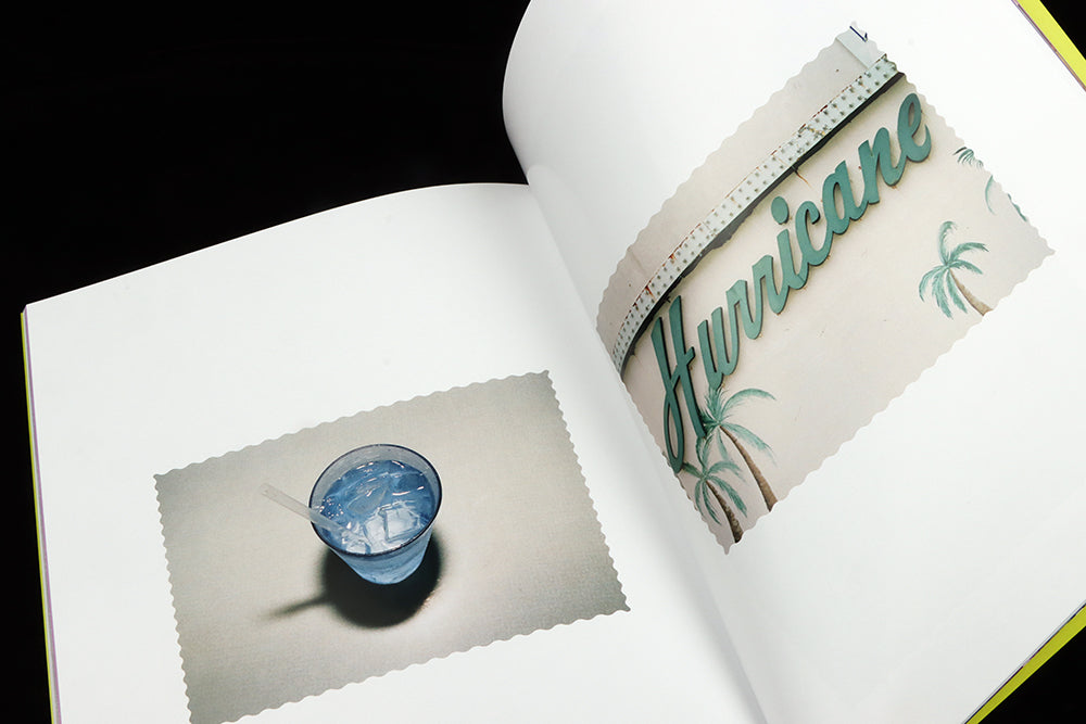
Such care over presentation of images is a central part of Scenic Views. A series of photographs from New Jersey are cropped with crimped edges referencing, but not mimicking, postcards (above); a wonderful collection of novelty teapots—the issue is worth it for this story alone—makes use of gingham backgrounds to hint at the tea table (below). ‘The danger with all these differently sourced images is that it could become a car crash of references. The designers strip them back and turn it into something that is still playful, but very readable’.

The biggest shift this issue is the choice of underground artist Stu Mead as the featured artist, a potentially controversial selection and far away from the cosy domesticity of Beryl Cook. Mead specialises in sexualised images of young girls (below). ‘There was a long discussion as to whether to feature him,’ Louise explained, ‘because he paints sexual fantasies, basically, and has faced backlashes over his career.’

Mead’s work sits alongside the sixties US underground comic scene. ‘We were careful to commission a writer to interview him who has a good understanding of that background’, says Louise, ‘and the resulting in-depth piece (by Breakdown Press co-founder Tom Oldham) provides context for the paintings. We were worried about what the reaction might be, but we decided ultimately that putting Scenic Views together as two women set the tone for how the paintings would be perceived.’
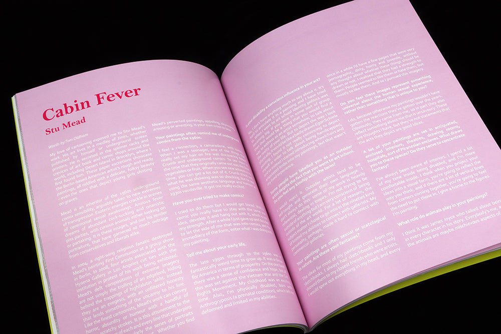
‘In terms of being an interiors magazine, we were interested in the way Mead pays attention to interior spaces, real spaces with different textures and details. It was really interesting what came out in the interview (above) as well, where he talks about how the nature of his disability means that he spends a lot of time indoors. Perhaps that is a reason that he has ended up choosing to depict interior spaces in an often domestic spaces in such detail.’
Scenic Views has always taken a unique approach to interiors, challenging assumptions about taste and asking questions of its readers rather than providing reassuring, aspirational answers. It’s good to see the magazine take this sense of challenge further. The conversation about what’s acceptable in art is an important one and Scenic Views is a good platform in which to start it, as from its title on, all its stories test the reader.
Are those novelty teapots amusingly naff or genuinely intriguing? Should we be proud of the interiors of our care homes? Does the way that party venues feature the same celebratory visual clichés provide a comforting shared nostalgia, or is the repetition just depressing?


