September 2015
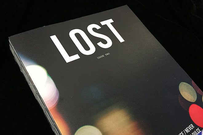
Lost #2
A previous magazine of the week here, issue two is just as strong, maintaining the creative and production standards of the first. Written in English and Mandarin, the magazine provides a unique insight into travel, with lengthy, in-depth stories of journeys and the belief in travel as a form of self-discovery. In stock in our online shop now.
lostmagazine.org

Platform #1
We get a lot of magazines sent to us that I’ve come to think of as ‘platforms’, blank canvases for photographers and graphic designers to show-off their talents. These paper-y platforms usually have a theme to shroud the fact that they’re a vehicle for creatives to test and hone their skills. There’s no smoke and mirrors with Platform magazine though – inside you’ll find a collection of creative work laid out simply against white pages.
platformplatvorm.com

Mirror Mirror #1
Mirror Mirror is a new beauty magazine from the Netherlands, a thick glossy filled with theatrical shoots, heavily designed spreads and sparkling jewellery. The fashion magazine market is incredibly over-crowded and we’ve seen this kind of aesthetic many times before, but the emphasis on beauty seems to be new (although last month we did feature issue 0 of another beauty magazine, Beauty Pages, in our Coverage). It’s interesting that fashion publications have started to focus primarily on smaller areas of the industry – but I’m unsure whether Mirror Mirror’s execution isn’t just an extension of a traditional beauty section to all the pages of a mag instead of just 20. The styling and shoots are well-crafted though, and its makers are obviously very knowledgeable about their field.
mirror-mirror.nl

Aus-Das Magazin #1
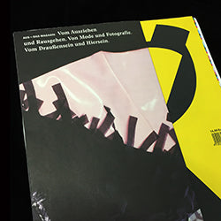
Published by the University of the Arts, Bremen, this German fashion and photography title offers students the chance to collaborate in sharing their work. As such it’s inevitably a mixed bag, but what is impressive is its large format with different-sized pages and folded parts. As such it is physically intriguing, the content less immediately engaging.
aus-magazin.hfk-bremen.de

Les Others #1
Les Others is a site about creativity and the outdoors, and this is their first print edition. The cover has a definite Another Escape/Cereal/Kinfolk quality to it, and with the theme of ‘Morning’ you can expect to see the magazine in lots of Instagram photos alongside cups of coffee. It’s a gentle and soothing read, with plenty of white space, warming illustration and sun-bathed photography.
lesothers.com

MITT #3
The third issue of MITT carries on where the first two left off; the neat pocket-sized spin-off fro the blog of the same name observes men of all ages, with an added Women of This Town section too. Neatly designed and produced, it’s a slim but interesting little mag that translates its digital origins into print well.
meninthistown.com

Aviation Historian #12
A very specialist title, but interesting because its founders have taken their experience and passion out of ‘big publishing’ and launched their own, independent magazine. 12 issues in they appear to be doing something right; it’s intriguing seeing what would once have been a traditional part of a large publisher’s inventory making a go of it in the indie world. Brilliant if aviation is your thing, but I’m not sure it’s going to win over other readers.
theaviationhistorian.com

Sirene Journal #1
Here’s a magazine for sea-lovers: it’s filled with articles about surfing, sand, whales and the future of the Pacific Ocean. The spreads are foam-white with occasional knotted illustration and deep blue photographs, and it’s aesthetic combines Cereal-like minimalism with Baywatch.
sirenejournal.com

SOFFA #10
Here’s another magazine from Prague, a city that’s flourishing with independent publications at the moment. Its theme is ‘Eternal Youth’, which it explores through art, design, recipes and lifestyle articles. Interestingly, it’s one of the few magazines of its size that I’ve seen with lots of big-brand adverts, and I enjoy that they have an entire section dedicated to classical music scores.
soffamag.com

Take #1
Take does a pretty good job of taking a fresh look at the New England region of the States. Its ambition and influence might best be reflected by the front cover art above, although two alternative covers are far more traditional in approach. Some nice art direction touches inside mean this is a title to keep an eye on.
thetakemagazine.com


