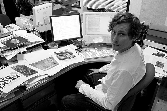
Simon Bainbridge, editorial director, British Journal of Photography
First published in 1854, the British Journal of Photography is the world’s longest-running photography magazine. For much of that time it was a weekly, but the title has been few a few changes in recent years, becoming a monthly, being bought by its publishing director and now getting a smart redesign. We catch up with Simon Bainbridge as the new looks settles down.
Where are you today?
It’s press day, and I’m back in the office after a few days in rural Latvia taking part in a photography masterclass. I’m musing cover options for our talent issue, ‘Ones To Watch’, passing the final pages, and fleshing out our August edition, which is a special issue devoted to photography education. There’s also a multimedia presentation at this year’s Photo España to think about. And I’ve just been given the go ahead to programme some films at Photo London next month.
What can you see from the window?
Our building was originally a print works for The Bank of England, so it’s a bit of a dungeon. To one side are the communal dustbins (it’s a far cry from Kate Berry’s view in your last ‘At Work With’). To the other a mottled view of an anonymous office block – a reminder that we’re on the front line between Shoreditch and the ever-encroaching City of London.
Are you a morning or evening person?
I’m the husk of a morning person in a nightbird’s body. I have a four-month-old baby at home, and a five-year-old. The morning began at 7am with a nappy change and the chaos of getting my oldest ready for school. But I’m rarely asleep before 2am.
Which magazine do you first remember?
I grew up with The Face. Everything in it seemed impossibly distant and exciting from small-town Chester. The photography and the mix of high art and popular culture is an inspiration to this day. But it never even occurred to me that I could be part of something like that. According to our school careers advisor, there were only two job options, depending on your academic abilities; a lawyer or a fireman. I imagined the people who worked on The Face were impossibly cool, and that wasn’t me. Years later, I saw Sheryl Garrett (the former editor) on television, and it was a shock. She was very bright, but no fashionista. And she’s a Brummie.
What’s your favourite magazine this morning?
During the prep for our redesign, I bought loads of magazines for research and inspiration. They ended up in a pile, so weren’t much of a reference point once we began, but the one I just rediscovered is AA Files. It’s dense, but I admire it’s uncompromising, paired-back design and the pacing of the illustrations. It’s beautifully executed. And I’m a sucker for all those magazines that look like postwar academic journals.
Who is your reader– how does the ‘British’ part count today?
Our focus is global, but it’s very much filtered through the perspective of a small team of people working together in a small office – albeit in one of the great international capitals of photography. I’m not sure we could talk about photography from a purely British point of view; it has a global lexicon understood by everyone (even if the nuance is often lost), and of course the market – and photography culture more broadly – operates at an international level.
Our readers are primarily practicing photographers and related roles in the creative industries. We don’t put the same emphasis on professionals as we did when we were more of a trade journal, in part because there aren’t as many of the jobbing ‘general purpose’ photographers operating these days. Yet we have thousands of graduates leaving college each year who are dedicated to photography, but most of whom will never make a living from it. Our focus is more on people who make signature images – be that through their aesthetic, their choice of subject or their particular approach. And that’s what most professional photographers trade on anyway. So, we’re more about the ideas behind images rather than the how.
Congratulations on the redesign. Tell us about the process behind it; did you go through the BJP archives or just look ahead at the future?
Thank you. We felt it was long overdue, even though it had only been five or six years since our last redesign, switching from the weekly format we’d employed for 150 years to a monthly. To us, that was a radical change. But you’re a little blinkered when you’re working in a very corporate environment – back then we were one small insignificant part of a financial media empire. Now we’re out on our own.
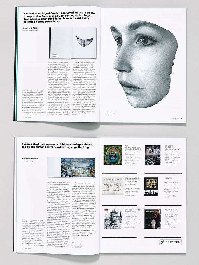
I went back to the original brief for the monthly format before setting a new one, and really it was about drawing on those first instincts, and pushing them further with an new visual identity – amplifying the visual content, giving more space to longform articles, separating text and image, bringing some of the élan and sophistication of the indies we admire to our readers.
We want to appeal to a younger readership, home and abroad, yet the design needed to respect the long heritage of the journal, and the authority that brings. We asked Bruce Usher to come in and work with our longtime creative director, Mick Moore, to bring a fresh pair of eyes. Bruce found lots of inspiration in our archive, though him being much younger than us, his idea of retro or classic was frightening, given he was referencing pages we’d worked on many years earlier.
In many ways we thought of it as an ‘undesign’, simplifying and decluttering the pages, especially the front cover, for which we wanted the option to run images full bleed as well as in a frame or combined with other pictures or graphic elements. We also set about giving the sections a better sense of identity and a change of pace.
The magazine can be quite serious, so we wanted the design to introduce some play and surprise, breaking from our regular font treatments for special issues and lead features. That’s also the thinking behind using four different paper stocks.
Inevitably, it’s a process of compromise. But in Bruce, we had someone with a great eye and impeccable taste. And in Mick we had experience and application – how to make visual ideas work in a grid, and make it fit within an extremely busy monthly workflow. Both have endless enthusiasm, which helps.
BJP has explored a few digital experiments and apps. What’s the current thinking?
We put a lot of time and energy into apps five years ago, and we’re still very much committed to them. But print is still the core of our business.
When we went independent three years ago, we launched a couple of digital-only titles, but we wouldn’t do that again soon without the backing to keep them going for more than a year while we built readership. The problem with apps is the storefront and the lack of visibility (it’s a problem for print magazines too, to a lesser extent). That said, our BJP app has doubled our subscription base, and nothing we’ve tried over the years has touched that. We’ve been able to harness our huge social media reach to reach out to a global readership. The timing worked for us, and the fact that we made a proper app, rather than a glorified page-turner (the prevalence of which has dampened enthusiasm for digital magazines).
Like a lot of other magazines with a long heritage in print, I don’t think we’ve ever got our website right, and we’ll be working on that next.
What are you most looking forward to this week?
No longer having immediately impending deadlines, and putting my family before my job. This may involve flowers, a lot more nappy changes, and many episodes of My Little Pony.
What are you least looking forward to this week?
Cartoon horses besides, the last day or two of production are a slog. And some of the best intentions and ideals are sacrificed in the final moments of getting the magazine out the door. And there’s all those bits of copy I’ve been putting off...
What will you be doing after this chat?`
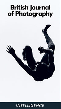
Arguing – sorry, ‘debating’ – the cover with my boss. We need some colour this time around. And of course it needs to be arresting, and to set us apart from previous issues and all the other photography magazines on the newsstand. It needs to convey the theme. It’s for our annual talent issue, so it should exude contemporary cool. And yet, to appeal to more casual buyers, it needs to be recognisable as a photograph that’s been crafted. For me, it’s a toss up between a full-bleed of Marton Perlaki’s photo of a blue head, or using Bastiaan Woudt’s black-and-white image of an African mask set in a colour frame, which is a treatment we plan to use occasionally, but haven’t so far.
Let’s see if I get my way...


