

Spiral #2
We’re often asked what the criteria are for stocking a magazine in the magCulture Shop. Our latest Magazine of the Month offers an ideal demonstration of what we’re looking for.
On the launch of its first issue last year we noted Spiral was the first indie we were aware of about American football; we also praised its physical appearance, its design, and its range of stories.
Issue two matches the first on every level, reflecting founder Shawn Ghassemitari’s comment when I asked him what he had learned from that launch issue: ‘If you don’t truly love print or the community you speak to, you won’t last, simply because hardly anyone in publishing makes money from it.’

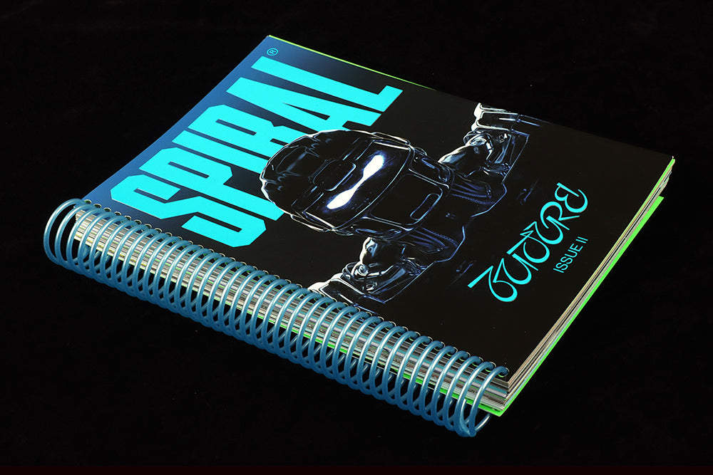
First up, its physical presence is again impressive; spiral-bound, this time with a vivid blue binding echoed in the rich, high-gloss cover. The title text and theme (Future) are both embossed and overall the cover is stronger than issue one—stronger and in glorious contrast to that issue’s orange identity (above). The blue continues through the issue, used on the doiuble-page section openers (below).
Held in the hands, the relatively small physical footprint of the magazine is contradicted by the heft of its 230 pages. It feels special, and the way the pages slip and slide on the binding adds a satisfyingly tactile quality. All of these considerations are important, whatever format a magazine settles on.
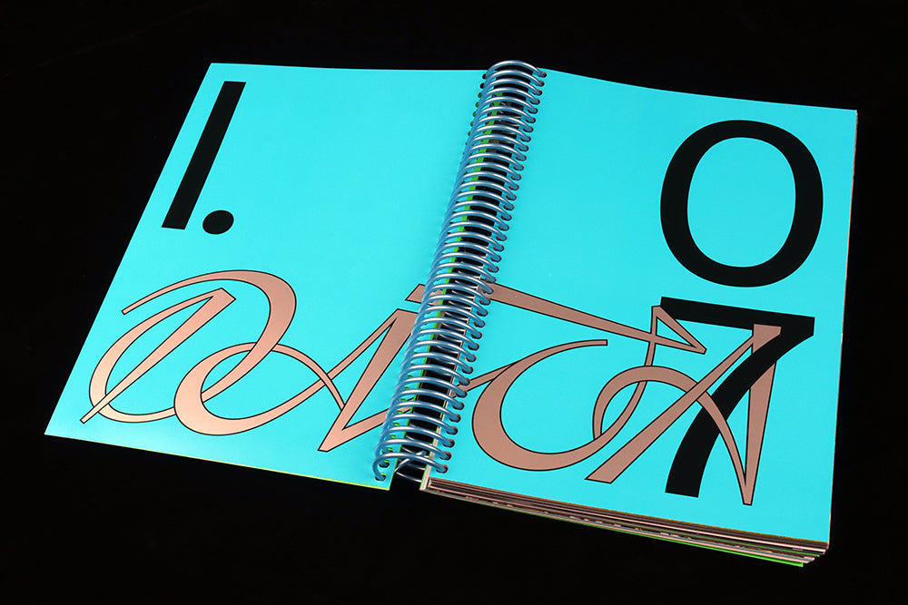
Today more than ever, a print magazine should make the most of its physical identity. The page designs are impressive throughtout Spiral but just as important here has been the decision-making about paper stocks, extra colours, effects. These can be expensive of course, but the point applies even to a simpler production. There are always choices to be made, and we love a magazine that relishes its physicality, that feels magazine-y.
A particular strength of Spiral is the way that its graphic design and art direction are tightly interlocked with its physical design.
The two front covers to date demonstrate a clear sense of visual identity: the bold title that refers to its binding, the head and shoulder image of a footballer that clarifies what the magazine is about in a manner just as strong as slapping the words ‘American football magazine’ across the cover would, and the powerful piece of bespoke typography announcing the issue theme. Different in many ways, the two covers have enough in common to work as a series. We can already sense how future issues will look.
 Graphics and typography are an essential part of any magazine and Spiral gets them right; a headline takes over a whole spread (above, taking advantage of those smallish pages), firmly expressing the meaning of the words. A powerful, bold use of typography, but I also like how the subsequent story—discussing the problems facing female game officials—is illustrated with gentle pencil illustrations (below) in complete contrast to that opening type.

The magazine is split into four sections, starting with Data, then Code, Ideas and finally Q&A. Each has distinct parameters, but writing-wise it’s the Q&A section that is perhaps most impressive.

‘As we’re just on our second issue, the response is still young and growing within the NFL/NCAA community itself,’ says Shawn, ‘But it was amazing to interview Chris Godwin (above), who recently won a Super Bowl and who like many players in the league look to pursue their creative passions once their playing days are over.’ It’s intriguing to see such players mirror those of the new generation of English football (soccer) players in their desire to be more than just wealthy athletes.

Alongside the writing, the images throughout the issue are strong and varied too. Besides those gentle pencil portraits, there’s brighter illustration including a series of pop art renditions of the golden era of American TV (above) which drive home how American football grew in popularity with the sixties rise of television.

A more contemporary example of the intertwining of sport and culture is a visual history of video game version of American football. This uses only screengrabs from the games—ranging from 1989’s John Madden Football (above)—but they’re spread across the pages like your computer desktop, complete with drop shadows. A great example of how to make the most of simple imagery.
As with many sports, the loyalty to your local team is being tested by the introduction of personalised fantasy teams made up of players from all the teams in a competiton. ‘As the world becomes more connected, perhaps shedding our loyalties just a little, is a good thing.’

This is beautifully illustrated with a series of composite team logos (above). A strong creative idea, but one that could easily have been mishandled. Instead the nine composite logos are perfect; I don’t know enough my American football teams well enough to identify individual parts, but I can spot recurring themes and colours. Each one is a beautiful thing in its own right, and matches my limited visual knowledge of the sport.
There is also plenty of game photography in the issue, ranging from Andy Kenutis’s action shots from stadia emptied of spectators by Covid, to Pelle Cass’s composites showing repeats of each player as they move through time.
The secret to Spiral’s success is twofold; first it makes great use of all the forms available to the magazine maker. Starting from strong writing and editorial ideas, and with a passion for his subject, editor/founder Shawn Ghassemitari harnesses great typography, photography, illustration and design. Few magazines are as successful in ticking so many boxes that help us say ‘yes’ to stocking it.
Secondly, it looks at its subject in relation to multiple other areas of cultural activity. Anyone disinterested in American football can easily find themselves sucked into the broader cultural scope the magazine encompasses.
As Shawn told me,‘The team and I are just excited to keep growing, building, educating and elevating the culture of the game both at home and abroad.’ His publication does just that, which is why we’ve selected it is our Magazine of the Month.
Editor-in-chief and creative director: Shawn Ghassemitari
Design and art direction: Forth + Back