The Best of Nest
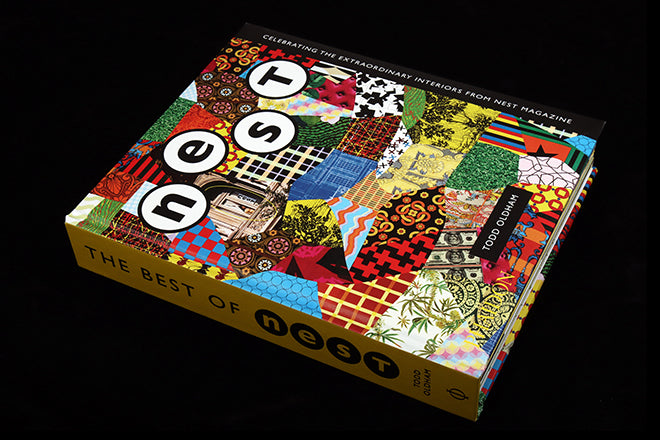
There is currently a mini-boom in retrospective collections of dead magazines. The latest is this much-awaited book, a collection of pages from US interiors mag Nest.
Few magazines deserve such a fabulously produced memorial. Between 1997 and 2004 there were 26 issues of Nest, and as the book’s editor/designer Todd Oldham points out in his opening essay, ‘The title of this book is wrong. There really is no best of Nest… all of Nest is the best.’

Yet an edit had to be made, and while selecting 16 pages from each issue may seem an inappropriately tidy editorial device – the magazine was many things but systematic and simple are not words that spring to mind – it makes perfect sense from a production angle.

The magazine was renowned for its physical characteristics as much as anything, and those 16 page sections – the natural number of pages to fit a single printing sheet – mean the original print and finishing effects used on each edition can be faithfully reproduced.

The result is seriously imposing: 45mm thick, with a padded cover and so little white space on its pages there was surely a surcharge for ink coverage from the printer. The 26 issues run chronologically, opening with the front cover, the pages trimmed as they originally appeared: curves, angles, diecuts and fold-outs are all included.


The page layouts and typography actively competed with the visually rich photo stories, positioning the magazine at the opposite pole to the likes of fellow new launches Wallpaper and Frieze.

The founder of the latter, Matthew Slotover, wrote to the magazine, very much missing the point. ‘It pains me to think of the money that must have gone into the rounded corners, drilled holes, and samples of fabric and wallpaper. Nice try, but for me they weren’t worth it… More generally the art direction is too much.’ Rem Koolhaas wrote of the design, ‘a curious hybrid of amatuerism and calculation, its seeming arbitrariness a potent rebuke to current graphics…’

The books’s editor/designer Todd Oldham’s treehouse featured in issue 14
The magazine’s editorial and design visions were strongly matched, and remain unique, a complex combination of vernacular decoration and modernist idealism. The magazines arrived quarterly as if from another planet and the book retains that other wordly feel. Oldham is correct, an edited version of the collected issues is inevitably incomplete, yet it still convinces.


The magazine’s masthead began in more traditional fashion (top of the post) but evolved issue by issue, for a period including a birds next as its central motif
Over the years, some mystique has built up around the reason founder Joseph Holzmann ended publication of Nest in 2005. Announcing the closure in issues 26’s editorial letter, he challenged others to take up where Nest left off. Among those who have taken that challenge since are indie touchstones Apartamento and MacGuffin.

Holzmann’s silence since then has only served to add to the questions, but here he opens up. The book finishes with an issue-by-issue commentary from the founder, a series of reflections that make vital reading for today’s publishers. The orginal editor’s letters are reproduced alongside new notes, and you can sense Holzmann’s shifting concerns in his letters.

Broadsides about the state of ceilings merge into the realities of publishing: the importance of subscribers (a brilliantly desperate subs ad is included here, above), the desire for corporate support, the launch of product ranges, an internship programme.
He reminds us that the internet had by then arrived, and with it an ocean of free content. Nest continued to ignore digital photography, prefering to be ‘a dry island of the real,’ as it celebrated print and its myriad physical possibilities.

There are several levels on which to assess this book. First, it’s a fabulous object in its own right; the reproduced pages still stand up as more than a retro time capsule. Second, those same pages act as a strong advocate for the magazine format, reminding us of the power of a strong editorial vision, and yes, that role as time capsule.
Lastly, the back section is a brilliant record of the ups and downs of self publishing, that difficult coming together of ambition and reality.

One of the best-known stories the magazine ran appeared in issue two, about living in an igloo (above). Holzmann’s comment here neatly sums up his approach: ‘I was always curious about igloos – what they were like inside. You only saw them from the outside…’ That curiousity shines through every aspect of this wonderful book.


