

The Gentlewoman #27
The days are getting longer, the weather’s warming up, and a new issue of The Gentlewoman is on our shelves. It must be Spring! To mark this happy shift, we asked the magazine’s creative team to select five key moments from their 27th issue
Penny Martin has edited the magazine since its 2010 launch, while this is art director Merel’s debut issue. The three of us spoke on Zoom—Penny is based in Scotland, Merel in The Netherlands—and before looking at their selections, we discussed how they had approached the new issue. In particular, the controlled chaos of magazine production and the need to reconsider the details every issue.
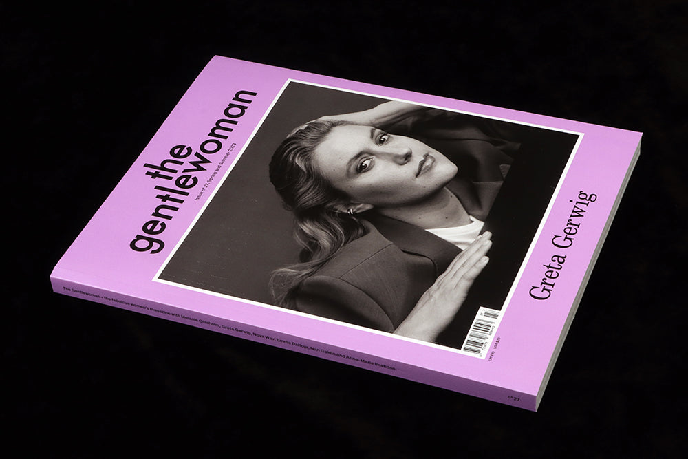
The central feature of every issue of The Gentlewoman is the cover star—or sitter as they refer to their subjects. Their use of celebrity sitters is perhaps the most traditional aspect of a magazine that has reinvented the woman’s press in so many ways. It’s a powerful part of their identity—each issue is announced by a cover reveal a week ahead of the on-sale date and social media is cleverly used to push the news.
The choice generally switches between a lesser known face one issue and an A-list celeb next; for issue 27 they interviewed and photographed film director and actor Greta Gerwig, a sitter who perfectly intersects those two options. A perfect Gentlewoman cover, Gerwig is at the inflection point between known figure and superstar celeb. ‘It was important to get a writer and photographer that fitted her and the way that we wanted to present her,’ Penny explains, expressing dismay at the all-male Best Director shortlist at the recent Oscars. ‘We wanted people to think this is our Scorsese and not some kind of minor curio.’ The black and white portrait by Jody Rogac presents Gerwig in a serious, directorial light.
That’s the creative part, the enjoyable part, of creating a cover: working out the editorial angle, identifying the interviewer and photographer, making it happen.
But if you think finding the right sitter is simple, think again. ‘Most people probably understand that it’s not just a case of coming up with a list, and everybody says yes, and it happens,’ Penny explains, ‘But they wouldn't believe that editorial meetings keep happening all the way through the season, every week.’ This is the chaos of editorial work, building an issue from a wish list and seeing it crumble then reform in front of you. ‘It's a sort of dynamic equilibrium,’ adds Merel, ‘right up until the end, when it all drops into place, almost like a moon landing. You constantly have to re-evaluate the features that you have, the range of people, and whether the balance is right.’
The magazine’s flatplan is designed to provide structure for both the team producing it and the reader. It follows a specific arc. ‘We open with brief conversations. Then you get depth. And the final part is a kind of escape, pure aestheticism,’ explains Penny, ‘We've always enjoyed having that structure rather than mixing things up. Maybe it just says a lot about us that we like order.’
But before getting going on the issue, Penny and Merel met to look back over recent issues. ‘We’ve got 13 years to pick and choose from,’ says Penny, ‘It’s really important that you don't throw anything out unthinkingly for the sake of novelty, but you know, actually the task is always to be renewing, renewing.’
Here are the five parts of the magazine Penny and Merel selected for our conversation.
 One
One
That three-part structure is always announced by a set of full-page chapter headings. The make up of these pages changes every issue; they have often been bold and graphic, but this time subtle images and delicate texts are in deliberate contrast to the rest of the magazine. Alesandro Furchino Capria’s images were selected before words added, as Merel reveals, ‘We thought it might be nice if something completely abstract could come in, a moment of semi-randomness in an otherwise very deliberate and intentional magazine’.
Penny: ‘They’re supposed to wash over you in a kind of sensual way.’

Two
Immediately after that first chapter heading we meet Sophie Carbonari. This is our first sighting of the magazine’s new headline typeface, Trainer Grotesk. ‘There’s a pleasant sort of clunkiness to Trainer that offsets Ilya Lipkin’s very present and really feminine portrait,’ says Merel. The balance between text and image is very much in favour of the portrait. ‘The photography gets really up close and personal, the incentive is to not have to say someone’s name large, but have the reader be pulled in by a really nice portrait from up close. This is something that we love to do.’
 Three
Three
A recent format added to the magazine is a series addressing traditional women’s magazine subjects—Penny mentions women drinking alone, and women’s public toilets—where it’s not about avoiding a hackneyed subject but rethinking how to approach it. ‘There was this fallacy that in the lockdown, everybody got rid of their bras,’ says Penny, ‘That’s as bad a myth as the story that people burnt their bras in the sixties—they never did. Almost all women use them—this idea that we can do without a bra is super-pernicious.’
The graphic treatment here is important, immediately setting a different tone for a subject which in another magazine might feature a model in lingerie. As Merel explains, ‘I love the idea of a page being dipped in ink—there’s a front and a back here, both solid blue with a graphic still life image. It celebrates print, it has a zine quality.’ Text on the left adds to that effect, partly in the same blue, and the almost abstract, short word of the headline. Merel continues: ‘I love using a short, almost abstract word like bra to announce an essay. I think that’s funny.’
It’s also an example of another deliberate move in the issue—a more purposeful change in typographic volume on the pages. In recent issues the page furniture—headlines, pull-quotes, standfirsts—have all been low key. Here, the Sophie Carbonari story is relatively quiet, but here we see the Trainer typeface in a larger form.
 Four
Four
The opening spread of the Nan Goldin interview is bolder still, relying on her name and a typically candid Wolfgang Tillmans portrait. The image is used exactly as supplied, it arrived with very specific cropping instructions. ‘It’s a very welcoming image, says Merel, ‘See how he seems to crop off very mundane sort of details in the background? There’s a certain reality.’ That crop also means the image doesn’t quite fill the page, there’s a white border down the gutter. ‘The slight change of format is a nice change in rhythm. It works within the bigger order of the magazine.’
As well as a series of portraits of Goldin, Tillmans also supplied the second image shown here, a scene from her apartment that functions almost as a still life. Another magazine might have ignored it, or run it small, but here it takes up a whole spread.
Merel: ‘It’s a classic Wolfgang still, but it’s also a reference image… it’s presented as a selected photograph, not as an afterthought.’ It encompasses the story of the recent movie about Goldin, ‘The Beauty and the Bloodshed’. The bell jar is full of empty OxyContin bottles, the Golden Lion trophy is a gift from director Laura Poitras, and the portrait is of David Wojnarowicz, who features in the film. Merel stressed this wasn’t a set-up scene, but shot as found by Tillmans.

Five
At the back of the issue is the fashion, represented here by a shoot featuring i-D’s global editorial director Olivia Singer. Famous in fashion circles for flamboyantly wearing black clothes to the biannual fashion shows, Olivia is caught static in a series of black outfits. ‘Olivia posts carousels of herself in different black clothes on Instagram all the time,' adds Merel. It’s interesting to see that translated into a magazine in a very classical, gentle way. It’s very goth.’
Does Penny worry about addressing the fashion industry rather than the reader? ‘Our 25-year-old graphic designer and our 45-year-old businesswoman can both relate to Olivia.’ It also relates back to the basic rubric underscoring the world of The Gentlewoman: ‘To bring fashion into the real world and the real world into fashion.’