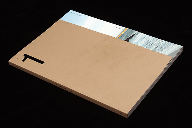
The Modern House #1
Online estate agancy The Modern House launched in 2005, initially specialising in modernist houses and apartments. It has since expanded its scope to feature good design from other periods too, celebrating the idea that well-designed living spaces help our wellbeing. And this month they’ve launched their first print magazine.
With a background in design journalism, The Modern House founders Matt Gibbard and Albert Hill note in their introduction that they’ve ‘always fancied ourselves as magazine editors.’ They may have achieved that ambition a little sooner had Covid not intervened – after two years planning, the magazine was originally due in April this year. But this week it’s arrived at last, and it’s a beautiful thing.
Put together by The Modern House in-house editorial team and designers Studio Small, who’ve also recently rebranded the whole company, the editorial reflection of the TMH brand will immediately appeal to anyone used to poring over their website; though it’s worth noting it may also repel anyone who struggles with the commoditisation of Modernism (more here).
But if you’re going to produce a magazine iteration of TMH, it has to hit the right tone in every sense, and here we have a magazine that does just that.
The mood is quiet throughout; the cover image of a coastal landscape is almost totally covered by a flap of brown paper, an embossed ‘1’ the biggest typographical element on the page. The name of the magazine appears at about 8pt in the top right corner. The various papers are by Fedrigoni, the print by Pure Print.

Open the cover, and the contents are listed in a single column of delicate serif type (above). This is typical of the design throughout, subtle and unshowy.

There’s a strong editorial mix here; yes we visit properties and meet the owners (each marked by double-page co-ordinates, above, the largest type in the entire issue). Several subjects are design celebs – the head of CSM, Wayne Hemingway’s daughter – and the editorial formats vary nicely, covering profiles, Q&As and first person. As well as this core content, there are also diversions around gardening tips, recipes, restaurants, property advice – in this case about green living – and design history (Marcel Breuer’s Cesca chair, below).


The inevitable fetishisation of the analogue – this close-up (above) of a collection of vinyl, for instance, and a list by Alice Rawsthorn of her favourite design books shown on her bookshelves (below) – is balanced by a dedicated Spotify playlist with access code.

As Allie Boalch, one of the team behind the magazine explained to me, ‘Everybody at The Modern House loves print, we see the magazine allowing us to expand on the type of content we can do online.’ In short, there’s more scope for a softer type of editorial content that adds a deeper character to the overall brand. For now, the issue id available direct from the publisher or via a few magazine shops, including ours.
This is a really accomplished launch issue, a piece of brand publishing that has the confidence in itself to rely on strong storytelling in words and pictures rather than big logos and overt visual branding.
Every aspect is well considered: the writing, the imagery, the design and physical production. This dedication to quality makes it our Magazine of the Week.


