The redesign of Elle magazine

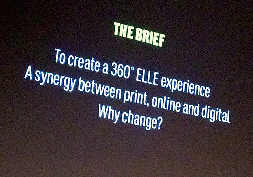
I’ve had a copy of the newly relaunched British Elle sat on my desk for a while now as I considered the drastic change the magazine made between its February and March editions. I always liked Marissa Bourke’s previous reinvention of the Elle brand as an upper-mid market style title, and was surprised by the change of direction. But last night in London new creative director Suzanne Sykes and design consultant Mark Leeds talked through their redesign for EDO members and clarified the changes.
Sykes comes to Elle after a stint in New York at US Marie Claire, and before that had launched Grazia in the UK. Leeds specialises in helping redesign projects, perhaps most strikingly working with Richard Turley on his reinvention of Bloomberg Businessweek.

The first thing to note is their joint presentation. Speaking together, it was easy to see how they co-operated in reinventing Elle. It made a relaxed change to the more usual ‘hero’ mode of single speaker talking through their work. Here we got a sense of their respective roles and how they collaborated, as well as an insight into what they had each learned from the other. They chatted their presentation, and it worked.

The second refreshing choice they made was to concentrate on the detail of making magazines. Just as when preparing a portfolio it is tempting to mainly include big feature spreads for their drama and excitement, so speakers tend to rely on the big stories. Last night, led by the explanation of their thinking, we saw plenty of hardcore detail. From examples of early research (typographic and grid examples above) through to the complex grid designs prepared by Leeds (below), there was no doubting the detail that underpinned the project. Organised by EDO, the event was held in partnership with (and held at) Central St Martins and talking to students afterwards this attention to detail had made an impression.

Although initiated as a print redesign, a key part of the project is to recreate Elle as a fully print-digital experience. Research shows the Elle reader is very digitally minded (apparently one in four write a blog, for instance). At present this exists primarily as calls to action on the pages, with section heads presented as Twitter hashtags (below) and constant directions online.

I particularly like the simple device of reproducing a video still as if in a browser (below). No big deal, yet visually effective and instantly recognisable.

That complex grid allows items to float loosely yet still hang together. As a result, pages are intensely busy yet structured, and spacious with strong horizontal and vertical elements (below). It’s difficult to just pull out a few spreads and show the complete look and feel, the actual magazine feels far more finished than a few pictures can demonstrate. The use of colour and modern mix of fonts – Sykes admitted there were more fonts than she might usually use – is a sea change from the previous austerely stylish use of monochrome Baskerville.

Aside from a few elements of the typography – the extended ‘R’ on the front cover (below) feels old-fashioned to me – it’s a remarkable reinvention not just of this magazine but of the women’s monthly. Leeds’s typographic detail combines well with the sophisticated brashness reminiscent of Sykes’s work at Grazia. At a time when the editor–designer relationship is more important than ever it’s worth noting that a single editor, Lorraine Candy, has overseen both reinventions of Elle.

Given the short redesign process the project remains a work in progress, but it’s hugely exciting to see what was already a well-designed, typographically sensitive magazine jump into a new space so convincingly. It’s going to be fascinating watching how the print monthly develops what Sykes described as its hero role for the brand, particularly as the creative team moves on to their app (currently a Pixelmags project) and website. ‘We’re aiming at selling off the page,’ was one remark from Sykes I noted. The biannual fashion spin-off Elle Collections will be next for reinvention.
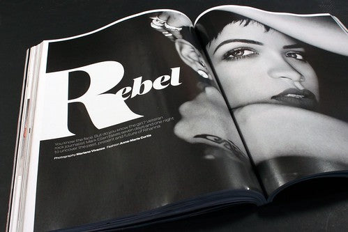
And finally, of course, there are some big features page, the April edition leading with Rihanna shot by Marianno Vivanco (above, below).


