The Shelf Journal #4
There are some magazines that deserve coverage here every issue, but they land so regularly that it’s just not possible. Then there are those that appear so irregularly that a new issue is always worth a post. The Shelf Journal is one such title – issue three apeared two years ago, so it’s a pleasure to highlight the arrival of issue four.
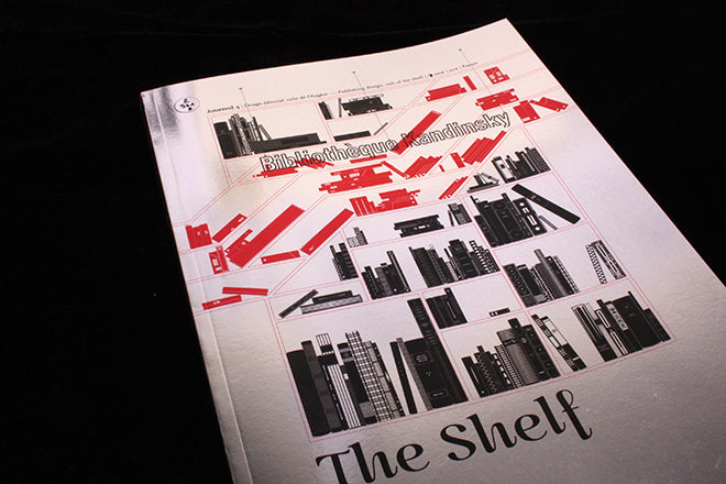
Dealing with publishing design means you have to live up to exacting standards and as ever this French magazine does not disappoint. Every new issue uses a different binding/finishing and this one comes in a reflective silver cover. When such stock is used there’s often a gimmicky mirror trick or reference, but here it’s just gives the magazine a strong shiny finish, echoed by the metallic silver page edging (above).
Each issue the shelf graphic on the cover fills up with the new books and magazines featured in the issue; we asked last time what might happen when they run out of space and the editor/designers Colin and Morgane have headed off that problem here. The issue is based on items discovered at the Bibliotheque Kandinsky, housed in the Centre Pompidou in Paris. So the new cover features publications cascading across the shelf visual (above), a visual nod to the escalators of the iconic seventies Pompidou building.
Inside, the page design continues where it left off last time; a beautifully intricate design that is highly decorative without distracting from the many visuals of the works displayed. The featured publications all sit on graphic representations of shelves, this time in red (above).
The issue has less about magazines this time, but there are plenty of strong stories including a look at the sixties modernist book designs of ABC Verlag (above); a highlight of a team pick selection at the end of the issue are these Prisunic catalogue covers from the seventies (below).
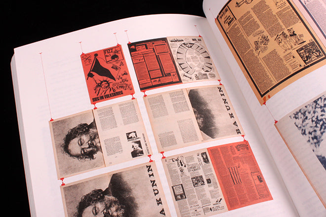
In complete contrast, the issue looks back at German anarchist newspapers Agit 883 and Fizz, (above and below). In a minor update to the ‘shelf’ decorations, the pages here are hung from clips – the pages are too large for shelves.
The Shelf Journal is a beautifully produced, well designed and, importantly, well written magazine that takes its subject very seriously. If you’re at all interested in publishing design you’ll get a lot out of it.


