

UK Esquire relaunch
Mainstream magazines are increasingly adopting the qualities of the independent magazines: a slower publication schedule and better production values, for instance. The latest iteration of UK Esquire is a particularly overt example of this shift.
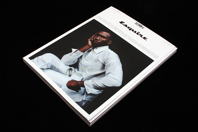
The new magazine is bigger, calmer – check the cover design with its framed portrait of Mahershala Ali and a notbaly reduced logo – and will appear six times a year, down from twelve.

Overseen by editor of eight years Alex Bilmes and creative director Nick Millington, and taking 18 months to complete, this latest move is the most distinctive that the title has made in its 28-year history.
Launched in 1991, the UK edition of Esquire has never quite found a definitive position in the men’s market, despite outlasting titles that flew higher in their time, such as Arena, FHM and Loaded. This relaunch sees the magazine turning its sights more towards the likes of Man About Town and Port.


‘We are huge fans of many of the indies,’ Nick told me, ‘We feel we have married the high production values for which they are rightly celebrated, plus a clean, modern design aesthetic, with the rigorous journalism and the great writing with which Esquire has always been associated.’ That marriage is evident in these images, which present an austere simplicity of design: text pages are heavy with words, images occupy full spreads (such as this exclusive shoot by Martin Parr, above).

As well as visual references to today’s indie mags, the design also nods towards the early days of Esquire itself, launched in the US in 1933. That era is a common reference for indie mags too, a time when a more basic technology limited the layout options. The inclusion of extra elements to break up the columns of text (like this poem, above) emphasises the reference.

The new Esquire also mixes paper stocks like an indie, a back section appearing on an uncoated stock. This section includes a piece of fiction by John Lanchester, printed salmon pink to give the appearance of a coloured paper stock; again, very indie and very sixties Esquire. Perhaps most importantly, the changes establish very obvious clear space between Esquire and GQ, the two remaining non-specialist mainstream men’s titles in the UK.
It remains to be seen whether the direction works, but the team are rightly proud of the bold new direction. Esquire now feels like a celebration of print, a magazine to be coveted and collected. ‘We think it’s a best of both worlds situation,’ adds Nick.