


Vestoj #11
Sitting among the shiny, glamorous fashion biannuals on our shelves are an increasing number of written fashion magazines built on analysis and critique. Chief among them is (the very occasional) Vestoj, from Paris.
Issue 11 of Vestoj—the name means ‘clothing’ in Esperanto—has just been published, and as ever it consists of a brilliant collection of writing from a varied selection of contributors on a single theme: this time, Every Day Life. To honour its rare arrival—issue 10 appeared over 18 months ago—we’re pleased to assign it our Magazine of the Month for June.
As we’ve noted before, Vestoj bridges visual the gap between the serious academic journal and the pure fashion magazine. The text-led nature of the content means it is wordy, but designed in an accessible manner—legible and clear. Scattered among the pages are full colour images that clarify its fashion origins; these are less illustrations of the text than intelligent additions to the story being discussed alongside them. The advisory board listed at the start of the issue explains in part why the magazine is so unique: among the names are Nicholas Schonbgerer from Nike, king of fashion writers Tim Blanks, Liz Wilson from the London College of Fashion and Hamish Bowles, the fashion editor’s fashion editor, currently at World of Interiors.
Previous issues of Vestoj have made more of their physical presence, with fold out covers and the like, but this is one arrives satisfyingly direct and bright, that bright yellow and bold title perhaps emphasising a sense of everyday-ness.

The first image of the issue is this tragic shot of a dropped ice cream cone sitting upended on a street, symbolising how the special can quickly become disgusting. This is a thread that runs through the issue, particularly in Seamus Khan’s piece ‘Dirt is a Matter Out of Place’. Khan starts by looking at how Burberry reacted to their famous check becoming ‘too popular’, meaning popular with the wrong sort of people—the working classes. There follows a broader, fascinating discussion of cultural appropriation.

A more direct story of the everyday is Ruby Hoette’s notated series of pictures of lost clothing—items found on the street, hanging from fences, tucked into corners. Anyone in a big city ignores similar items every day; here, Hoette describes each item in heroic detail, imagining a story out of each one.

As a person who generally dresses in full black, I enjoyed Eran Dorfman’s piece ‘Black Clothes, Colourful Life’ (above). Again, context is all: what stands out in one situation recedes in another. ‘Black is both standing out and fitting in’. Sounds about right to me!

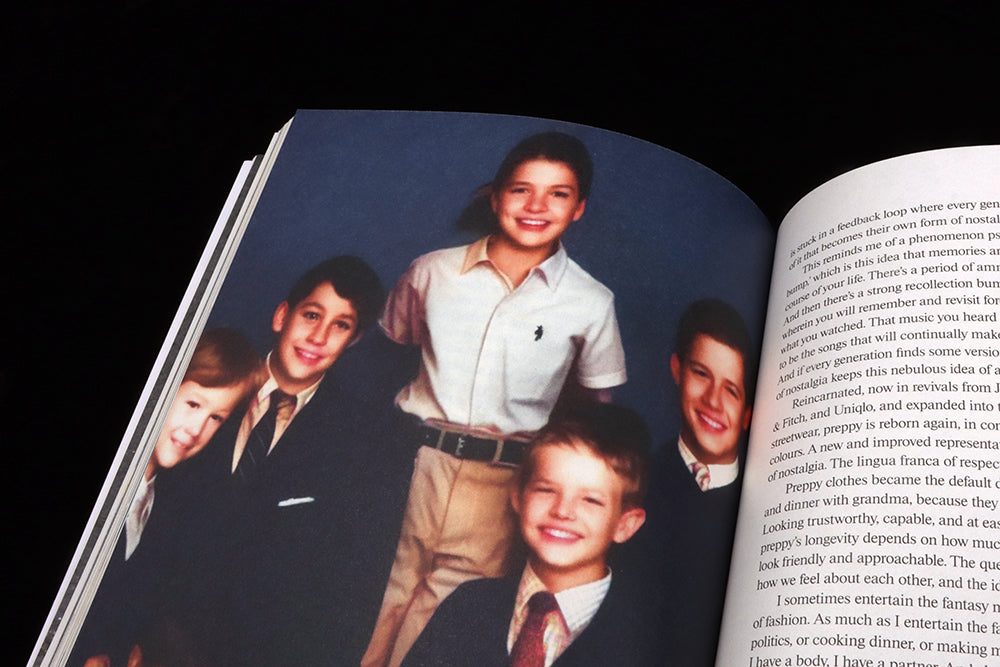
No serious magazine today can avoid a reference to AI, which duly arrives on page 92 with Avery Trufelman’s ‘Ivy Forever’. Her history of the enduring nostalgia of the Ivy League preppy look is accompanied by a ghostly set of images created by photographer Zachary Ohlman using generative AI (Zachary is also one half of the magazine’s new creative direction team). Each feature the same set-up of a young people showing off their preppy gear, their appearance changing presumably in response to the AI prompts used by Ohlman. It’s quite eerie.

Another series of images that has a similar effect is a collection of people in biohazard suits used alongside Hazel Clark and Alla Eisenberg’s brilliant essay (above) about what we learned from wearing cloth masks over the Covid-19 years. What was once unthinkable remains normal today, but the carefully selected images accompanying the piece remind us of our pre-Covid-19 fear of covering up.

The design of the issue is simple and clear, a little drama added by large, tightly letter-spaced headlines. Alongside these, and on the spine and at other random moments, there are a series of colour squares that are sometimes tiny, sometimes taking up a full page. I imagined there to be a logic, or code, in these shapes but apparently that’s not the case.
Editor-in-chief Anja Cronberg told me that the magazine has a new design team in place (Ohlman Consorti), who explained that, ‘The squares are meant as a decorative element. We used the squares as a graphic signifier beyond the written word and photographic iconography, an illustration devoid of style’. They certainly add a subtle identity, one I’m intrigued to see develop in future issues.
But sooner than 18 months please.
vestoj.com