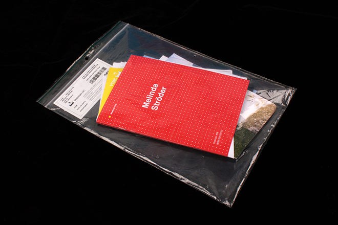
Voortuin #29
The majority of the winners at the recent Stack Awards were familiar to us at magCulture, but one magazine stood out as being very much unknown: Dutch title Voortuin, winner, best art direction for it’s spectacular issue 29.
The magazine is published every two months and runs an open submission for a different theme each time. For this issue, editors Sim, Nanda and Tom invented a medical patient, Melinda Ströder, and asked for submissions about her that would be added to her ‘medical file’ – the magazine.
The result is a crowd-sourced story of the imaginary Melinda, presented as a set of different documents: letters, files, air tickets, conversations and images. This set of parts is presented really cleverly; although bound together as a magazine, each page has been cut at different angles so even though saddle stitched together the impression is given that we’re dealing with a pile of individual, folded sheets.
The team have also been careful not to slavishly mimic the graphic stylings of the different artefacts. The same font – Helvetica – is used throughout, but is subtly adapted to different situations. Thus the whole thing hangs together as a unit rather then ending up a melange of stylised pastiches.
That explains how the physical and visual parts of the magazine work; editorially, the abstract nature of the storytelling is held together just tightly enough to make sense but still loosely enough there is space for the reader to add their imagination. It’s a delightful magazine, light and heavy, funny and serious, that relies on a curious reader.
Hear from the Voortuin team in our next magCast, coming soon.


