

Wrap #13
Magazines sometimes disappear from view, and you assume they’ve gone forever. One such was Wrap, the magazine about illustrators and their work. So we’re delighted to see it return, better than ever, after a four-year hiatus.
Four years is a long time, but founders Chris Harrison and Polly Glass haven’t been quiet. If you’ve bought a greetings card recently, chances are you came across their large range of happy, brightly coloured, illustrated cards. Perhaps you don’t even know about the associated magazine, but that is where the Wrap brand started.
Chris popped by magCulture HQ recently to tell us about the new issue, their thirteenth. He explained there was no single reason for the four year delay; the pandemic impacted their stationary business of course, with shops closed, and he and Polly started a family. But the magazine was always due to return—it just took longer than expected. ‘We hope everything we do is inspirational, whether it’s a card, something we post on Instagram, or the magazine. We want to present people with the best of what’s out there’.
The magazine is the most explicit channel for that, its large pages presenting a mix of commissioned and existing work from illustrators working to a theme (in this case Paradise). And as always it includes five A2 foldout artworks designed as wrapping paper—the origins of the name and a key part of its reputation.
I asked Chris to highlight five things from the issue and this is what he chose.

One
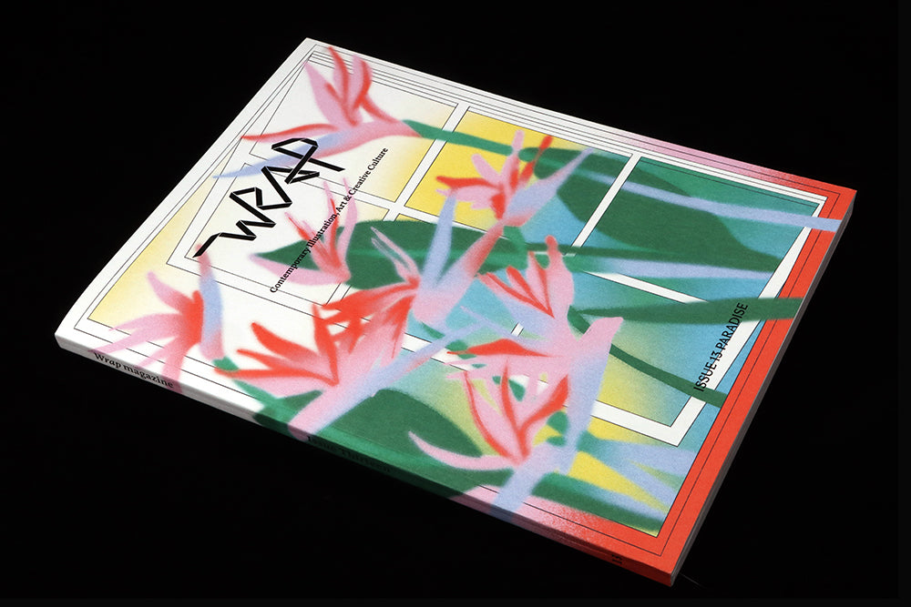
There are two front covers, both by French artist Marine Buffard, plus a limited edition lenticular version (above). Chris: ‘We love Marine’s blurry spray style, and we thought that’d be really appealing for a cover. We try to feature people’s work in the best possible way, and as she also uses her iPad to create animations, the lenticular cover seemed like a good opportunity to make something special and capture a sense of what she does.’ Most lenticulars animate by moving left to right; this one work more smoothly by animating top to bottom. ‘As soon as we flipped it, it became this beautiful nine-frame animation.’ It’s far better IRL then this quick GIF shows.
 Illustrator Laura Burke at work.
Two
Illustration might be a very obvious part of Wrap, but Chris chose it to emphasise again his and Polly’s desire to show off illustrators and their work in the best possible way. ‘We want people to be proud to be in the magazine, and feel like they’ve been presented in the right way.’ Over the ten years of publishing, he and Polly have seen how illustration as a form has changed, ‘It’s definitely turned into more of an art form. That’s the beauty of keeping it as the mainstay of the magazine. It becomes a document of the time and space of artists and their work.’

Three
An interview with photographer Thandiwe Muriu is designed to echo the visual tricks of her series of images titled ‘Camo’, in which people wearing African patterned textiles disappear into a background of the same fabric. Headlines use a clear varnish, giving them a visible—invisible vibe. ‘Making a magazine has to involve as many fun processes as possible today, there’s so much more that’s readily available to read online now.’

Four
A further dose of ‘magazine-iness’ comes with the set of pull-out wrapping papers in every issue of Wrap, each one reflecting that Paradise theme. ‘The great thing about using the wrapping papers is it’s a real talking point to have when you’re giving a gift to your mate. You can talk about the illustrator whose work you’ve wrapped the gift in, it further shares that work.’ Or you can cut them out and frame them.

Five
Another example of taking advantage of the physical side of print is this interview with multidisciplinary artist Alex Proba. ‘The title is Dive In—she has painted the insides of swimming pools—and it’s a play on diving into her world and her work, but we’ve also added a gatefold section that opens out. As you open out the pages, you’re recreating the act of actually diving into a pool. It’s another way to separate the physical from the digital’.
It’s great to see Wrap return with a bright, happy collection of creative illustration that is inspiring visually and physically. It’s a real celebration of how print magazines can stand apart from digital channels.