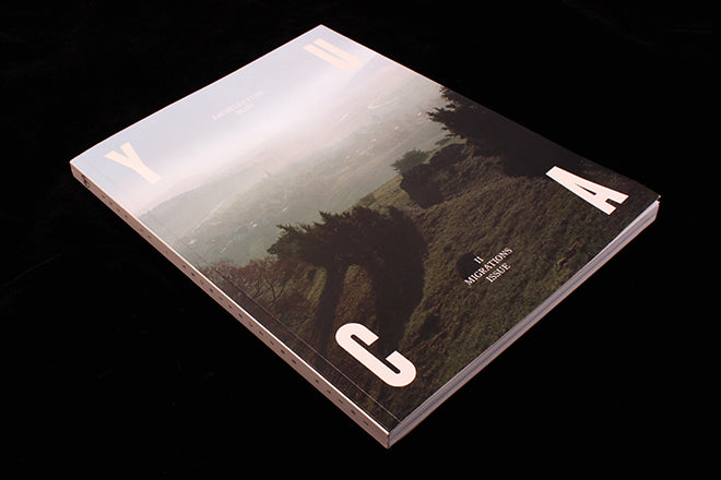
Yuca, #2
On the Journal, we’ve been noting over the past four months that there’s a definite shift in the tone of new titles: design-minded indies are beginning to focus on weightier political issues than they have been in the past. Yuca falls into that new camp of magazine. Similar to Migrant Journal and The Real Review, Yuca is the product of a design-orientated editorial team that considers social issues through a creative lens. The second of the biannual is loosely based in Columbia (every issue roughly focuses on a different place).
Instead of working thematically Yuca has ‘alibis’ and sub-themes, which is a potentially overly complex way of describing what an issue is about. Issue one’s ‘alibi’, for example, was ‘Gastronomy’ with a sub-theme of ‘Roots’. Now issue two is ‘Architecture’ with a sub-theme of ‘Migration’. Why not simply ‘The Architecture of Migration’? I tend to agree with the notion that if you can’t sum up your magazine concept in one sentence, then it’s possibly leaning on the side of convoluted. But I’m being pedantic, because Yuca is a very solid and thorough magazine and there’s actually little to criticise.
It’s our Magazine of the Week, very simply, because of its hopeful, utopian outlook, its excellent content, and the smart way it pairs all of this with editorial design.
A set of illustration by Mikkel Frost of literary worlds – from Kurt Vonnegut (above) to Paul Auster – is intriguingly sat alongside an article about refugee housing in Calais (written by the editors of much-loved design magazine Macguffin, a magazine Yuca shares much with). Yuca then continues to look at social issues through artworks that explore issues around migration: it showcases a project by Juan Francisco that visualizes the victims of Colombian conflict (below) for example, and also looks at a series of photographs of walls to explore what it means to encounter a block (also below). As you can see from the following spreads, Yuca uses typography effectively for visual expression.
Overall, the look of the publication combines design-know-how and playfulness with the pared-back rigour you'd expect in an academic title
As Jeremy noted last week in his review of The New Yorker, we want magazines right now that are hopeful and aspirational for their creative readership. Yuca has this kind of inspirational edge. Although its use of ‘alibis’ is confusing, the upside is that it will be useful for its editors—the approach means Yuca can migrate and transform into whatever it wants to be. It can curate content to suit the times instead of being locked in a concept, a place or a specific theme.
Editors-in-chief: Juliana Gomez & Lina Rincon
Graphic design: Carles Murillo & No Water for Whales


